Mini clear plastic cone cups with stands are more than just vessels for serving frozen treats; they embody a blend of functionality and visual appeal that enhances the customer experience. Ideal for bubble tea shops, restaurants, food trucks, and catering services, these cups not only present desserts attractively but also provide stability and convenience. This article will explore their practical uses, aesthetic advantages, cost considerations, durability, sustainability, and branding opportunities, showcasing how these versatile cups can elevate any beverage service. Through insightful chapters, we delve into each aspect that makes mini clear plastic cone cups a must-have for any culinary business looking to impress and serve efficiently.
Seeing is Serving: The Practical and Aesthetic Power of Mini Clear Plastic Cone Cups with Stands
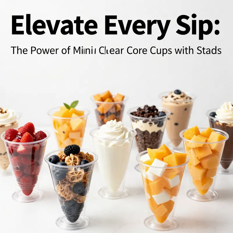
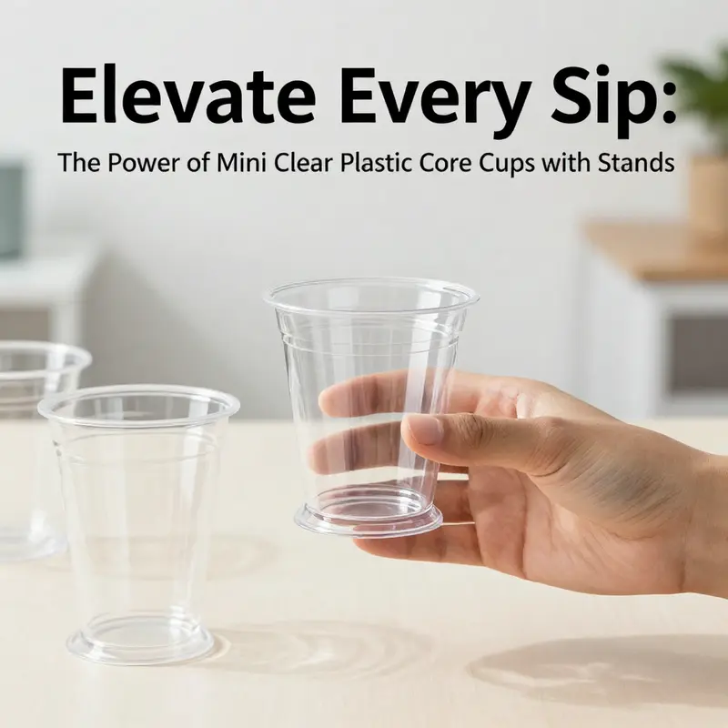
Transparency has become a defining feature of contemporary food presentation. In the world of small-portion desserts and bite-sized treats, mini clear plastic cone cups with stands fuse visibility with stability, turning a simple serving into a curated moment. The clear plastic acts like a window, inviting customers to inspect the swirl of color, texture, and freshness before the first spoon or straw is lifted. At the same time, the integrated stand shifts the paradigm from hand-to-mouth to display-to-heart. Stands create order on a counter, buffet line, or cart, allowing vendors to arrange several cups in neat rows, each offering a precise, easy-grab portion. This combination answers a practical need—controlled portions and rapid service—while feeding a larger desire for measured elegance in everyday settings. The cups’ compact size supports agile service models, especially in fast-casual, mobile, or event-based contexts where speed and presentation must coexist without clutter. Through this simple pairing, form and function converge to shape how customers experience a treat even before it reaches their lips.
Because the contents are visible, operators can lean into color storytelling. A vendor serving fruit jellies, yogurt swirls, or shaved ice can let the natural hues speak for quality. The 6-ounce scale is small enough to feel indulgent but large enough to be satisfying, and the cone shape helps guide the eye toward the product’s interior. The stand, often a flat base or molded support, anchors the cup, reducing the risk of tipping as trays are passed along a line or while customers carry them from seating to service. In high-traffic settings—soft-serve corners, food trucks, or yogurt galleries—the ability to present many units with crisp, upright alignment elevates the overall experience. Some configurations come with universal lids that seal the top without sacrificing the glass-like clarity of the walls, supporting freshness and preventing early melt during peak hours. When filled, these cups can be stored in compact refrigerated units, a boon for vendors who need to move quickly from prep to display. A well-made display becomes more than a storage solution; it becomes a stage where color, texture, and aroma mingle and invite touch, taste, and trust.
A practical advantage extends beyond aesthetics: spill resistance and hygienic handling. The water-tight seal provided by compatible lids reduces leaks during transportation and reduces exposure to air that can degrade texture. The small footprint means more products can be displayed within a single footprint on a counter, a detail that matters when space is at a premium. The case for these cups grows stronger when combined with standard filling machines and sealing lines. Modern production lines can slot these items into existing workflows with minimal modification, making them scalable for seasonal promotions or pop-up markets. A vendor can rotate through flavors with minimal downtime, because the cups are easy to fill and cap, and the stands keep everything aligned for quick packaging. An 8-slot acrylic stand, easily placed on a counter, can turn a simple display into a spectacle that draws the eye from across the room. In practice, the choreography of fill, cap, and place on the stand becomes a rhythm that supports both efficiency and the sensory anticipation that drives sales.
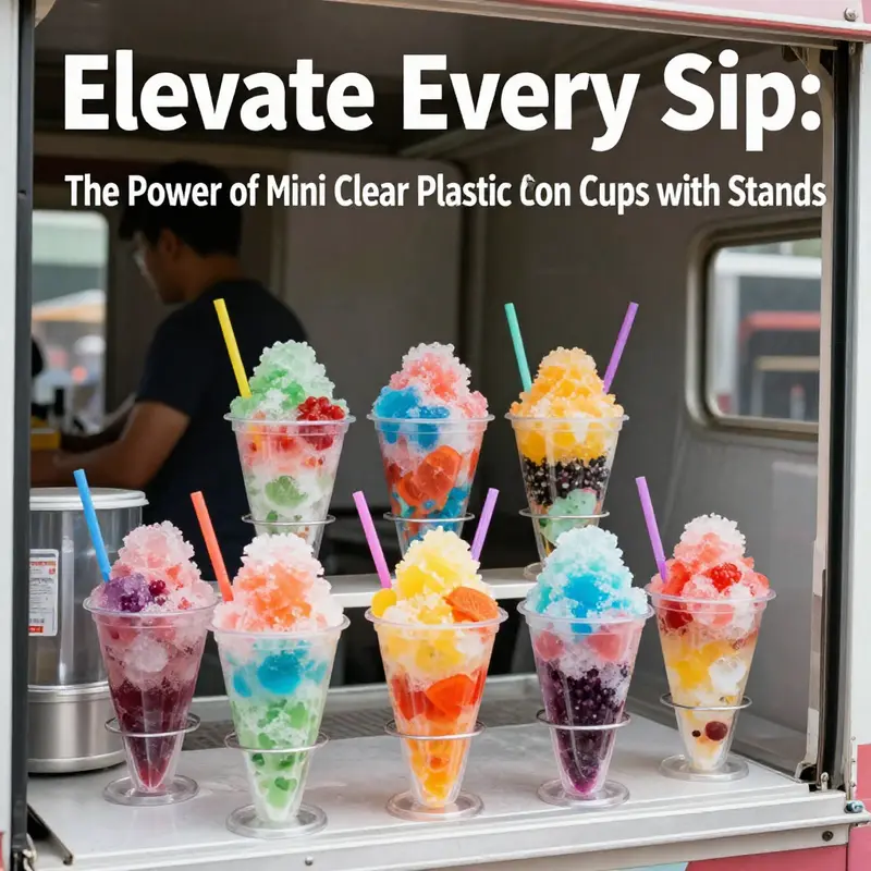
Yet the applications extend well beyond desserts. In catering, these mini cups serve as elegant samples, letting guests taste a new flavor while keeping portions controlled. They work as party favors or guest tastings at weddings or corporate events, packing a moment of whimsy into a single, disposable package. In laboratories or cosmetic showrooms, the hygienic profile of single-use cones makes them suitable for small-volume demonstrations or product tastings, where cleanliness is paramount and reuse is discouraged. The quick turnover and predictable sizing help event planners maintain consistency across service points. The material—often PET or another food-grade plastic—offers rigidity that preserves the product’s shape and resistance to micro-leakage, even when the cup is briefly set down between courses. The temperature tolerance supports chilled storage without drying out interior surfaces or causing condensation that could blur the view of the product. These attributes transform a humble container into a versatile tool for a spectrum of experiences, from casual tastings to refined display moments that reinforce a brand’s modern ethos.
As with any packaging choice, there are trade-offs. The upfront packaging costs of premium mini cone cups with stands per unit can be higher than basic disposables, particularly when compared with bulk, non-visual alternatives. For some operators, those costs are offset by the improved presentation, reduced spillage, and enhanced perceived value. Structural limits matter too: while the cups are sturdy enough for light-to-moderate fillings, very dense or heavy mixtures may stress the cone walls or the stand’s base, necessitating careful formulation or a transition to a sturdier packaging option. However, for premium or themed dessert experiences—seasonal pop-ups, nautical or tropical displays, or color-coordinated events—the investment pays off in a perception of quality and the ability to command a higher price point. The opportunity to customize further—logos, embossing, or themed artwork—transforms each serving into a micro-advertising moment, reinforcing brand identity with every bite or sip. The cost discussion, while important, often shifts toward value: does the packaging help a brand convey competence, care, and a distinct experience? When it does, the incremental expense can be recouped in faster service, higher perceived value, and greater customer recall.
From a brand-building perspective, the simple act of presenting a product in a transparent cone can be a powerful communication tool. Visibility is trust; customers can see the mass, the texture, and the freshness, which reduces hesitation and builds confidence. The cone geometry naturally elevates the perceived value because the container becomes part of the dessert’s storytelling. The stand reinforces narrative by presenting the cups in a structured, deliberate array rather than a stray pile. When a shop or event needs to convey a curated, modern vibe, this packaging delivers with minimal extra steps: design, fill, cap, place on stand, and present. For teams that manage a mixed menu, interchangeable lids and compatible accessories create a cohesive ecosystem of serving ware that looks and feels intentional rather than improvised. The packaging can also harmonize with other display assets, such as colored napkins, spoons, and signage, so the entire station reads as a unified brand experience rather than a mishmash of disposable items. In environments where the goal is to invite curiosity, the clarity of the container invites an up-close inspection that can become a social moment as customers photograph the display for sharing.
Within the operational mind, there is also a simple logistics efficiency. The compact nature of the cups makes them easy to store, stack, and transport. They occupy less cooler real estate than larger bowls, and the stands themselves can be arranged to maximize visibility without crowding. Staff training becomes more straightforward when the mouth of the container is clearly visible through the wall; staff can inspect color, texture, and portion without lifting the lid or opening the cup. The closure mechanism, whether a snap-on lid or a sealing cap, helps preserve product integrity during service waves, a practical advantage at events where lines form rapidly and turnover is brisk. And because the cups are typically designed to be single-use, the sanitation protocol remains simple: wash hands, grab a clean cup, and proceed. The result is a service flow that respects both speed and cleanliness, a balance that customers increasingly expect in busy environments. The stand also reduces the risk of cross-contamination by keeping utensils and containers organized, allowing staff to focus on consistency and speed during peak moments.
In considering packaging ecosystems, operators often weigh alternatives against the familiar two-part balance of form and function. For example, a disposable Kraft paper bowl can offer a different tactile and environmental profile for samples or tastings, while still keeping the consumer’s attention on the product inside. This option can complement cone-based displays in venues that want to mix premium visuals with eco-conscious messaging, allowing staff to switch between cup-based servings and paper bowls as needed without sacrificing aesthetic coherence.
Ultimately, the practical utility of mini clear plastic cone cups with stands rests on their capacity to blend viewing pleasure with dependable handling. They turn fleeting moments into repeatable experiences, where a customer’s first sight of a dessert translates into trust in portion, freshness, and service quality. The simple act of presenting a treat in a way that is both visually engaging and operationally efficient creates a small but meaningful difference in how a brand is perceived during the busiest service hours. In venues ranging from casual counters to curated events, the combination of transparent walls, stable bases, and well-designed tins or stands can elevate the ordinary into something memorable. As consumer expectations edge toward more tactile, visually rich experiences, these cups offer a flexible, scalable solution that can grow with a business—from a single storefront to a fleet of mobile units, with room to adapt for seasonal palettes and evolving display strategies. For a deeper dive into structure, material properties, and performance metrics, see the Design Plastic Cone Cups Guide. https://www.plasticcontainerguide.com/design-plastic-cone-cups-guide/
Clear Lines, Elevated Treats: The Design and Aesthetic Impact of Mini Clear Plastic Cone Cups with Stands
In the realm of small-dessert presentation, the mini clear plastic cone cup with its stand rises as a quietly ambitious format. Its appeal rests not merely in the clarity of its material but in how the entire experience is elevated by the juxtaposition of see-through cups against a stable, almost architectural base. The transparency of the cup is a deliberate design choice. It invites the eye to move beyond the container and linger on what lies inside—the ribbons of color from shaved ice, the delicate gradient of a layered parfait, or the glimmer of fruit jellies dancing within a pale, creamy backdrop. Clear plastic becomes more than a vessel; it is a stage backdrop that lends a performance-ready quality to the dessert. The contents are not concealed; they are illuminated by the absence of visual noise. This is not merely about showcasing color; it is about revealing texture, density, and composition in a single glance. Patrons are invited to appreciate the artistry of the dessert before tasting, and that first visual impact can influence perception of flavor and value even before the first bite is taken. The choice of a cone shape contributes to the sensory arc as well. The taper toward a narrow tip mimics a delicate sculpture, suggesting precision and craft. Paired with the stand, the cone becomes a vertical vignette that can anchor a dessert display in a way that a traditional cup cannot. The stand itself performs a crucial function. It provides stability in a setting where movement is constant—during service at a busy café, at a bustling festival, or in the fast pace of a food truck. The flat base or molded support keeps the cone upright, reducing accidental spills at the moment of handoff and enabling easier handling along a crowded line. This stability translates into better customer experience, fewer clerical distractions for staff, and a cleaner presentation overall. Aesthetics and practicality converge most easily when form and function align, and these cups manage that balance with a degree of elegance that no ordinary disposable cup can claim. The modern design language they embody speaks to contemporary venues that prize minimalism paired with tactile appeal. Clear, frameless silhouettes, smooth edges, and a seamless transition from cup to stand signal a refined sensibility. In a café setting that emphasizes curated visuals—think of a display case with artisanal confections or a dessert bar designed around a brand palette—the cups read as intentional props rather than utilitarian tools. They are not merely for consumption; they participate in the overall dining narrative, reinforcing a sense of brand identity through color, form, and staging. The stand’s geometry often polishes the perceived value of the serving. By elevating the cone, the dessert gains prominence on the plate, inviting closer inspection from guests and encouraging photos that can be shared on social feeds. The visual height, receding lines of the cone, and the clean, uninterrupted surface of the plastic collaborate to present the dessert as a curated object. The design is versatile enough to suit many culinary expressions. In a café, these cups can be used for single portions of gelato or sorbet, for layered ice-based desserts that reveal their internal strata, or for miniature versions of more elaborate sundaes. In events and catering, their compact footprint makes them efficient for display tables and dessert stations while still offering a moment of theater as guests lift the cone to savor the first bite. Home entertaining can also benefit from this presentation approach. A well-curated dessert spread at a small gathering can be elevated simply by choosing the right glass-like vessel that communicates care and attention to detail. One of the cornerstones of this design is its ability to pair with accompanying utensils without breaking the visual language. A matching spoon or straw set—designed to fit the cone’s scale—completes the presentation and reinforces the sense that the dessert experience is thoughtfully designed from first glance to last taste. The material properties deserve more than a passing mention. A clear, rigid plastic offers durability in transit and a degree of rigidity that helps maintain the cone’s shape under light pressure. It is essential, however, to acknowledge the practical limits. While the cups are suitable for many frozen and semi-frozen preparations, there are constraints when the fillings are extremely dense or heavy. The risk is that the cone could experience structural strain if the contents exceed a certain weight or viscosity. This consideration plays into the decision-making process for operators who must balance branding and presentation with reliability. Nevertheless, the presentation advantages tend to outweigh these limitations for premium or themed dessert experiences where the goal is to create a memorable visual moment as much as a memorable taste. Beyond the physical form, the opportunity for branding and customization adds a dynamic layer to the concept. Clear cups provide an unblemished canvas for logos, embossing, or themed artwork. When a vendor or event planner leverages that blank slate, the serving becomes more than a dessert; it becomes a branded touchpoint. Custom graphics can echo a color scheme from the rest of the event, or be used to tell a small story within the dessert lineup. The potential to imprint or decorate the cups—whether through additive manufacturing, labeling, or laser-like embossing—can transform each serving into a micro-marketing moment. The synergy between presentation and branding is where this format truly shines. It enables a cohesive aesthetic across serviceware, signage, and display areas, reinforcing the theme and elevating the perceived value of the offering. In thinking about the operational aspects, the cups are often integrated with a complementary set of tools. Straws and spoons designed to fit the scale of the cup contribute to a frictionless experience from first contact to finish. The ease of use at the point of sale—quick grabs, simple assembly, and minimal cleanup—adds practical value for vendors operating in high-volume environments. The overall experience, from the moment a guest spots the display to the moment they savor the last bite, benefits from a choreography of preparation, presentation, and service that this cone-and-stand format supports. A practical takeaway for designers and operators is the importance of maintaining a clean, distraction-free presentation area. Because the container is transparent, any imperfections in the dessert or the surrounding station become more noticeable. Keeping the area tidy, ensuring consistent portioning, and aligning color palettes across the menu help maintain the pristine, modern vibe that the cups convey. The choice of materials also relates to sustainability considerations that are increasingly part of consumer expectations. While these small vessels are primarily disposable, their life cycle matters. Reusability, where feasible, and recyclability of the plastic can influence how a venue brands itself in eco-conscious markets. This is not to suggest that the aesthetic value should be compromised for sustainability, but rather to invite thoughtful decisions about portion control, cleaning protocols, and waste management that keep the experience elegant without sacrificing responsibility. The chapter of design here is less about a single feature and more about how a series of small decisions—from the cone’s proportions to the stand’s footprint, from the level of transparency to the finish on the base—combine to create a cohesive experiential object. In this sense, the mini clear plastic cone cup with stand becomes a statement piece within a broader ecosystem of dessert presentation. It signals a commitment to showcasing color, texture, and technique while delivering stability and ease of service. The result is a vessel that respects the dessert as art and the audience as participants in that art. For readers exploring adjacent packaging options, it is worth considering how alternative vessels—such as eco-friendly custom paper coffee cups with lid—might align with a particular brand narrative or event design. See eco-friendly custom paper coffee cups with lid for a contrasting approach that foregrounds sustainability and brand messaging in a different material family. As with any packaging choice, the ultimate decision rests on the balance of aesthetic impact, functional reliability, and alignment with the intended experience. The mini cone cup with stand offers a compelling combination of transparency, stability, and modern elegance that can anchor premium dessert experiences across venues while inviting guests to engage with the visual drama of the contents before they even take their first bite. When executed with care, it becomes more than a serving method; it becomes a small, stylized stage on which dessert stories are told. External resources on the properties and performance of such display options can further inform decisions about materials, shape, and use in real-world settings. For further details on the material properties and performance of these cups in real-world applications, see this guide: https://www.alibaba.com/product-detail/Buy-Mini-Ice-Cream-Cone-Holder-Clear_1600572498238.html
Balancing Price and Presentation: Cost Considerations for Mini Clear Plastic Cone Cups with Stands
Cost is rarely a single number. For the tiny, crystal-clear cones with a stabilizing stand, price sits at the intersection of material science, logistics, and the hoped-for impression on guests. The right balance can elevate a simple shaved-ice serving into a premium experience, while a miscalculation can turn an elegant display into a budgetary headache. To grasp the full picture, it helps to start with the most tangible driver: the material. Mini cone cups are typically crafted from one of several polymers, each with its own merits and price pressure. Polystyrene (PS) remains the most economical option, delivering clarity and stiffness at a lower cost per unit. When durability and a sturdier handfeel matter—such as during longer service hours or for more dense fillings—polypropylene (PP) often becomes appealing, trading a modest uptick in price for improved impact resistance and reuse potential. A third path, polylactic acid (PLA), introduces a biodegradable or compostable dimension that can align with sustainability goals but typically carries the premium of higher material costs and more variable supply chains. These material choices ripple through the bill of materials, affecting not only the per-unit price but also the tolerances around stacking, shipping, and even the stand’s integration. The stand itself, sometimes a flat, broad base and other times a molded support integrated into the cup, introduces a second layer of cost that often goes overlooked in quick price estimates. The stand improves stability on crowded event tables, reduces the likelihood of spills, and can permit higher stacking densities during storage. Yet it also adds manufacturing steps and potential waste if the design requires additional materials or tighter tolerances. From a procurement perspective, every incremental improvement in durability, leak resistance, or branding potential must be weighed against the incremental cost and risk of supplier delays. The numbers in the market reflect this balancing act in a telling way. For small-quantity purchases, the shopping list price span can sit in a broad range—roughly between the mid-teens and the mid-twenties per unit. Those figures, while useful for rough budgeting, mask the more consequential reality: the total cost of ownership. Shipping, for example, is rarely included in a quoted price and must be negotiated separately. The geographic location of the supplier matters not merely for the sticker shock of freight but also for the reliability and speed of delivery. A supplier closer to your distribution hub can shave days off lead times and reduce the risk of damage in transit, a nontrivial factor when fragile, glass-clear plastics are involved. In practice, many buyers find the most meaningful savings come in bulk. Once orders climb into larger quantities, per-unit costs can fall sharply, aided by volume discounts, more favorable production scheduling, and less frequent reordering. The magnitude of those savings, however, depends on factors beyond quantity alone. Customization options, for example, can dramatically change the math. If a shop wants to imprint logos, brand artwork, or even color accents on the cups or the bases, the price per unit rises in almost every scenario. The upfront tooling costs for custom decoration, minimum order quantities, and the incremental unit price for each customized surface combine to push the break-even point further out. For venues that want a subtle branding cue, a light imprint on the cone might be enough to justify the extra cost. For others aiming for bold visibility, the sticker price must be weighed against the anticipated uplift in brand recognition and guest recall. A practical approach rests on translating these branding ambitions into a disciplined cost-benefit analysis. When the goal is to distinguish a dessert presentation at a festival or to elevate a kiosk’s perceived value, a modest premium for customization can be warranted if it accompanies a measurable increase in ticket averages or repeat visits. It’s essential, though, to quantify both sides of the equation: the incremental revenue or margin gained from better branding versus the added cost and potential procurement friction. Another lever in the cost equation is the choice of architecture around the entire serving system. Some operators consider the practical trade-offs between a fully disposable approach versus a reusable or partially reusable system. Reusability can lower long-run per-use costs if the cups and stands are robust enough to withstand repeated washing, but that path incurs its own cost burden—procurement of wash stations, water and energy consumption, sanitization supplies, and the added labor required to manage the cleaning cycle. In settings with high turnover, the time saved by a quick, single-serving workflow can be the decisive factor, outweighing the higher upfront unit price. There is also a branding dimension that often travels with cost discussions. Clear, elegant cups provide a clean stage for vibrant contents, letting colors gleam through the plastic in ways that opaque packaging cannot. The visual gain is not merely aesthetic; it communicates quality and care, especially when presented with a coordinated set of straws and small, matching spoons. The potential for decorative or thematic customization—logos, embossing, or themed artwork—can convert each serving into a micro-marketing moment. Yet customization adds price pressure and may lengthen lead times. For teams weighing these options, it helps to anchor decisions in realistic forecasts: expected daily or weekly volume, event frequency, and the stabilizing effect of a single, consistent presentation across multiple outlets. If a business plans to run dozens or hundreds of events per year, even small per-unit savings from bulk ordering or supplier negotiations can accumulate into significant totals. Conversely, for a neighborhood pop-up operating only on weekends, the value of a premium look must be weighed against the marginal cost of maintaining stock, managing spoilage, and the risk of supplier shortages during peak seasons. Beyond the core materials and customization, the decision environment is shaped by logistics. The quoted price is only a starting point. Shipping costs, import duties, and packaging for transport all contribute to the final check-out amount. In some markets, tariffs or duties on certain plastics or finishes can tilt the choice toward a locally sourced option, even if the unit price is marginally higher. The supplier’s location intersects with regulatory considerations as well. Local or regional vendors often offer faster turnarounds and easier compliance with regional food-contact standards, and that convenience is a tangible cost feature when service windows are tight. The question, then, is not simply which material is cheapest, but which combination of material, customization, quantity, and logistics yields the lowest total cost per usable serving while preserving the desired guest experience. For teams exploring alternatives, it is instructive to compare the full spectrum of packaging options, including non-plastic or paper-based alternatives, to gauge whether the premium for plastic serves a purpose beyond the momentary aesthetic. A relevant facet of this exploration is the possibility of hybrid solutions—using clear cups for display and a separate, lower-cost vessel for the actual serving—when the event format and guest flow justify such a split. This broader perspective illuminates a practical pathway: start with a base model that meets the core requirements—clarity, stability, and leak resistance—and iteratively layer on customization, material choices, and stand design as justified by evidence from trial runs and small-scale pilots. For teams with branding ambitions, a staged approach often pays dividends. Begin with a minimal imprint on a standard clear cone, measure guest response, and then decide whether to scale up to more elaborate branding or to adopt a stand that amplifies visibility without adding excessive weight or cost. The math behind this strategy becomes clearer when you consider the total cost of ownership rather than the unit price alone. The base unit cost must be multiplied by expected usage, while customization adds fixed and variable costs that should be amortized across projected volumes. Shipping, handling, and storage costs must be estimated in a cost-of-service model that mirrors real-world scenarios. In the end, the price tag is a proxy for the combined promise of performance, presentation, and profitability. The right choice aligns with the event format, the audience’s expectations, and the business’s broader brand narrative. If the objective is a premium dessert experience that travels across markets, the premium on materials and branding can pay off, provided the procurement plan remains disciplined and transparent. If the aim is a casual, quick-service display with high turnover, a leaner option for materials, minimal customization, and efficient logistics can deliver acceptable margins without sacrificing the guest’s perception of quality. For readers seeking a practical starting point, the cost landscape suggests several concrete steps: first, secure quotes for the base material you plan to use—PS for economy, PP for durability, or PLA for sustainability—with and without the stand. second, request a customization quote that separates art setup from per-unit cost, and specify minimum quantities to understand the impact on price per piece. third, ask for a shipping quote that includes packaging and delivery timelines, and consider regional suppliers to assess transit risk versus cost. fourth, pilot a small batch to validate your assumptions about leak resistance, stacking reliability, and the overall guest experience. Finally, keep an eye on the branding payoff. A cohesive visual package—clear cups, a consistent stand design, matching utensils, and a thoughtful placement strategy—can contribute to higher guest satisfaction and stronger recall, sometimes justifying a higher upfront spend. For businesses curious about the broader marketplace while planning for cost efficiency, a quick look at related packaging ecosystems can be enlightening. If you wish to explore broader packaging strategies and eco-conscious options beyond plastic, you can consult industry resources that discuss eco-friendly printed-logo single-wall paper cups and related disposables. See here: https://greendispopack.com/product/disposable-eco-friendly-printed-logo-single-wall-paper-cup/ The long-term takeaway is clear: successful deployment of mini clear cone cups with stands hinges on a deliberate blend of material choice, customization strategy, quantity planning, and logistics engineering. The result is not merely a price tag but a value proposition that can elevate every serving into a controlled, memorable experience for guests and a predictable, scalable model for the operator. External reference for further context on market pricing and sourcing: https://www.alibaba.com/product-detail/Mini-Catering-Cone-Stands-Clear-Plastic1600839795387.html?spm=a2700.1.wissu2.2.4c7c1b2eNQKtGd&productId=1600839795387&productTitle=Mini+Catering+Cone+Stands+Clear+Plastic&scm=1007.13966.248376.0&src=detailpage
Between Clarity and Commitment: The Durability and Sustainability of Mini Clear Plastic Cone Cups with Stands
Clear mini cone cups with stands sit at an intriguing crossroads where visual appeal meets practical design. Their transparency invites a closer look at the dessert inside, inviting trust and appetite in equal measure. The stand underneath is more than a prop; it is a stabilizing partner that keeps the display upright as orders pile up, as servers move briskly, and as customers lean in to choose their treat. In that sense, the pairing is not merely cosmetic; it is a deliberate approach to service, presentation, and reliability. The chapter that follows considers how durability and sustainability converge in these small-for-big-impressions vessels, shaping choices for vendors, venues, and guests who value both experience and responsibility.
Durability arises from a careful blend of material quality and geometric design. The cups themselves are crafted from a clear plastic chosen for rigidity and resistance to everyday mishaps. In active settings, the risk of impact, heat, or awkward handling is real, and cups that crack, leak, or deform under pressure undermine the entire serving moment. The tapered cone shape helps the cup distribute stress along its length rather than concentrating it at a single vulnerable point. When a sturdy stand is added, the base becomes a platform that resists tipping during quick handoffs, bustling queues, or slippery surfaces. This is not simply about keeping ice and syrup inside; it is about preserving the integrity of the entire user experience—the moment when the customer notices the cleanliness of the construction, the ease of pickup, and the confidence that the cup will perform consistently from first impression to final bite.
In benchmarking durability, these cups often outperform traditional disposable options. Paper or straight-sided plastic cups may buckle or leak under the weight of viscous fillings or the cold-sweat of a crowded outdoor event. The cone’s geometry, paired with a robust stand, reduces wobble and supports more controlled handling. It is a synergy: the shape lends structural stability, while the stand provides a broad, low center of gravity that guards against accidental tipping. The result is a serving instrument that remains visually pristine and functionally reliable even as the tempo of service accelerates. Yet durability is not a fixed trait; it hinges on how the product is used, stacked, and transported. A well-designed leakproof seam, compatible lids, and durable utensils all contribute to a seamless experience, where the cup’s resilience reduces waste and replacement costs.
This durability also intersects with storage and logistics. For vendors, the ability to stack, transport, and display without compromising the cups or their contents translates into tangible operational gains. A stable, securable stand minimizes the risk of spills during transit and on display boards, while the cone’s inward taper helps minimize the footprint of each unit in a display lot. The combination supports more predictable inventory management, enabling staff to pull cups quickly without searching for damaged stock. In a fast-paced environment, that predictability matters as much as the cups’ ability to hold a dessert. Durable performance thus becomes a keystone of brand reliability, turning small components into dependable rituals that customers can trust.
From a sustainability perspective, the landscape is evolving toward materials and lifecycles that respect ecological boundaries without sacrificing performance. Plastic products have long carried an environmental stigma, yet advances in material science are expanding the toolkit. Recyclable plastics offer a path to recovery when local streams can sort, collect, and reprocess them, while bio-based options—such as PLA blends—aim to reduce fossil-fuel use and curb long-term waste. Biodegradable and compostable variants hold promise for directing end-of-life flows toward specialized facilities. The crucial caveat is that these options are only effective if disposed of correctly and if the surrounding infrastructure supports their intended pathways. Consumer behavior, municipal collection programs, and industrial composting capabilities all shape the true environmental impact of these cups. In practice, choosing a material with credible certifications and clear disposal guidance matters as much as the choice of aesthetic.
For businesses seeking to emphasize green credentials, sourcing options that balance performance with end-of-life clarity matters. Clear labeling about disposal helps staff and customers align actions with intent. It also reduces contamination in recycling streams, which can undermine the value of recyclable packages. When a brand communicates not just what the cup is but what should be done with it after use, it helps create a consistent sustainable narrative that customers can follow without guesswork. In addition, certifications and third-party verifications provide assurance that the chosen option meets recognized environmental standards, which can be crucial for building trust with a discerning audience. Even as single-use packaging remains common for mobile and casual dining, the emphasis should be on accountable design and responsible disposal pathways rather than token green claims.
Customization, too, plays a meaningful role in the sustainability conversation. When branding is integrated with sustainable messaging, the cup becomes a storytelling device as well as a container. A clear cup can showcase the vivid colors of a dessert while carrying a message about responsible packaging, especially when paired with print or embossing that signals recycleability or compostability. Design decisions—such as how to print without compromising clarity or how to emboss with minimal material impact—can affect both aesthetics and lifecycle outcomes. The opportunity lies in aligning visual appeal with practical guidance, so each serving becomes a small, repeatable reminder of the brand’s commitment to quality and care.
For readers exploring greener footing, practical sourcing decisions matter as much as public perception. The right material choice should harmonize with your waste management reality and your customers’ expectations. If your locale boasts robust recycling or composting infrastructure, recyclable or compostable options may deliver meaningful reductions in environmental footprint. Clear disposal instructions, staff training, and visible customer education support this effort and help ensure that the packaging does not end up in a landfill when a better fate is available. In practice, this requires coordination with suppliers who offer credible certifications and with distributors who understand how the packaging will be used in the field. The aim is not merely to “tick a box” but to create a coherent lifecycle story—from production to consumption to end-of-life recovery—that visitors can follow and feel good about.
The opportunity to connect durability with sustainability is enhanced when vendors consider the broader ecosystem of packaging. While a single cone cup wears the marks of a premium display, it also signals a commitment to responsible practices when chosen thoughtfully. This is particularly important in premium or themed settings where the visual drama of the cup must coexist with a credible environmental stance. A durable cup reduces waste and breakage, which translates into fewer replacements and less material loss at the point of sale. A sustainable choice, meanwhile, signals a longer-term investment in customer trust and brand integrity. The synergy between durability and sustainability thus helps elevate a simple dessert into a tightly choreographed experience—one that respects both the enjoyment of the guest and the responsibilities of contemporary business.
For those building a broader packaging strategy, the path forward is not a single universal solution but a carefully considered mix of materials, labeling, and disposal guidance. The cups should fit the stand design and the overall display concept while also aligning with the waste systems in the operation’s geographic footprint. The focus, then, becomes twofold: ensure that the cups perform their primary function with reliability, and provide customers with clear, actionable information about disposal. This approach strengthens comparisons across vendors, products, and service contexts, making durability and sustainability inseparable rather than competing priorities.
In closing, the conversation about mini clear plastic cone cups with stands is not solely about how they look or how long they last. It is about how these small components contribute to a dependable, visually compelling guest experience and how they can be integrated into responsible packaging choices. The glass-like clarity of the cup, the quiet confidence of a stable stand, and the careful choice of material all converge to tell a story of thoughtful design. When that narrative includes transparent disposal guidance and credible sustainability credentials, the cup becomes more than a vessel—it becomes a deliberate part of a hospitality ethic that values performance, presentation, and planet alike. To those seeking practical exemplars of sustainable packaging choices for desserts and small servings, consider options that offer both durability in use and clarity about end-of-life paths. For more on eco-friendly packaging solutions, see this internal resource on eco-friendly custom paper coffee cups with lids. eco-friendly custom paper coffee cups with lids.
External reference for sourcing and material options can be explored at: https://www.alibaba.com/product-detail/Clear-Plastic-Cone-Cups-for-Ice-Cream-Desserts_1600472358569.html?spm=a2700.160949.0.0.6f4b5e2cUHqXKw
Branding on a Transparent Canvas: The Strategic Potential of Mini Clear Cone Cups with Stands
Every facet of a brand’s presentation contributes to how customers perceive and remember it, and packaging is a crucial, often overlooked, conduit of identity. When a business adopts mini clear plastic cone cups with stands, it does more than hold a portion of frozen dessert or a petite dessert bite. It creates a portable canvas where color, texture, and brand personality are displayed in real time. The cups’ transparent walls invite customers to view the contents, turning the serving into a colored vignette that can be seen from a distance and appreciated up close. In this way, the container becomes a visual partner in the storytelling arc, not merely a vessel. The result is a seamless blend of utility and aesthetics, a compact stage that travels with the consumer from street cart to festival, from kiosk to cafe window, and back into memory long after the last lick or bite has been savored.
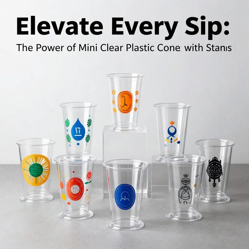
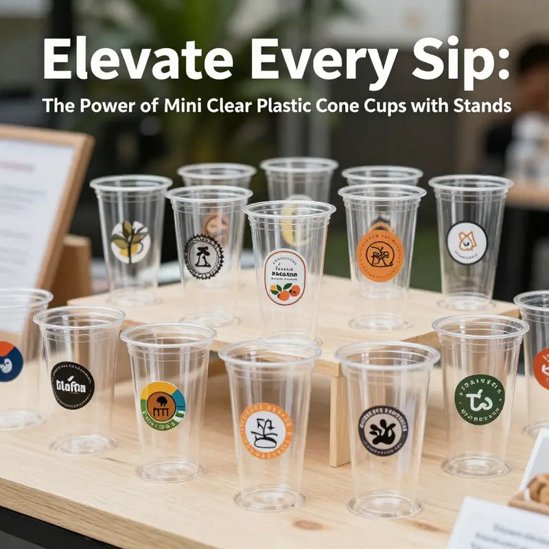
Customization sits at the heart of this branding opportunity. These cups can be tailored with logos, embossing, or debossing to add tactile and visual depth. Finishes can swing from matte to glossy, and themed artwork can echo seasonal campaigns, storefront design, or product lines. The transparency of the cup does not suppress branding; it enlivens it, because the contents themselves lift the overall composition. A saturated fruit swirl or a creamy confection glows through the walls, while a bold logo or emblem anchors the scene. The brand’s color story becomes a framing device rather than a distraction, guiding the consumer’s eye toward the product while whispering the brand’s identity at the same time.
The stand that accompanies the cup is more than a stabilizing base. In fast-paced environments—outdoor markets, food trucks, or during peak service hours—the stand provides a reliable footing that minimizes spills and maintains presentation. A well-designed stand elevates the perceived value of the serving, signaling that care extends beyond flavor into the entire customer experience. This small architectural detail helps set a premium tone without requiring elaborate infrastructure. When the cup, stand, and accessory items—such as a coordinated straw or spoon—are aligned under a single design language, the consumer experiences a cohesive moment rather than a string of loosely related items. The visual rhythm created by color blocks, typography, and texture can be as impactful as the taste itself, turning a simple serving into a branded micro-event.
From a marketing perspective, the impact of portable branding is understated yet powerful. Each served portion on a tray or in a cone travels through space as a moving advertisement. People encounter the cup in transit—on crowded sidewalks, in queues at events, or at pop-up tastings—and the design, color, and form reinforce brand recognition with every passersby who glances or photographs the scene. This is how packaging becomes a living part of a brand’s reach, extending beyond the storefront. Seasonal palettes and limited-edition artwork can amplify this effect, inviting repeat engagements and social sharing. When a brand coordinates the cone cup with other branded elements—lids, straws, spoons, and signage—the effect compounds: a unified, recognizable ecosystem that travels with the customer and returns as familiarity, preference, and loyalty.
Yet branding through these cups is not a vanity exercise. It requires a careful balance of aesthetic ambition and practical constraints. Per-unit costs may be higher than standard disposables, driven by the demand for stability, clarity, and leakproof performance. The ROI hinges on brand perception, reduced spillages, and higher engagement, especially in premium offerings where presentation signals quality and care. For operators who rely on a fast-turn, high-visibility service model, the additional investment can pay off through stronger differentiators and a more memorable guest experience. The cups act as a tangible expression of the brand’s promise—culminating in a consumer interaction that feels deliberate and crafted rather than incidental. In this way, packaging becomes a strategic asset, not a mere afterthought.
Executing branding on a transparent canvas calls for a design method that respects legibility, balance, and brand voice. Start with a concise brand narrative that translates into color, texture, and minimal form. Embrace bold, legible marks and high-contrast compositions that read clearly from a distance, while preserving the product’s visual appeal up close. Embossing or debossing can add texture without compromising the cup’s transparency, and the choice between matte and gloss finishes can be used to modulate touch and light interaction. The objective is to create a design that communicates instantly and endures across contexts. Overly intricate line work or tiny typography tends to lose impact when the cup moves through diverse lighting and angles; thus, emphasis on strong silhouettes and prominent motifs is usually more effective. In practice, the best designs leverage the transparent medium to enhance the product’s color story rather than obscure it, letting the dessert’s own hues propose the brand’s mood.
A cohesive branding strategy extends beyond the cup itself. The cup should be part of a broader visual system—coordinated napkins, minivan-friendly packaging, or a compact display that echoes the same colors and motifs. When the branding language travels together across multiple touchpoints, it creates a consistent brand footprint. This consistency helps strengthen recognition, recall, and affinity as customers encounter the brand in different places and moments. The result is a narrative that unfolds with every serving: a promise of quality, a glimpse of flavor, a hint of character that lingers in memory and conversation. The experiential value increases, and so does the likelihood of social sharing, as customers capture images that showcase not just the dessert but the brand’s chosen aesthetic framework.
In choosing how to move forward with a brand strategy anchored by mini clear cone cups with stands, operators should plan for scalable execution. The goal is to preserve a strong visual identity across varying volumes and venues, from a single storefront to a mobile fleet. This requires thoughtful production planning, from color-matching and print options to materials that maintain clarity and stability even with the rigors of transport and on-site handling. A well-conceived branding program recognizes the cup as a platform for storytelling that is both portable and durable, capable of withstanding the everyday realities of busy service environments while preserving the integrity of the brand’s image. The payoff is a tangible, repeatable asset that customers associate with positive experiences and reliable quality.
To illustrate how branding can be anchored in practical design choices, consider the role of eco-conscious customization on a compatible cup family. Brands seeking to emphasize sustainability can emphasize logo and color choices that align with environmental commitments while keeping the presentation clean and modern. The opportunity to integrate a logo or artwork in a way that remains legible and distinctive on a clear surface becomes a balance between brand marks and product visibility. For inspiration and guidance on this approach, see the internal resource focused on eco-friendly printed logos on single-wall cups. disposable-eco-friendly-printed-logo-single-wall-paper-cup.
As this chapter closes, the central takeaway is simple: mini clear cone cups with stands transform packaging into an active branding tool. They support a premium consumer experience, enable portable storytelling, and provide a scalable platform for brand differentiation in bustling, competitive spaces. The cup is no longer a passive container; it is a carefully crafted element of the brand ecosystem, designed to travel with customers and to speak in color, texture, and form at every encounter. When brands treat packaging as an extension of their store environment—an on-the-go display that aligns with signage, service flow, and ambiance—they create moments that feel cohesive, intentional, and memorable. The result is a branding strategy that travels well, resonates across contexts, and turns a simple serving into a branded moment worth sharing.
External resource: For a broader perspective on how these cups function as portable branding tools in action, see this external reference: https://www.icecreamplasticcups.com/mini-clear-plastic-cone-cups-with-stands
Final thoughts
Mini clear plastic cone cups with stands offer an ideal solution for businesses in the food and beverage industry, combining practicality with aesthetic appeal. They are perfect for showcasing colorful products while ensuring customer convenience and satisfaction. As we explored, the advantages of these cups go beyond their striking design to include sustainability and branding opportunities that can significantly benefit any business aiming for excellence. Embracing these cups can elevate your service standards and engage customers effectively, making each serving a pleasurable experience.