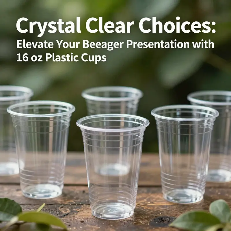
Clear 16 oz plastic cups are a favorite in the beverage industry, offering unmatched clarity and durability for presenting a variety of drinks. Perfect for bubble tea shops, restaurants, and catering services, these cups combine functionality with aesthetics, enhancing the consumer experience while enabling effective brand communication. As we delve into the nuances of these cups—focusing on their material characteristics, innovative designs, customization for branding, and sustainability considerations—you will gain insight into how these elements can contribute to your business’s success in serving beverages that not only satisfy customers but also showcase your brand’s commitment to quality and environmental responsibility.
Durability and Material Considerations of Clear 16 oz Plastic Cups
Clear 16 oz plastic cups sit at a crossroads of presentation and practicality. They must show off a beverage’s color and texture while resisting bumps, shakes, and temperature changes that accompany busy service environments. The backbone of that balance is PET, short for polyethylene terephthalate, whose combination of high clarity, strength, and broad recyclability makes it a common choice. When a server slides a tray across a crowded buffet or a caterer stacks dozens of cups for service, the cup’s resilience becomes part of the guest experience. If a cup cracks or fogging occurs after condensation, the presentation suffers and operations lose efficiency. In this sense, durability is not just a physical property; it is a line item in the service equation that links how a drink is delivered to how a guest feels. The material choice informs daily rhythms of a cafe counter and the tempo of large catering operations where speed, reliability, and appearance must align. PET’s durability comes from its robust molecular structure, which resists deformation and cracking under normal handling. It supports a wide range of cold beverages and can tolerate hot beverages under certain engineered designs, with wall thickness, stabilizers, and barrier coatings affecting heat tolerance. In practice, many 16 oz PET cups tolerate chilled or mildly warm liquids, while hot-use is reserved for specialized cups or double-wall designs. Clarity reinforces durability by enabling staff to monitor fills and beverage quality at a glance, and a transparent cup with a well-finished rim reduces drips and aids in straw placement. The ease of seeing the drink can translate into perceived freshness and smooth service. Recyclability remains central to durability. PET is widely accepted in recycling streams, allowing cups to re-enter the materials cycle rather than end up as waste. However, durability and recyclability are not the same as compostability. PET is not typically compostable in municipal programs, and some brands offer PLA alternatives that are compostable in industrial facilities but require appropriate infrastructure. Therefore, end-of-life decisions should align with local capabilities. In regions with robust recycling, PET clear cups provide a strong performance-to-environment balance, while compostable options may appeal where composting is accessible. Vendors may also offer branding customization, which can influence branding value without compromising performance. Beyond the cup material, the shapes and features matter for durability. Straight rims create a uniform edge that supports stability during pouring and stacking, while lid design, such as dome lids with built-in straws, balances headspace with leakage protection. A cohesive cup, lid, and straw interface reduces spill risk during transport and service. In high-volume settings, even small design choices—rim finish, wall thickness, and fit between components—can affect speed and accuracy. Finally, brand and sustainability narratives shape material choices. PET’s recyclability aligns with expectations to redirect single-use cups into useful cycles, but compostable or alternative materials may be favored when branding, end-of-life pathways, or carbon footprint considerations are decisive. The ability to customize with logos adds value, though operators should consider whether branding options align with local waste facilities. As the industry evolves, readers seeking deeper technical exploration of PET’s performance can consult specialized guides and supplier literature to compare cup grades, wall thickness, and coatings for industrial applications. In short, clear 16 oz PET cups offer a careful balance of strength, clarity, temperature tolerance, and end-of-life options, making them a reliable mainstay for many cold-drink applications while leaving room to consider alternative materials when contexts demand different trade-offs.
Seeing Color, Calibrating Confidence: The Integrated Design Language of 16 oz Clear Beverage Cups
The choice of a clear 16 oz cup is more than a matter of utility; it is a deliberate design decision that shapes how a beverage is perceived, served, and remembered. In the bustling choreography of a restaurant, a festival kiosk, or a corporate event, the cup acts as a transparent stage for the drink. Its clarity is not merely an aesthetic flourish but a functional attribute that communicates freshness, quality, and even the exact moment a beverage is poured. When a customer peeks through a flawless, glass-like surface, color, texture, and layering become cues that influence appetite and expectation. The cup thus becomes a medium through which the beverage’s identity is conveyed, and its design must harmonize with both product safety and shopper psychology.
Material choice sits at the heart of this alignment. Most clear 16 oz cups are molded from high-quality PET, with PLA offering an eco-friendly alternative that is biodegradable and compostable. PET’s clarity is exceptional; it delivers a pristine window that showcases the drink’s hue, carbonation, and any toppings with minimal distortion. This transparency has a practical upside beyond aesthetics: it reduces the need for guessing about fill levels and drink composition, which in turn supports accurate serving and improved inventory control. PET’s shatter resistance is another practical virtue, particularly in fast-paced service environments where cups may be bumped during transport or stacked in crowded back-of-house areas. When temperature rises, PET maintains structural integrity, keeping a cold drink cool and a hot one from deforming the rim or losing its shape. In some contexts, PLA is chosen for its compostability, aligning with sustainability goals that increasingly guide procurement decisions. The choice between these materials is seldom a simple binary; it is a calculated balance between performance, environmental impact, and end-of-life considerations for a business’s broader packaging strategy.
Equally important is how the cup’s geometry supports both efficiency and experience. A uniform, even rim is more than a cosmetic feature; it stabilizes the pour, ensures a comfortable lid seal, and contributes to safer handling throughout the supply chain. The tapered profile yields a stackable form that can save significant space during storage and transport. In bulk operations, this space efficiency translates into tangible cost savings—reduced warehouse footprint, easier palletization, and faster count-and-ship cycles. These advantages compound over time, especially for venues that rotate large volumes of beverages and operate under tight timelines. The trick is to balance a compact stack with a comfortable grip and a mouthfeel that feels appropriate for a 16 oz serving. The result is a cup that feels designed for both the hand and the habit—easy to grip, easy to fill, and easy to drink from without compromising the drink’s presentation.
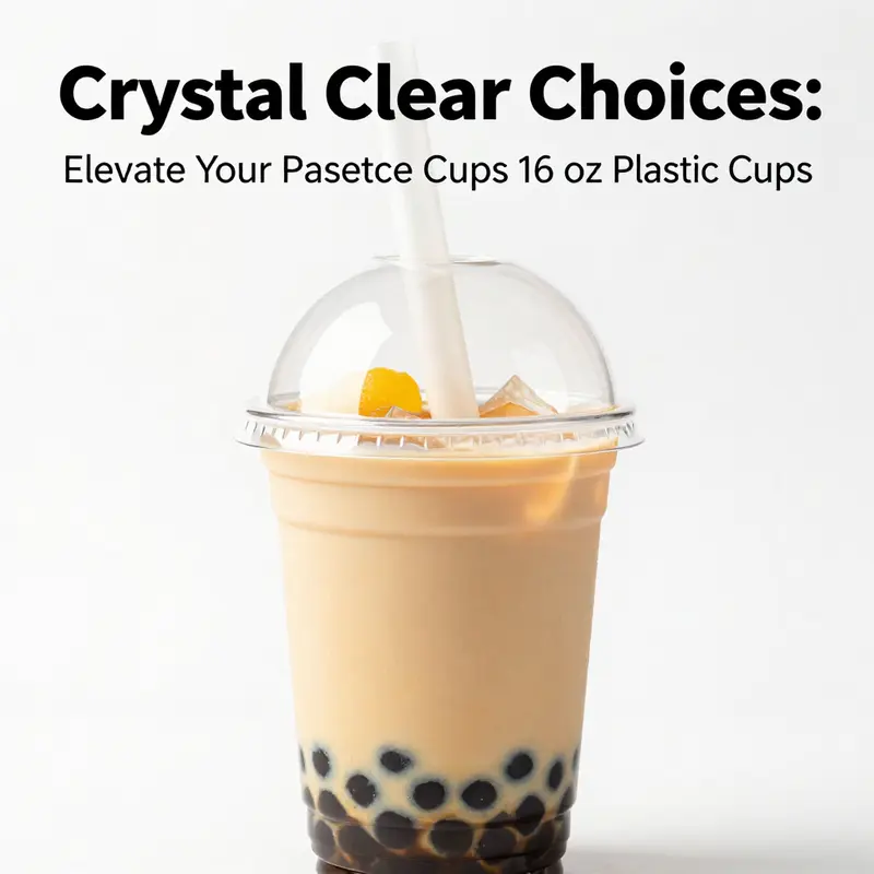
Lid design completes the cup’s functional triad and carries its own set of design imperatives. Dome-shaped lids and flat-top variants each serve distinct purposes. A domed lid creates extra headspace for whipped cream, foam, or toppings that float above the surface, while a flat lid emphasizes a clean, minimalist presentation for beverages that stand on their own color and clarity. Leak resistance is essential, especially for on-the-go consumption at events, festivals, or quick-service settings. A well-engineered lid forms a reliable seal that prevents spillage during transit, so a customer can move from a pickup counter to a seat or line without worry. For drinks that incorporate toppings or dense mixtures—think iced coffee, smoothies, or milkshakes—the interplay between cup and lid matters as much as the liquid’s recipe. The dome lid, in particular, allows the drink to breathe slightly, accommodating foams and pearl toppings while preserving the visual integrity of the beverage beneath. In more utilitarian configurations, a seal-tight lid supports a smooth handoff for catering and self-service stations, where staff must move quickly without compromising cleanliness or presentation.
Capacity and shape are not arbitrary conventions; they reflect the practical realities of portion control, presentation, and consumer ergonomics. The standard 16 oz (approximately 500 ml) capacity presents a familiar benchmark for beverage service, aligning with common recipes for iced coffee, smoothies, and cold drinks. A 98 mm diameter top opening is chosen to balance spill resistance with ease of filling and drinking. The wide mouth is a clear invitation to the consumer, enabling quick identification of color and texture at a glance and facilitating a satisfying sip experience. That openness also matters in sensory engagement; it allows customers to see the layers in a layered beverage or the swirling of a colorful smoothie, reinforcing the perception of freshness and quality. When the drink is visually appealing, the cup becomes part of a story that customers tell themselves about value and taste—the cup and its contents united in a moment of consumption.
Customization and branding are not afterthoughts but central vectors for value creation. The ability to print logos, colors, or promotional text on the cup’s surface elevates a simple vessel into a moving advertisement and a tangible reminder of the brand experience. A cup becomes a canvass for color-first branding that can reinforce a campaign’s mood, a seasonal promotion, or a corporate message. The visual impact is amplified when the cup’s clarity serves as a bright backdrop for the design, ensuring legibility and resonance even from a distance. Beyond aesthetics, customization supports loyalty by giving customers a keepsake-like reminder of the event or venue. Printing and labeling options enable a wide range of approaches, from subtle color accents to bold, full-coverage imagery, each chosen to align with a brand’s voice and the event’s tone. The opportunity to integrate logos, color schemes, or text on a disposable cup can be particularly compelling for large-scale gatherings, where consistent branding across thousands of servings creates a cohesive atmosphere and memorable impression.
The design language of a clear 16 oz cup extends into safety, compliance, and sustainability considerations that modern buyers increasingly weigh. BPA-free construction and food-grade certifications reassure operators that the beverage remains in a safe contact environment. Adherence to standards such as FDA regulations and ISO9001 quality systems underpins consistent performance across batches, while SVHC disclosures help ensure transparency in material constituents. The Biodegradable Products Institute (BPI) certification, when present, signals a compostable end-of-life option that can be crucial for customers pursuing circular economy goals. The market today often blends options that cater to a spectrum of environmental imperatives: recyclable PET with responsibly sourced resin, plant-based alternatives that offer compostability, and even blends that favor reduced weight or fewer additives to minimize environmental impact. In practice, this means that a buyer can select a cup that aligns with a broader packaging strategy—whether the priority is recyclability, compostability, or straightforward reuse-and-disposal workflows—without compromising on clarity or reliability.
Material choices also reflect operational realities beyond the counter. For many venues, the decision to use PET or PLA is informed by end-of-life infrastructure. Recyclers and waste processors increasingly favor clear PET when there is a well-defined recycling stream, while compostable PLA cups align with facilities that can handle organic waste. Some users, seeking reusability or higher heat resistance, may opt for polypropylene (PP) configurations when appropriate, or choose designs that support dishwasher-safe reuse in controlled settings. Each option carries implications for storage, logistics, and the theater of service. In practice, operators weigh the cadence of service against the environmental objectives that guide procurement. This means evaluating not only the cup’s cosmetic clarity and physical durability but also the downstream pathways that determine whether a cup is ultimately diverted from landfill or redirected into a recycling or composting stream.
Beyond the particulars of the cup itself, the broader packaging ecosystem adds layers of complexity and opportunity. Clear 16 oz cups sit at the intersection of beverage formulation, service style, and consumer perception. They impact how a beverage is poured, presented, and ultimately enjoyed. They shape the crowd’s behavior at self-service stations, where the ease of lid application and the secure fit of a domed top contribute to a smoother flow of traffic and calmer lines. They influence staff efficiency, as rim integrity, stackability, and lid compatibility affect fill times and error rates during busy shifts. They also affect the merchandising story at a catered event or a retail counter, where visual continuity across packaging and signage helps customers quickly identify the type of drink and its price point. The cup’s transparency thus becomes a strategic element in the overall experience design, enabling operators to craft consistent, compelling, and efficient beverage programs.
From a sustainability and innovation perspective, the industry is evolving toward packaging that respects both aesthetics and the planet. As consumer expectation shifts toward sustainable choices, designs that pair high clarity with responsible materials will gain traction. The potential for coatings or barrier technologies to preserve beverage quality without compromising recyclability or compostability is an area of active exploration. Meanwhile, the availability of custom solutions that reconcile branding with environmental goals means businesses can maintain a strong brand presence without sacrificing stewardship. In this landscape, the clear 16 oz cup is not a static commodity but a platform for ongoing experimentation—an evolving interface between flavor, form, and footprint.
For readers who want to explore related opportunities in cup and lid packaging and to see practical examples of how these design principles translate into real-world products, an external resource offers a snapshot of OEM/ODM capabilities and bulk-batch customization that can inform procurement decisions. https://www.alibaba.com/product-detail/16oz-Clear-PET-Plastic-Cups-with-Lids_1600472124368.html?spm=a2700.gallery-1000000000001.0.0.0.0.0.0.0.0.0. There, suppliers outline the scope of materials, customization options, and regulatory certifications that buyers commonly evaluate when planning large-scale beverage service programs.
In parallel, internal considerations for those shaping the future of beverage cups emphasize the value of aligning packaging choices with broader sustainability and branding objectives. A linked resource that complements this discussion focuses on eco-friendly printed-logo cold beverage cups with lids, illustrating how brands translate visual identity into tangible, single-use form without sacrificing practicality or performance. eco-friendly printed-logo cold beverage cup with lid. The convergence of clarity, durability, and responsible materials in 16 oz cups thus embodies a larger shift in how beverage service is imagined: as a seamless blend of beauty, reliability, and conscientious design that serves both people and planet without compromise.
Branding on a Crystal Canvas: How 16 oz Clear PET Cups Turn Every Drink into a Mobile Message
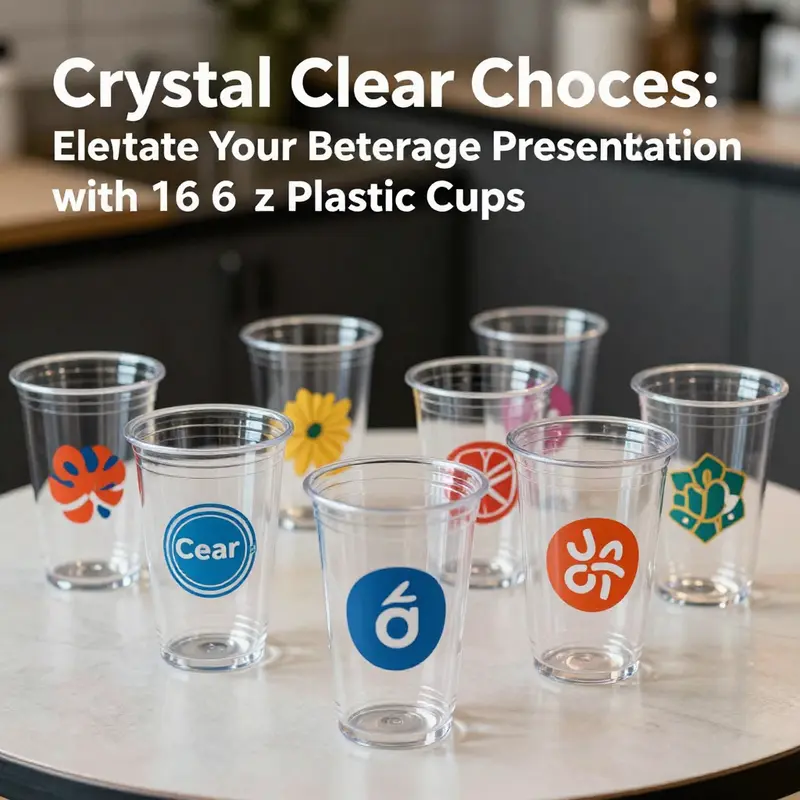
A clear 16 oz cup does more than hold a beverage; it creates a moving, visible surface that can carry a brand story from the moment a drink is poured to the moment it reaches someone’s hand. In many service contexts, the cup is the first touchpoint a customer has with a brand during a purchase. Its transparency showcases the drink itself, but it also becomes a blank canvas for design, a space where color, typography, and imagery converge to tell a company’s or event’s narrative without demanding extra attention. When a brand treats the cup as part of the overall experience, the result is a cohesive visual language that travels with the customer. The clear 16 oz format provides ample surface area around the sides, a generous wrap that can accommodate a logo, a slogan, or a playful graphic, while preserving the beverage’s color and appeal. In sectors where presentation matters—cafés, beverage counters, catering, and retail promotions—a well-branded cup can elevate perception and set the tone for the entire interaction, turning a simple purchase into a moment of recognition and memory.
Customization opportunities on these cups go beyond a single logo stamped on the surface. Through screen printing, labels, or even direct molding approaches, brands can achieve a range of effects from subtle, refined branding to bold, wrap-around graphics. Screen printing on clear PET cups allows bold colors and clean lines, especially when the design relies on high-contrast combinations and a strong logo mark. Label applications offer flexibility for limited runs, seasonal campaigns, or events where a quick refresh is advantageous. Direct molding, while more technical and cost-intensive, can embed brands into the cup’s surface in innovative ways, enabling durable color retention and design fidelity even under the stresses of chilled beverages, ice, or bustling service environments. Each method has its own advantages in durability, cost, and production lead time, underscoring the importance of aligning printing strategy with the brand’s goals and the event’s scale.
For businesses planning to scale branding across multiple channels, the choice of customization method also harmonizes with how the cups are used in real-world settings. A wrap-around, high-contrast logo that remains legible as customers glance down while sipping can significantly boost recall. In addition, the choice between full-surface wraps or more restrained placements—such as a primary logo on one side with a secondary mark or a color block on another—offers a way to preserve brand integrity while ensuring readability at various viewing distances. The transparent background of clear PET cups makes colors pop and keeps the beverage visually appealing; but this same transparency requires thoughtful color and contrast decisions. Dark or saturated inks tend to read well against most beverages, while lighter or white elements can leverage negative space for elegance. The design language must also consider the cup’s life cycle: from the initial pour to the last sip, the graphics should remain intact and legible through handling, stacking, and even occasional re-use in settings that encourage sustainability and minimal waste.
Bulk ordering adds another layer of strategy. The economics of customization reach their sweet spot when the volume is large enough to justify setup and tooling, yet flexible enough to accommodate seasonal campaigns and event-based promotions. On the supply side, options typically exist for OEM (original equipment manufacturer) or ODM (original design manufacturer) collaborations, which means a brand can influence not only the printing and color but also the material choice, lid configurations, and even packaging. Communicating brand identity across thousands of cups demands careful alignment of color-matching processes, ink stability, and surface treatment. Color consistency across batches becomes a competitive differentiator, especially for brands that rely on precise palette alignment with signage, packaging, and digital assets. This is where color management and quality assurance play crucial roles, ensuring a uniform appearance across all cups, whether they’re used in a quiet corner café or an expansive catering event.
Lids and lids-with-straws extend the branding canvas in meaningful ways. When a dome lid with a straw is used, the visible surface area remains ample for logos and art, while the lid’s edges and the straw slot introduce additional design opportunities. The lid can carry a secondary color accent, a short tagline, or a subtle pattern that complements the main cup design. For beverages that rely on toppings—foam, whipped cream, or pearls—the extra headspace created by a domed lid can be leveraged in the packaging story, reinforcing a sense of indulgence or novelty. In a promotional setting, even the lid’s color or the printed outline on the lid itself can help reinforce the campaign’s visual identity. This multi-element approach—cup, lid, and straw combination—offers a cohesive frame for the drink experience, turning a simple commodity into a well-orchestrated display of brand personality.
Beyond aesthetics, the choice of material and the claims around sustainability influence how brands position themselves. Clear PET cups are widely recognized for their clarity, durability, and recyclability, aligning with consumer expectations for responsible packaging. When brands communicate sustainability, using clear, factual language about the cup’s lifecycle helps build trust. Some cups in this category carry labels or certifications indicating compostability or recyclability, which can be meaningful for campaigns centered on environmental stewardship. The nuance here matters: while PET cups are widely recyclable where a local recycling stream exists, compostability claims require careful scrutiny of the certification and the conditions under which composting occurs. For brands aiming to marry branding with environmental responsibility, this means selecting cups that are clearly labeled as food-grade and BPA-free, and that offer transparent information about recyclability or compostability. It also means pairing the cup with lids and straws that share the same environmental ethos, ensuring the entire packaging system supports the stated sustainability goals. When done thoughtfully, branding on a clear cup becomes a story of quality and care, not just a logo on a surface.
This is also where the cup’s role as a mobile advertisement comes into sharper focus. A well-branded cup travels from the counter to the dining table, into the office break room, and out into the street, becoming a visual reminder of a brand wherever the beverage goes. The durability of the cup’s surface printing ensures that the logo survives the realities of transport and handling, from cold beverages to ice and toppings. A design that remains legible after a few minutes of condensation or a light wash in a sink should be considered a mark of quality. In practice, brands that invest in durable, well-printed cups can achieve a surprisingly high level of on-the-go exposure, turning attention into foot traffic, social media buzz, and word-of-mouth recommendations as customers show off a stylish, branded container to friends and colleagues.
The decision to pursue customization is also a decision about consistency. A brand’s physical presence—its colors, typography, and imagery—should look coherent whether the cup is used in a boutique cafe, a busy conference center, or a pop-up market. This means agreeing on a single, scalable design system that works across different print methods, sizes, and configurations. It also means planning for future campaigns by defining repeatable design elements that can be updated without sacrificing recognizability. The most successful implementations treat the cup as part of a holistic brand environment, one that extends across signage, packaging, staff apparel, and digital touchpoints. In this way, the clear 16 oz cup ceases to be a disposable item and becomes a strategic asset in a brand’s portfolio, a portable ambassador that supports recognition, recall, and reputation with every sip.
For teams exploring these opportunities, a practical starting point is to map the customer journey around the cup itself. Consider where the cup first enters the consumer’s field of view, how the design reads from multiple angles, and where in the hand or on the surface the viewer will most actively engage with the branding. Visual hierarchy matters: a strong logo, clear product messaging, and a tiny but legible call-to-action can coexist on the same surface without overwhelming the eye. The goal is to strike a balance between bold graphic expression and the cup’s functional purpose. A plan that integrates this balance will lead to a product that looks effortless on the shelf or at the service counter and yet communicates a rich narrative when the drink is in hand.
In practice, brands can also leverage a direct-to-consumer or wholesale approach to scale customization. While standard orders meet the needs of single-location operations, bulk programs support multi-location franchises, corporate events, or promotional campaigns spanning cities. The ability to customize 16 oz clear PET cups in large quantities, with consistent print quality and reliable delivery timelines, makes them a practical choice for teams that want a unified, on-brand experience across different touchpoints. In such arrangements, the supplier’s capabilities—ranging from decoration options to the ability to match an exact color signature to coordinating lids and accessories—become decisive factors in the decision-making process. Through clear communication about material safety, printing durability, and alignment with sustainability objectives, brands can create a packaging strategy that is as enduring as it is visually compelling.
For readers seeking concrete paths to enact these ideas, consider exploring brands that emphasize eco-friendly, logo-ready cups and lids in bulk. An internal resource on fully branded, eco-conscious packaging options can provide practical guidance on aligning design, material choice, and production logistics. This approach helps ensure that the branding on clear 16 oz cups remains legible, durable, and on-message across all event types and service contexts. And while the cup is a single element, the larger system—the cup, lid, straw, and supporting packaging—plays a pivotal role in shaping how customers experience and remember a brand after the last sip.
Internal link note: For a related example of eco-friendly, logo-ready cup packaging, see the discussion on eco-friendly printed-logo cold beverage cups with lids across a paper cup format. eco-friendly printed logo cold beverage cup with lid.
External reference: For a broader view of the external marketplace landscape for custom-branded cups, one illustrative resource discusses personalization at scale and the implications for marketing reach. External resource: https://www.amazon.com/dp/B0XXXXXXX
Clarity with a Conscience: Designing and Using 16 oz PET Cups Within a Sustainable Lifecycle
Clear 16 oz PET cups are common in service environments, valued for transparency and durability. They support presentation while withstanding high-volume service. Yet they are also part of a broader sustainability conversation that includes material science, design, manufacturing, and end-of-life stewardship. The sustainability of clear PET cups depends on choosing materials and processes that align with local waste streams and consumer behavior.
Material technology sets the stage for recyclability and recovery. PET is widely recyclable, and its clarity and strength enable reuse in recycling streams and production of new PET items. Certification marks help operators communicate credibility, but must be evaluated against local infrastructure. In some regions industrial composting is available; in others, compostability claims may have limited practical impact. The best approach is to choose cups with certifications that match the available end-of-life options.
Design and production choices influence embedded energy and waste. Lightweight cups use less resin and energy, while stable geometry improves packing and transport efficiency. A well-designed cup also reduces breakage and spill risk, which lowers waste in both materials and labor.
Beyond the cup, the ecosystem includes lids, straws, and branding. When end-of-life streams rely on recycling, components should be compatible to avoid contamination. Transparent labeling and consumer education help improve recovery rates. OEM/ODM options can align branding with responsible material choices, supporting credible sustainability claims.
Lifecycle thinking remains essential. In many cases, single-use PET cups are the pragmatic choice for hygiene and throughput. When feasible, reusable systems may reduce environmental impact, but require careful assessment of cleaning energy, water use, durability, and consumer behavior. For many cold beverages, single-use PET cups with robust recycling access remain a practical option.
Practical guidance emphasizes credible certifications, alignment with local waste infrastructure, and clear consumer instructions. By coordinating material choice, design, and end-of-life planning, organizations can deliver a product that is both visually appealing and responsible. A broader packaging ecosystem approach—including appropriate alternatives for other meal components—helps ensure that sustainability is achieved through an integrated strategy rather than isolated changes.
Seeing Through Service: The Quiet Power of Clear 16 oz Plastic Cups in Beverage Presentation and Logistics
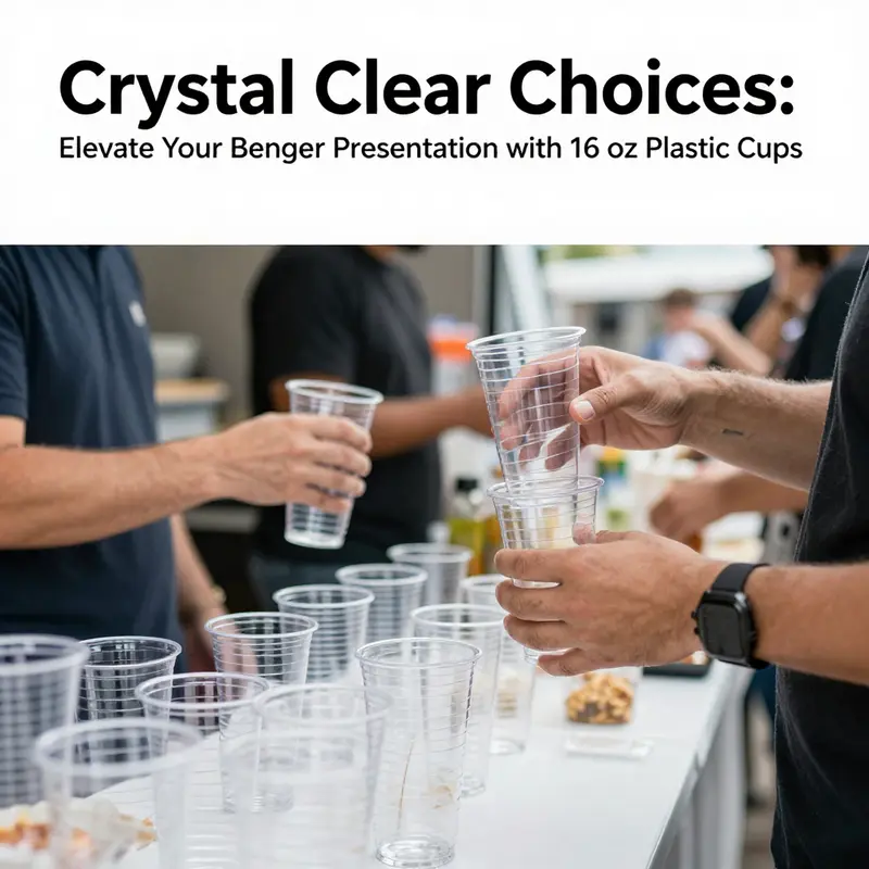
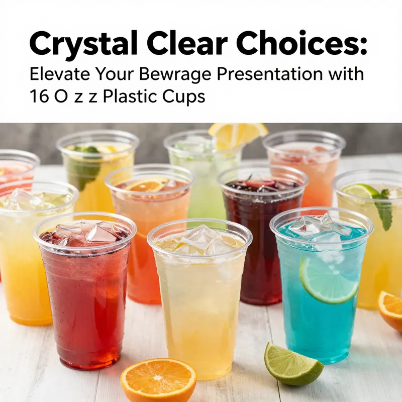
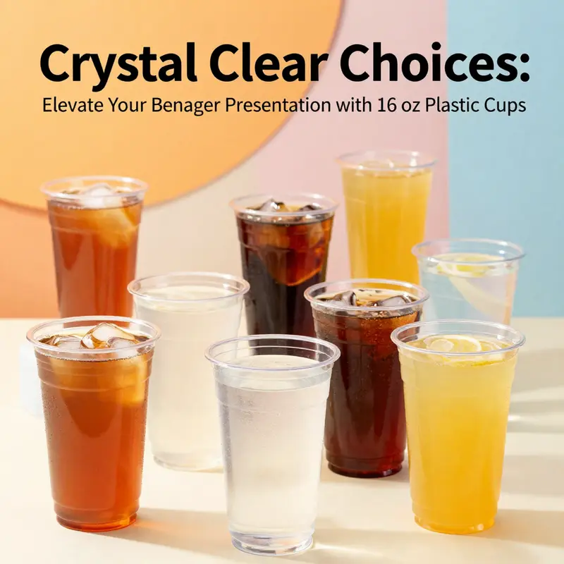
Clear 16 oz plastic cups do more than hold a drink; they shape perception, streamline service, and echo an operation’s approach to efficiency and presentation. In hospitality and retail environments where speed, clarity, and trust are paramount, these cups serve as a practical canvas that lets the beverage itself—its color, texture, and even foam or bubbles—take center stage. Their transparent walls are a simple but powerful design choice. They invite a customer to visually assess what they are about to consume, from the subtle amber of iced tea to the vibrant hue of a fruit-forward juice. This visibility isn’t merely aesthetic; it communicates freshness, quality, and a sense of honesty about what’s inside. The cup becomes a stage for the drink, and in a world where pictures often speak louder than words, the unit itself serves as a reliable billboard for the beverage’s appeal. When a server reaches for a cup, the motion is almost invisible, but the impact is cumulative: fewer misread orders, quicker identification of the drink on crowded counters, and a sense of reliability that extends from the bar to the pickup window and, ultimately, to the customer’s hand and back to the table or car seat where the experience will unfold.
The material—clear PET plastic—does most of the heavy lifting here. PET’s combination of clarity, rigidity, and resistance to cracking makes it well-suited for high-volume settings where a shared kitchen, a busy catering hall, or a fast-casual line demands cups that won’t buckle under a bumped shelf or a quick, repeated rinse-and-fill cycle. This durability, paired with transparency, creates a practical symbiosis: the drink looks as good as it feels in the hand, while the cup’s strength reduces breakage in transport and stacking, cutting down on waste and replacement costs. Yet the same clarity that enhances product visibility also places a premium on cleanliness and hygiene. In a world that is increasingly attentive to how food and beverages are presented, a perfectly clean, smear-free rim and an unobstructed view through the glassy surface become small but meaningful signals of care and quality.
In professional settings, these cups are chosen for more than cold beverages alone. They are staples in fast-food outlets, coffee kiosks, cafes, and bustling catering events where speed and reliability are essential. They excel with cold drinks—iced tea, lemonade, soda, juice, and smoothies—where the beverage’s color and texture can spark appetite and influence choice. The visual appeal of a well-presented drink, with its hue and any visible fruit bits or ice, can be a deciding factor for a customer who is choosing between a bottled option and a made-to-order beverage. The cup’s shape and rim are not accidental details; they contribute to pour stability, stackability, and overall handling. A straight rim cup, for instance, offers a uniform, even edge that supports stable pouring and helps keep the beverage from sloshing during transport. When a server grins at the counter while topping off a glass of iced tea with mint leaves or a slice of lemon, the user’s perception of control and care is reinforced; the cup’s precise geometry mirrors the precision of the service.
Lids and accessories further expand the functional repertoire of these cups. Domed lids with extra headspace are particularly valued for chilled drinks topped with foamy cremes, whipped toppings, or pearls, as they accommodate toppings without risk of overflow. The dome also accommodates taller drinks, which can be a friendly surprise for customers who want a little extra volume without choosing a larger container. Built-in straw options add another layer of convenience, enabling customers to sip with ease while walking through a line, grabbing a quick snack, or enjoying a social moment at a parklet or festival footprint. From an operations perspective, these design elements can streamline service workflows. Lids, straws, and secure rims reduce spillage during pickup and delivery, contributing to a cleaner service area and a more predictable handling process across shifts. The combination of a clear cup, a well-fitting lid, and a dependable straw system keeps the experience consistent, which is priceless in settings that average hundreds or thousands of beverages per day.
The role of customization in the world of clear cups is an area where aesthetics and strategy converge. Many suppliers offer branding opportunities that let a business imprint its logo or a striking graphic on the cup itself or on accompanying lids. In practice, this creates a continuity of brand identity that customers can recognize even before they see the cup’s contents. The impact goes beyond vanity; it supports marketing visibility, event branding, and the reinforcement of a company’s color palette in a busy service environment. For larger events or corporate promotions, bulk orders with customized markings can reduce post-event waste by providing a familiar, repeatable containment option across many touchpoints. It is essential, however, to balance branding with the cup’s functional requirements. Printing should not obscure clarity or introduce textures that interfere with stacking and handling. The cups themselves must remain strong, crisp, and easy to grasp. The best practice is to select branding options that preserve the cup’s transparency while allowing the design to come alive in the right light, so a customer’s attention is drawn to both packaging and product.
Sustainability, a topic that sits alongside practicality in every supplier briefing, adds another layer to the decision matrix. PET cups are widely recognized for recyclability, which aligns with modern waste-reduction goals in many operation plans. In some instances, cups and related packaging can carry certifications indicating compostability under specific conditions, a factor that can influence supplier choice for events with strict sustainability narratives or internal environmental commitments. It is important to recognize that certification statuses vary by material, by country, and by the waste streams available to the end user. Therefore, a thoughtful procurement approach considers local recycling capabilities, the lifecycle of the beverage program, and the broader sustainability pledge of the organization. In this light, some operations integrate a palette of materials—PET for general cold beverages and polypropylene for higher-temperature or reusable applications—so that the right container is chosen for the right use case. This nuanced approach supports both performance and responsibility, ensuring that the cups serve the drink and the business ethos alike.
Beyond the bar and back room, these cups migrate into retail and public-facing environments where the flow of beverages must align with the pace of people’s days. Festivals, fairs, BBQs, picnics, and deli counters frequently rely on the same basic vessel to deliver both a product and a moment of refreshment. Their light weight and stackability simplify storage before and after events, and their clear design ensures that even at a distance, a shopper can identify the beverage option—an iced tea’s golden amber, a fruit-forward juice’s bright pink or orange, or a dark cola’s deep caramel hue. The transparent walls also aid inventory management from a service perspective. Staff can quickly verify stock levels by a glance, which reduces breaks in service during peak hours. Desserts find a natural home in this category as well when cups become a conduit for gelato, parfaits, or layered dessert servings. The simplicity of the container allows the dessert to be the star, while the packaging remains practical and discreet, supporting hygienic handling and easy transport.
A notable, often-underestimated benefit lies in how the cup supports the customer journey from start to finish. The moment a customer reaches for a cup and sees the drink through its clear walls, they are invited to assess what they are about to drink. This can influence perceived value, and by extension, willingness to pay a premium for a beverage that is visually appealing and well-presented. When an outlet invests in a reliable, well-designed cup, it signals a broader commitment to quality control, cleanliness, and an organized service environment. The cup becomes a silent ambassador of the brand’s standards, even when customers are not actively looking for detail about ingredients, sourcing, or preparation methods. It is this quiet alignment between packaging and experience that helps create consistent, repeatable service moments across different venues and occasions.
In contemplating the broader ecosystem of clear 16 oz cups, one can see how the cup’s design and material choices reflect a balance between presentation, performance, and responsibility. The cups must deliver a transparent window into the drink while withstanding the rigors of busy service lines. They must be compatible with add-ons like domed lids and built-in straws without compromising stackability or transport efficiency. They should support branding strategies that boost recognition without sacrificing the product’s visibility. And they should align with sustainability goals that many businesses embed into their operations. The right selection is not merely a matter of price or aesthetics; it is a decision that reverberates through the customer experience, the staff workflow, and the organization’s environmental commitments.
For readers seeking practical insight into the broader landscape of packaging choices and how clear cups fit within it, a recent product overview highlights the range of usage—from barbecue settings to take-out services and casual dining—demonstrating how this simple container supports a wide array of beverages and formats. It also underscores the importance of understanding how different materials interact with temperature, stacking, and end-of-life disposal. While PET cups dominate, the choice to explore alternatives such as polypropylene for reusable or higher-temperature applications reveals a flexible strategy that can adapt to evolving service models and sustainability targets. Ultimately, the decision about which cup to deploy should be grounded in a clear assessment of the drink types, the anticipated volumes, the cleanliness standards of the operation, and the environmental expectations of customers and stakeholders.
Internal note for sourcing and content strategy: practitioners considering branding and packaging should explore sustainability-forward options that preserve the drink’s visual appeal while acknowledging waste streams and local recycling infrastructure. An example of a relevant external reference that contextualizes consumer packaging options and the visual impact of cup design can be found here: https://www.amazon.com/dp/B0BZQX7YJ8. For brands looking to weave sustainability into packaging without compromising branding flexibility, a practical internal resource worth examining discusses eco-friendly, printed-logo cold beverage cups with lids and the idea of maintaining a clean, crisp presentation across varied service settings. As a concrete starting point for aligned procurement, see the internal option that highlights eco-friendly printed-logo cups with lids as part of a broader packaging strategy: eco-friendly printed-logo cold beverage paper cup with lid.
In sum, the humble clear 16 oz plastic cup operates as a nexus of aesthetics, functionality, and responsibility. Its transparent shell invites the drink to speak for itself, while its structural design and accessory ecosystem support service speed, handling safety, and brand expression. The cup’s role may seem small in the grand choreography of a food service operation, but its impact travels far—from the moment a patron consolidates their order to the instant they enjoy that first satisfying sip—and it echoes in the efficiency of the workforce, the consistency of the guest experience, and the sustainability narrative that contemporary consumers increasingly seek to support. As the beverage industry continues to evolve, these clear cups will remain a practical, cost-effective instrument in shaping how drinks are perceived, delivered, and enjoyed across a spectrum of environments.
Final thoughts
In summary, clear 16 oz plastic cups serve as a versatile, durable, and visually appealing option for beverage service across various sectors. With their robust material properties, thoughtful design features, and potential for customization, these cups can effectively enhance the customer experience while offering businesses the opportunity to showcase their brand. Embracing sustainable practices further strengthens your brand’s commitment to environmental responsibility, ensuring that your beverage offerings not only satisfy but also resonate with conscious consumers. By prioritizing clear 16 oz plastic cups in your operations, you are set to elevate your service and engage customers actively and positively.