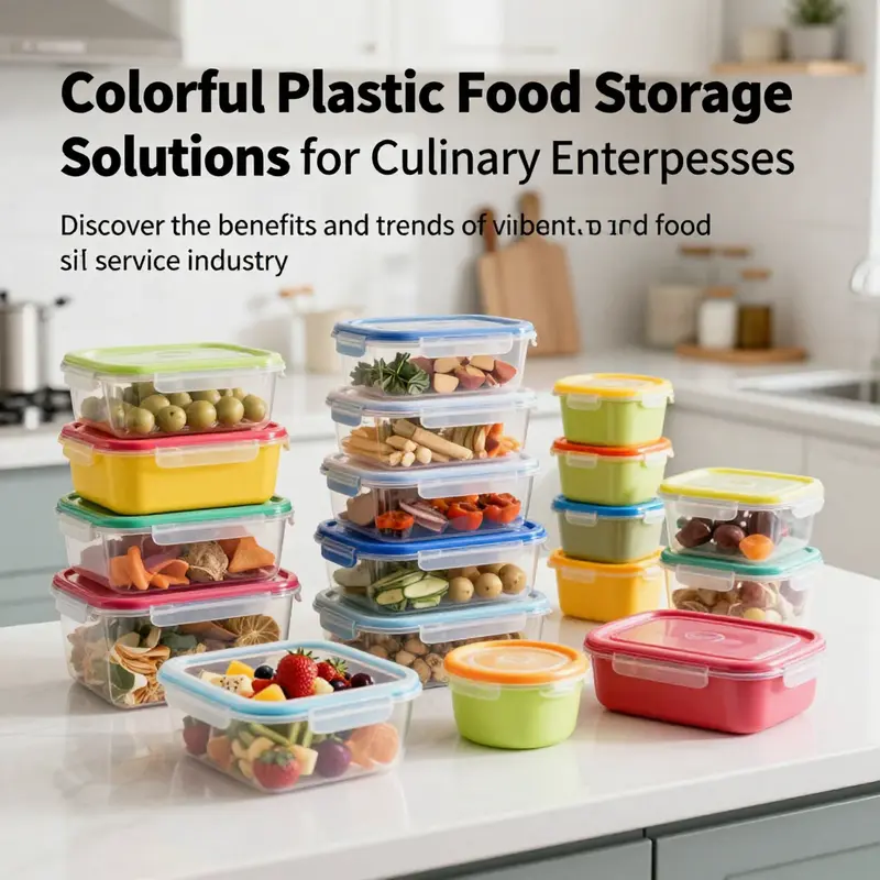
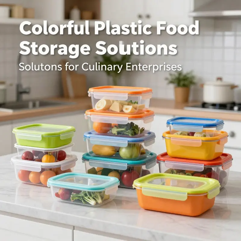
Colorful plastic food storage containers are becoming essential tools for culinary enterprises such as bubble tea shops, restaurants, food trucks, and catering services. Their vibrant hues not only brighten up kitchens but also enhance organization, efficiency, and branding potential. This article dives into the design and functionality of these containers, evaluates the sustainability trends shaping the industry, and provides a market overview to guide procurement teams looking to modernize their storage solutions. By the end, you’ll understand why these containers are more than just storage—they’re a vital part of the food service experience.
Vibrant Logic: How Color, Form, and Fit Make Colorful Plastic Storage Containers Work in Real Kitchens
The appeal of colorful plastic food storage containers rests on more than bright lids and cheerful silhouettes. It lies in a careful marriage of function and aesthetics, a design philosophy that treats color as a cue for everyday efficiency rather than mere decoration. In kitchens where time is a scarce resource and space is a precious commodity, these containers become more than receptacles for leftovers; they are a system for organization, a toolkit for meal planning, and a safeguard for freshness. Their design responds to a set of predictable, repeatable tasks: how to store, how to retrieve, how to stack, and how to maintain the integrity of a wide range of foods across several days. The result is a product family that looks inviting and feels reliable, a seemingly simple object that is, in practice, the product of deliberate engineering aimed at solving common kitchen frictions without demanding extra steps from the user.
Shape is the first concession to practicality. Containers arrive in square, rectangular, round, and oval forms, a geometric spectrum chosen to optimize space. Square and rectangular shapes are prized for their room-for-room efficiency in refrigerators, freezers, and cabinets. When lines straighten and corners align, shelves become orderly canvases where every item has a defined footprint. Round and oval variants, meanwhile, offer advantages for batch cooking and for meals that flow more naturally into bowls or serving dishes. The choice of shape is rarely random; it is a response to the way contents behave after cooking, the common sizes people actually use, and the way households stack items during weekday evenings when containers must be pulled from tight spaces without a struggle. The result is a collection that helps a user maximize cubic footage in a home kitchen while maintaining a clean, almost modular, appearance in the fridge or pantry.
Lids sit at the heart of why many people reach for these containers in the first place. Airtight seals and locking mechanisms are more than marketing promises; they are the practical guardians of flavor, texture, and safety. Snap-on designs offer quick access, while locking lids provide a higher level of leak resistance for transport and for storage of liquids or moistened foods that otherwise threaten to seep into the seams of a bag or the edges of a shelf. The lid is not merely a cover but a control point: it determines how well a system keeps out air and moisture, how resistant it is to spillage when bumped in a crowded kitchen, and how easily someone with wet hands can secure or release it. A thoughtfully engineered lid incorporates a positive seal and a dependable hinge, and it may even feature a recess or a top depression that enhances stability when containers are stacked. These design elements, while subtle, contribute to a user experience that feels almost effortless yet is anchored in robust engineering.
Transparency, too, plays a quiet but essential role. The body walls are often transparent or near-clear, enabling quick content recognition at a glance. In practice, this visibility reduces unnecessary openings and cross-checking, which in turn minimizes food waste and shortens the time spent deciding what to eat or what to reheat. When a parent can see the contents of several containers lined up on a shelf without removing lids, the process of meal planning becomes smoother and less error-prone. The transparent wall complements the color-coded lids and accent colors; together they form a visual taxonomy that helps households separate meals, ingredients, or family members’ lunches with intuitive ease. The effect is more than convenience; it is a small but powerful contributor to reducing waste, a rational system in which visible contents align with clear expectations about portion sizes and freshness.
Material choices underpin both safety and longevity. Most contemporary colorful storage sets lean on food-grade polypropylene (PP), a polymer celebrated for its durability, chemical resistance, and compatibility with a broad range of culinary tasks. PP is known to tolerate microwaving, cold storage, and dishwashing cycles common in home kitchens, making it a versatile workhorse for daily meal prep and leftovers. This versatility allows households to thaw, reheat, or transport foods without switching to a different container, thereby reducing the cognitive load involved in choosing the right vessel for a given scenario. It is not just about heat tolerance; PP’s resilience translates into stackability and transport convenience. A set that maintains its shape after repeated insertions into a freezer or a dishwasher is a set that earns more use and, ultimately, more confidence from the user.
Some lids incorporate UV stabilization, a seemingly small feature with meaningful implications. In spaces where sunlight spills through a kitchen window or a sunlit pantry shelf, UV stabilization resists degradation and helps maintain both the integrity of the plastic and the appearance of the design. It is a reminder that the aesthetic life of a container—the bright colors, the crisp edges, the clear walls—depends on more than the pigment choice. It depends on additives and composites that guard against yellowing, cracking, and material fatigue. The interplay between pigment, stabilizers, and base polymer is something most users do not notice directly, yet it shapes how well a set ages in a busy kitchen, how it holds up to the daily rigors of washing, stacking, and frequent handling, and how long it remains a favorite tool rather than becoming a brittle memory of last year’s color trend.
Precision tolerances are another technical detail that influences the user experience in a tangible way. Manufacturers aim for tight dimensional tolerances—often within a margin of about ±1.0 millimeter—to ensure that lids consistently fit across multiple units in a set. When every lid seals the same way and every container nests with the next, a family can be confident that a full set stores efficiently, stacks predictably, and replaces broken pieces without mismatched gaps or wobbly corners. This level of consistency reduces the mental friction that can accompany consumer goods, particularly in households that juggle many meals, snack packs, and batch-prep sessions. The result is a cohesive system where form and function reinforce each other—a design language that says, without words, that the product is built for real-life rhythms rather than for display alone.
Functionality extends beyond mere storage. Multifunctional designs invite use beyond the kitchen drawer. Many containers support meal prep by offering portion-controlled compartments or by fitting into typical refrigerator or freezer racks in a way that supports organized planning. Some designs also serve as compact serving dishes for gatherings, where bright colors and clear bodies help guests identify different dishes at a glance. In such contexts, the product becomes part of the table setting, bridging practical storage with shared eating experiences. This blend of purposes—the everyday and the occasional special use—helps explain why many households accumulate a growing collection of colors, shapes, and sizes: variety supports flexibility, and flexibility sustains consistency in daily routines.
The aesthetic side of these containers is not superficial. Color and pattern act as a cognitive tool, guiding behavior and reinforcing a sense of control in the kitchen. Color coding can differentiate meal types, family members’ lunches, or storage zones within the refrigerator. A bright lid might signal a protein-rich portion, while a pastel body could indicate a fruit-and-vegetable batch. The patterns—whether simple color blocks or playful motifs—add personality and can lighten the mood during a hectic evening. This is a subtle but meaningful part of product design: aesthetics that are not merely decorative but instructive, turning color and form into practical cues that enhance organization and reduce decision fatigue.
In industrial contexts, these containers support broader operational goals for catering operations and branded food services. The round or oval shapes, for instance, lend themselves to branding opportunities through logo placement on lids or body walls, aligning product design with brand identity while maintaining the practical requirements of food safety and leak resistance. The ability to customize lids, prints, or even the internal layout of a multi-piece set makes these containers a versatile canvas for brand experiences without sacrificing the core benefits of containment, shelf stability, and transport security. In large-scale settings, where efficiency and consistency matter, such design considerations translate into measurable benefits: reduced waste, faster service cycles, and a coherent visual system for staff and customers alike.
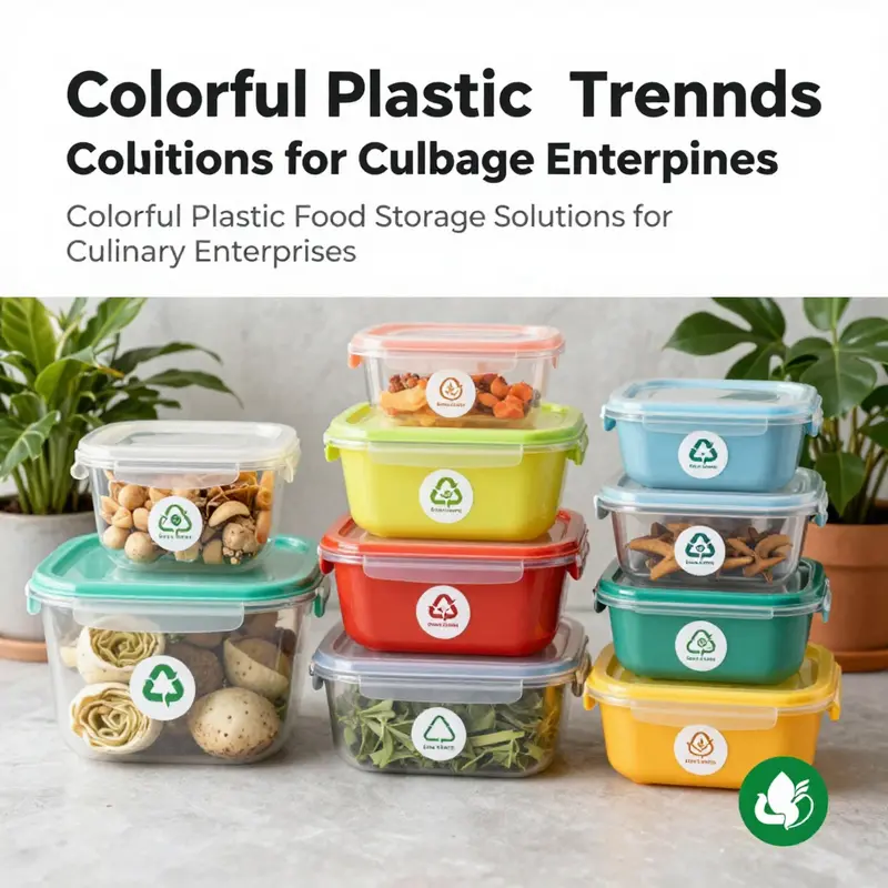
The conversation around containers would be incomplete without acknowledging the environmental dimension. Many brands emphasize sustainability by using eco-friendly PP plastics and designing products with recyclability in mind. The tension between durability and end-of-life considerations is not new, but it has become a more explicit design conversation. For some households, a trade-off is acceptable if the color variety and reliable performance help reduce the number of containers needed or discarded over time. For others, the promise of recyclability and the ability to segregate plastics for recycling streams is a decisive factor. The material science community continues to advance, seeking formulations that resist staining and chemical degradation while remaining recyclable through standard municipal streams. In practice, this means a product line can remain visually vibrant yet responsibly targeted toward a circular economy, an outcome that aligns with broader consumer values about waste reduction and resource stewardship.
Yet even with progress toward sustainability, there are limits to color and stain resistance. Highly pigmented foods—such as tomatoes, turmeric, or dark berries—can leave permanent or semi-permanent stains on lighter or translucent walls over time. The staining itself does not compromise safety, but it can alter the visual appeal and slightly affect the perceived cleanliness. The design teams respond to this reality with formulations that resist staining and with careful recommendations about which contents to store for extended periods. Users who want to minimize staining might opt for lighter-colored interiors or consider mix-and-match color schemes that reserve certain colors for long-term storage while others are reserved for short-term, low-stain items. These considerations illustrate how everyday choices intersect with material science, shaping practical outcomes that extend beyond aesthetics alone.
For many households, the total value proposition rests in the ecosystem created by color, shape, and lid. A well-chosen set offers a dependable solution for meal prep, leftovers, and pantry organization, while a thoughtfully designed lid and a transparent body streamline the daily ritual of cooking and eating. The user experience emerges from a chain of small, reliable decisions: a lid that seals with confidence, a container with a tight fit that stacks neatly, a body that remains clear enough to inspect contents quickly, and a color language that helps identify and categorize. In other words, the containers become a language in their own right, translating the daily needs of nourishment into a physical system that reduces cognitive load and increases planning accuracy.
To further illustrate how design translates to practice, consider a scenario in a busy household where meal-prep Sunday meets Monday morning routine. A family may group ingredients by color-coded options—greens for vegetables, yellows for grains, reds for proteins—then portion meals into uniform rectangular containers. The clear walls allow a parent to confirm that the greens maintain a fresh hue, the grains have not dried out, and the sauces remain at the proper consistency. A snap-lock lid secures the day’s lunches for the next workday, and the lids’ color cues help kids quickly locate their preferred meal. When the time comes to reheat, the PP material supports the transition from refrigerator to microwave without the need to transfer to a different dish, a step that would otherwise add friction to the routine. In a different setting—a small cafe or catering service—the same containers can be deployed with brand-aligned colors and logos on the lids or bodies, turning the storage system into a practical ambassador for the service’s identity while preserving the essential qualities of leak resistance, portion control, and easy handling.
As with any design, there is always a balancing act between several factors: visual appeal, functional reliability, manufacturability, and end-of-life considerations. The most successful products in this category do not simply provide a pretty option for the kitchen; they deliver a dependable, repeatable experience that users can rely on day after day. The color palette is not a cosmetic accessory but a functional signal that helps users navigate a crowded kitchen landscape. The shapes and lid configurations are tuned to human scale and practical usage patterns. And the materials chosen—particularly the use of food-grade PP and, in some designs, UV-stabilized components—reflect a conscious effort to combine safety with long-term durability. Taken together, these elements form a coherent system that supports healthier meals, less waste, and easier kitchen maintenance, which in turn reinforces consumer confidence in color-coded storage as a practical and attractive solution.
From a broader perspective, these containers illustrate how product designers translate everyday needs into physical form. They reveal that even commonplace items can embody sophisticated design decisions when those decisions are guided by a clear understanding of user behavior, kitchen choreography, and environmental context. The result is not simply a collection of colorful boxes, but a living toolkit for modern living—one that helps households keep pace with the rhythms of daily life while offering the flexibility to adapt to a wide range of culinary practices, storage challenges, and lifestyle preferences. The next time a user lines up several containers on a shelf and notices how the colors echo the day’s plans, it is worth recognizing the quiet intelligence that went into making that experience possible: a system designed to be both pleasing to the eye and loyal to the tasks at hand.
For readers seeking a broader technical frame, these observations align with industry guidelines that address material safety and regulatory standards for food-contact materials. The practical implications—safety in handling, compatibility with hot and cold foods, and the ability to withstand common household processes—are grounded in established guidelines that help ensure that everyday containers do not introduce risk into meals. As consumer expectations continue to evolve toward sustainable packaging and more sophisticated storage solutions, the design language of colorful plastic storage sets will likely become even more nuanced, balancing vibrant aesthetics with increasingly rigorous requirements for safety, recyclability, and durability. The result will be a future where kitchens are not only more organized but also more conscious of the environmental and health considerations that shape how we store, reuse, and ultimately dispose of containers.
Internal reference for further reading on sustainable packaging considerations can be found here: eco-friendly recyclable pulp cup holder.
External resource for safety and regulatory standards: https://www.fda.gov/food/food-contact-materials/food-contact-materials-questions-and-answers
Bright Colors, Greener Footprints: Sustainability Trends in Colorful Plastic Food Storage Containers
Colorful plastic food storage containers have become a common sight in kitchens around the world. Their vivid hues and practical shapes promise order, quick recognition, and dependable performance. Yet beneath the surface of cheerful colors lies a set of sustainability questions that increasingly influence how these containers are designed, produced, used, and retired. The chapter you are about to read traces the evolving landscape where consumer demand for vibrant, convenient storage intersects with a growing commitment to reduce waste, conserve resources, and lower emissions. In this space, color remains a powerful asset, but it is now balanced by a more deliberate emphasis on recyclability, safety, and long-term environmental stewardship. The shift is not merely about choosing a different plastic; it is about reimagining the entire lifecycle of a product that travels through households, offices, and schools and eventually joins the broader materials economy.
At the heart of contemporary sustainability trends is the circular economy. This approach reframes the container from a disposable convenience into a material resource loop. In practice, this means designing containers for durability and longevity, enabling easy disassembly, and ensuring that end-of-life pathways—recycling, repurposing, or safe disposal—are clear and accessible. Consumers respond to these priorities when they see sets that are not only colorful but also labeled with resin codes, recycling symbols, and care instructions that help them keep products out of landfills and in productive use longer. The result is a product experience that feels less like a single-use habit and more like a conscious choice integrated into everyday routines. The link between everyday storage and global waste reduction is direct: when efficient storage reduces spoilage, households use fewer resources to replace what spoiled or was discarded. Food waste alone accounts for a substantial share of global greenhouse gas emissions, a stubborn problem that motivates improvements in storage design, seal integrity, and airtightness.
Material choice remains a central lever in sustainability conversations about plastic storage. Polypropylene (PP), high-density polyethylene (HDPE), and, to a lesser extent, polyethylene terephthalate (PET) each bring a different mix of properties that influence environmental performance. PP is prized for its balance of toughness, heat resistance, and chemical stability. It withstands microwaving, resists chemical attack from foods, and is widely accepted as recyclable in many jurisdictions, often identified by resin code #5. This combination makes PP a cornerstone of durable, safe food storage. HDPE adds flexibility and moisture resistance, contributing to lids and bodies that can endure frequent washing and temperature variation. PET is strong, transparent, and highly recyclable, which makes it a frequent choice for rigid walls and clear viewing windows. The emphasis on recyclability is not merely about end-of-life; it also shapes the design process. Manufacturers increasingly aim to minimize additives that complicate recycling streams, select compatible colorants and resins, and engineer closures that can be separated from containers during recycling, modestly improving the efficiency of material recovery.
Color matters, but not merely for aesthetics. Distinctive hues aid organization—easy color-coding helps families separate meals by person, day, or dietary plan, improving waste prevention by reducing improper storage or misplacing leftovers. However, certain pigments can complicate recycling if they degrade or contaminate the stream. As a result, some designers favor color systems that rely on reusable, neutral bases with color accents that can be treated as simple, removable design elements. In practice, that means more attention to pigment choice, pigment loading, and compatibility with the base resin. The interplay between color and performance becomes a design brief: how to retain vibrancy without undermining recyclability or durability. The choice of color, then, is a statement about values as well as aesthetics—an expression of consumer identity that does not come at the expense of long-term material stewardship.
Innovation in materials and processes is expanding the possibilities for sustainable, colorful containers. Bio-based and biodegradable plastics are moving from experimental labs to more tangible market options, offering plant-derived feedstocks and, in some cases, reduced dependence on fossil fuels. While these alternatives hold promise for reducing lifecycle carbon footprints, they also introduce nuances. Bioplastics may require different industrial composting conditions or recycling streams, and their behavior under typical kitchen use—microwave exposure, dishwashing cycles, and long freezer storage—needs careful evaluation. Beyond bio-based options, material reduction techniques are being explored to produce thinner walls or optimized wall geometry that maintain strength while using less resin. These design optimizations can significantly lower material intensity without compromising safety or performance.
Improved recycling technologies are another critical thread in the sustainability fabric. Advances in mechanical and chemical recycling expand the range of plastics that can re-enter the circulation stream after a consumer-facing use. Better sorting technologies, more efficient cleaning processes, and higher-purity recycling streams can translate into more containers being recycled rather than discarded. For households, this progress translates into clearer guidance about how to prepare containers for recycling, such as removing residual liquids and understanding local program capabilities. For designers and manufacturers, it means more confidence in selecting materials that will be effectively recovered and reprocessed, encouraging a virtuous loop where product design and recycling technology reinforce each other rather than operate in parallel but disconnected tracks.
Despite notable momentum, the path to sustainability is not without constraints. Cost remains a primary barrier for many micro and small businesses that produce or sell colorful plastic storage solutions. Sustainable materials and processes may carry price premiums, and the capital needed for new equipment or updated supply chains can be prohibitive. Market dynamics also play a role: the push for recyclability must align with the capacity of local recycling infrastructure. If a material is technically recyclable but not economically viable in a given region, it risks ending up in disposal streams regardless of its theoretical merits. In addition, material limitations can surface in certain real-world conditions. PP, while robust at room and elevated temperatures, can become brittle in very cold environments. UV exposure can lead to discoloration or gradual degradation of polymers unless stabilizers are incorporated. Balancing colorfastness, transparency where desired, and ultraviolet resistance requires careful material engineering and sometimes trade-offs in design or price.
The consumer’s role in steering sustainability outcomes should not be underestimated. Sorting and proper cleaning before recycling play a decisive part in how effectively a container can re-enter the materials cycle. When households rinse containers and remove residues, the efficiency of recycling streams increases, and the likelihood that PP or HDPE can be reprocessed without contamination improves. The color codes and lid designs that help with organization can also guide users toward environmentally sound practices. At the same time, the desire for vibrant, modern kitchens encourages frequent replacement of older sets for updated aesthetics or improved features. This tension between fashion and function is a reminder that sustainable storage is less about a single material choice and more about a coherent system that integrates production methods, consumer behavior, and end-of-life pathways.
Policy and regulation are increasingly shaping the pace and direction of these developments. Governments and international bodies are adopting measures aimed at curbing plastic waste and reducing carbon emissions across packaging value chains. The results are a blend of restrictions, incentives, and standards that encourage safer materials, design for recyclability, and better labeling. In this regulatory context, the emphasis on food-grade safety remains non-negotiable. Materials must be non-toxic, stable under typical kitchen conditions, and suitable for contact with food. The resin code system, with codes such as #5 for PP, provides a practical language for identifying recyclable streams and guiding consumer disposal. Regulations also increasingly require manufacturers to disclose the environmental attributes of their products, including recyclability rates, the presence of BPA-free formulations, and, in some regions, end-of-life management plans. Such transparency helps consumers compare options not just by color or lid size but by the broader environmental profile of the container.
One of the more compelling narratives in this space is how colorful containers can contribute to broader sustainability goals, especially regarding food waste. When leftovers are stored effectively and visibly, households are more likely to maintain portion control and reuse ingredients rather than discard them. Transparent walls and clear labeling allow quick visual inspection, reducing the chance that food languishes in the back of the fridge. The net effect is a modest but meaningful reduction in waste, which translates into lower emissions associated with food production, processing, and disposal. The practical takeaway is not that color itself changes waste trajectories, but that color-coded, thoughtfully designed containers can be a cue for disciplined storage habits that preserve nutrition and minimize waste.
Alongside these developments, the ecosystem of durable, colorful containers invites a reimagining of what “sustainable design” looks like in everyday life. It is no longer enough to claim a product is recyclable; the industry must demonstrate the feasibility of recycling that product in real-world streams. It must show that the materials chosen can endure daily use, can be washed without compromising safety, and can be returned to productive life at scale. This requires collaboration across multiple actors: material suppliers, manufacturers, retailers, waste managers, policymakers, and, importantly, households. When these actors align around common standards and incentives, the vibrant palette that makes storage appealing can coexist with a robust, responsible materials cycle. Color then becomes a signal of an integrated system rather than a standalone aesthetic. The real measure of success is the degree to which colorful containers weave into a circular economy—retained, repurposed, and recovered rather than discarded.
For readers who want to explore related ideas beyond plastics, consider how other packaging formats address sustainability without sacrificing function. The broader packaging ecosystem increasingly embraces recyclable materials, compostable options in appropriate settings, and designs that minimize material use while preserving performance. The conversation is not about painting everything with the same brush but about selecting the right material for the right purpose, while designing for end-of-life realities. In kitchens that relish color and organization, the challenge is to keep the spirit of playfulness alive while embracing a responsibility to the environment that mirrors the care people put into choosing what to eat and how to store it.
In closing, the trajectory of colorful plastic food storage containers is a case study in how consumer preference, material science, and policy can converge to create products that are as mindful as they are cheerful. The colors captivate; the science informs; the policies push toward cleaner production and cleaner end results. The practical takeaway for designers, manufacturers, and shoppers alike is simple: value can be expressed through color, but responsibility is expressed through materials, design, and a well-functioning system for reuse and recovery. As the chapter progresses, the narrative will move from high-level trends to practical implications—guidance on selecting containers that balance safety, performance, and environmental impact, and considerations for contributing to a more sustainable storage culture in homes and workplaces.
To broaden the conversation beyond plastics while maintaining relevance to the everyday kitchen, explore how other packaging formats are integrating sustainability in social and economic contexts. This broader perspective reinforces that the colors on a container are not merely decorative; they are part of a larger conversation about responsible consumerism, resource stewardship, and a future in which vibrant design and environmental care go hand in hand. For readers curious about how related packaging options approach end-of-life and recycling, a related resource highlights the viability of recyclable, plant-derived or otherwise eco-conscious packaging solutions that co-exist with plastics in a broader materials economy. eco-friendly recyclable pulp cups.
External resources also offer deeper technical context for those who want to connect consumer packaging choices with the science of materials performance. A foundational overview from a respected industry body discusses plastic can materials standards, performance insights, and the evolving regulatory landscape that shapes how containers are specified, produced, and recycled. This external reference helps frame the practical implications of the trends described here and points to the standards that inform real-world decisions about color, safety, and recyclability. External resource: https://www.foodpackaging.org/plastic-can-overview-material-standards-technical-specifications-performance-insights/.
Colorful Corrals for the Kitchen: Trends, Technologies, and Choices in the Market for Plastic Food Storage Containers
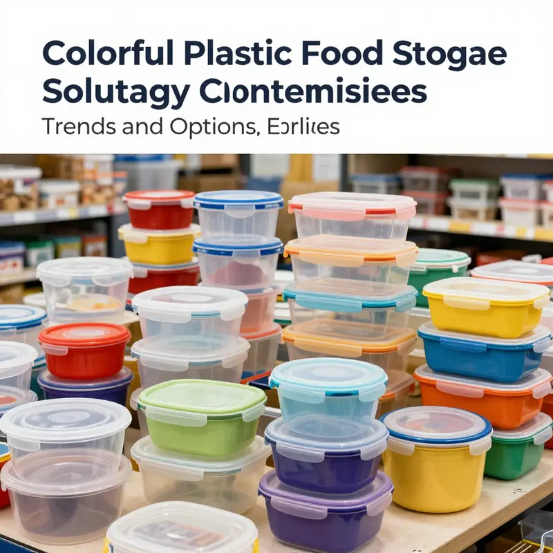
A market that once owed much of its appeal to practicality alone has evolved into a vibrant convergence of color, form, and function. Colorful plastic food storage containers are no longer simply receptacles for leftovers; they are design-forward tools that help households manage time, reduce waste, and express personal style within the rhythm of everyday cooking. This shift has been driven by a blend of consumer tastes, material science, and a rapidly changing pace of life that prizes convenience without sacrificing safety or aesthetics. The resulting market is marked by a convergence of durable polymers, smart features, and color palettes that aim to simplify decision making in crowded kitchens while signaling a sense of identity to the user. In this sense, the container category mirrors broader consumer trends toward home-centered living, where daily rituals—from meal prep to lunch packing to pantry organization—are cultivated as acts of care, efficiency, and even creativity. The growth narrative rests on a few steady pillars: the need for reliable performance, the desire for visual organization, and an ongoing stream of innovations that keep containers adaptable to modern routines and surfaces that are increasingly connected and conscious about sustainability.
At the heart of the marketplace is the practical assurance that plastic storage containers can safely come into contact with food, a claim historically anchored in the use of food-grade polymers such as polypropylene and high-density polyethylene. These materials offer a combination of resilience, lightness, and chemical resistance that suits busy kitchens. From a safety standpoint, the transition away from bisphenol A (BPA) toward BPA-free formulations has become a baseline expectation rather than a premium feature. This shift has helped rebuild consumer trust in plastic solutions, particularly as families juggle temperatures ranging from freezer chill to microwave heat. The ability to withstand such temperature fluctuations—whether heating a portion for a quick meal, or freezing leftovers to preserve freshness—has become a defining differentiator for mainstream sets that aim to cover multiple use cases within a single purchase. In practice, this translates to containers that can be nested or stacked, protected by snug lids, and rated for dishwasher cycles without warping or losing seal integrity. The combination of safety, durability, and versatility is what makes colorful plastic containers broadly appealing, but it is the color that often turns appeal into daily habit.
Color, in this market, functions as both a cue and a catalyst. A vivid palette helps households establish meal schemas—breakfast, lunch, dinner—or dietary patterns such as vegetarian, vegan, or gluten-free—without needing to open each lid. Color coding streamlines kitchen workflows: a red-lidded container might hold sauces or proteins, blue could denote vegetables, and green might house grains or snacks. This intuitive organization is not merely about aesthetics; it serves a practical purpose. Visual quick-checks save minutes each day, a small but meaningful gain in the context of busy families, students, and professionals who rely on prepped ingredients and portion-controlled meals. The aesthetic dimension also serves as a form of self-expression, supporting a broader consumer trend that favors stylish, personalized spaces within the home. In many households, the choice of color and lid design becomes a reflection of taste, mood, or even seasonal decorating impulses. The net effect is that these containers have earned a place at the intersection of function and identity, a space where usability and style reinforce each other.
From a design perspective, the practical features that accompany color are equally essential. Raised rims around the lid’s edge—designed to improve grip when hands are wet or greasy—are a small yet meaningful detail that speaks to the attention paid to real-world use. Transparent bodies that reveal contents at a glance complement the color-coded lids, reducing the need for constant label checking and helping to prevent food from lingering in the back of the fridge. When a user can identify contents in seconds rather than minutes, the everyday cooking and meal-prep cycle becomes more efficient, a factor that resonates with both individuals and households that rely on quick-turnaround meal options. In addition, modern sets increasingly embrace stackability. The ability to nest containers of different sizes reduces cabinet and fridge clutter, making it easier to store a broad range of portions without sacrificing accessibility. For travelers and commuters, some lids lock securely, preventing leaks during transport and accommodating a broader range of on-the-go lifestyles. Taken together, these design choices reinforce a consumer expectation: that a plastic container not only holds food but also contributes to an organized, calm, and predictable kitchen environment.
The market is also being shaped by the emergence of more sophisticated material and construction choices. While BPA-free polypropylene and HDPE remain the workhorses for most colorful sets, new formulations and processing techniques are enabling longer lifespans, better heat and chemical resistance, and improved clarity in transparent walls. The durability of these materials matters beyond the kitchen; it influences perception of value as consumers weigh price against lifetime usage. A set that resists cracking after years of daily use or repeated cycles in the dishwasher earns not just practical payoff, but trust—an intangible yet important driver of repeat purchases. In addition, some premium lines are beginning to weave in features that reflect broader tech-oriented consumer expectations. Time indicators on lids, QR codes linking to simple recipes or storage tips, and even basic digital integration concepts signal a future where storage becomes part of a connected ecosystem. While these more advanced features may not be universal, their presence signals a trajectory toward smarter, more informative packaging that helps households optimize what they store and how they use it.
Sustainability sits alongside performance as a central concern for this market. The drive toward eco-conscious options has pushed manufacturers to highlight recyclable polymers, recyclable-lid combinations, and designs that emphasize durability and reusability. The emphasis extends to packaging choices for the products themselves, with brands increasingly prioritizing materials that reduce carbon footprints and waste. Consumers are responding by gravitating toward options that promise longer service life and by showing growing willingness to select configurations that minimize environmental impact. In some segments, this translates into the use of plant-based or bio-based plastics where feasible, or into labeling that clearly communicates recyclability and end-of-life pathways. Yet even as these green trends gain momentum, the market must acknowledge that plastic storage carries a competitive dynamic with glass and other materials. The challenge lies in balancing the advantages of plastics—lightweight, durability, and clear compatibility with temperature cycling—against the climate conversation and consumer preferences for sustainable, long-lasting products. The result is a spectrum of choices that ranges from sturdy, recyclable polymers designed for reuse to conceptually bold, compostable options exploring the boundaries of current material science.
A broader view reveals several ongoing market dynamics that shape both supply and demand. Urbanization, more people living alone or in small households, and the proliferation of meal-prep culture have expanded the appetite for versatile containers that can keep pace with busy schedules. The rise of e-commerce has accelerated access to a wider range of colors, shapes, and lid mechanisms, encouraging experimentation and personalization. Consumers are no longer content with generic, one-size-fits-all solutions; they seek sets that cover a spectrum of portion sizes and lid types, enabling a single purchase to meet multiple daily needs. The packaging ecosystem that surrounds these containers—labels, markers, and even quick-clean tools—plays a supporting yet meaningful role in the overall experience. The market has learned that well-differentiated visuals paired with dependable performance create loyal customers who come back for the small, repeated improvements that cumulative usage delivers.
Innovation in materials and functionality often travels hand in hand with applications beyond the home kitchen. In commercial contexts, for example, colorful, durable, and leak-resistant containers support food-prep operations, catering, and even small-scale food service. The ability to maintain freshness during transport and to withstand the rigors of daily use is crucial in these settings, where the wrong seal or a brittle lid can disrupt operations. The design language here remains consistent with consumer expectations: clear walls for quick content checks, secure lids to prevent leaks, and a color system that supports efficient sorting and inventory management. The broader implication is that the consumer-grade solutions are increasingly informed by professional requirements, and vice versa. This cross-pollination helps the market push toward higher standards of durability, safety, and user-friendliness across a wide array of contexts.
Economic factors also influence the evolution of colorful plastic storage containers. Market analysts point to a steady growth trajectory with a favorable outlook through the mid-2020s. The CAGR is driven by urban lifestyles, the expansion of online grocery and meal-delivery ecosystems, and the ongoing demand for convenient home storage that does not sacrifice style. Consumers are willing to invest in sets that offer a compelling combination of color coordination, modularity, and reliable performance, especially when these attributes cohere across multiple sizes and lid configurations. The result is a market where color is not merely decorative but a strategic attribute that supports organization, reduces waste, and strengthens the perceived value of a well-arranged kitchen. While price points can vary, the value proposition for the majority of households rests on a balance of durability, ease of use, and the ability to keep food safe and organized in everyday life.
As the market continues to mature, a key question remains: how will evolving consumer expectations, regulatory landscapes, and technological advances shape the color-driven storage category in the next decade? The consensus among researchers and industry observers is that the core appeal of these containers will endure—the fusion of bright, expressive design with dependable performance. Yet the means by which that appeal is delivered will continue to diversify. Users can anticipate more nuanced color systems, more ergonomic lid designs, and a broader mix of materials that emphasize sustainability and recyclability without compromising the practical advantages that make plastic storage so appealing today. The ongoing exploration of micro-innovations—such as improved gasket materials that resist staining, clearer polycarbonate-like transparency in a recyclable matrix, or modular inserts that let users partition foods within a single container—points to a future where storage becomes a flexible tool tailored to the rhythms of daily life. In this evolving landscape, the container is not just a vessel; it is a small, well-designed system that supports mindful cooking, deliberate meal planning, and a deeper connection to the way households approach nourishment.
In considering the broader ecosystem, it is useful to acknowledge adjacent packaging formats that compete for the same space in the kitchen and in consumer choice. Paper-based and compostable options offer a counterpoint to plastic storage, emphasizing biodegradability and end-of-life stewardship. These alternatives remind us that aesthetics and practicality can coexist with environmental responsibility. For readers who weigh the trade-offs between plastic and paper, there is value in exploring both sides, recognizing that some contexts favor the durability and reuse potential of plastic, while others align more closely with compostable or biodegradable solutions. Within this spectrum, the color-coded plastic containers occupy a distinct niche: they deliver visible organization, reliable performance, and a sense of personal expression that resonates with today’s fast-paced, image-conscious, and efficiency-focused households. The continued success of these products will likely hinge on how effectively suppliers balance safety, durability, and convenience with evolving environmental expectations and the demand for smarter, more connected packaging experiences.
The experiential dimension of color and container design should not be underestimated. When a family opens the fridge to see a rainbow of neatly stacked, clearly labeled portions, the simple act of meal planning becomes less daunting and more inviting. The psychological impact of organization—how it reduces decision fatigue and creates a sense of control—has tangible benefits for daily routines. In many households, meal prep becomes less of a chore and more of a creative practice, where the choice of color and size communicates intent and supports healthier, more deliberate eating patterns. The aesthetic appeal thus reinforces behavioral outcomes: better portion control, reduced food waste, and greater consistency in meal timing. In this light, the color scheme becomes a small but meaningful instrument in the broader effort to cultivate mindful, healthful living within the domestic sphere.
From a strategic perspective, the market’s future may hinge on evaluating the right mix of features for different consumer segments. Younger consumers may prioritize bold, playful colors and easy-clean designs, while families with children may value durability, leak resistance, and lids that seal with confidence. Professionals who rely on meal-prep habits for the week ahead may seek containers that offer precise portioning, clear visibility, and compatibility with both microwave heating and dishwasher cycles. Across these segments, a common thread is the desire for clarity—clarity of contents, of durability, and of the end-of-life story a product tells. When manufacturers weave this clarity into both the material choices and the visual language of their product lines, they stand a better chance of nurturing long-term loyalty in a market that rewards consistency as strongly as it does novelty.
In the end, the colorful plastic storage category offers a compact but revealing lens on how households manage nourishment, space, and time. It is a field where color and contour, safety and sturdiness, and the promise of an organized day all converge. The growth trajectory reflects not only the expansion of options but the enhancement of everyday life through small, thoughtful design decisions. As more households embrace the idea that a container can be both practical and expressive, the market will continue to expand in ways that honor health, convenience, and sustainability while inviting personal style to play a part in how we store, retrieve, and enjoy our food. For readers seeking more context on sustainable packaging options and broader material choices in the packaging ecosystem, one relevant resource summarises the landscape of plastics in storage and its implications for market dynamics and consumer expectations: biodegradable eco-friendly kraft paper bowls.
As the narrative of color and practicality unfolds, it is clear that the market for colorful plastic food storage containers will continue to be shaped by a careful balance of color-driven usability, material innovation, and environmental responsibility. The next chapters will expand on how specific features—such as seal integrity, heat tolerance, and space-saving configurations—translate into real-world benefits for households and professionals alike. They will also explore how regional preferences, regulatory frameworks, and cultural attitudes toward storage influence the shaping of color palettes, lid designs, and the governance of waste in a world increasingly attentive to sustainability and lifecycle impact. The journey through this market is thus not merely about choosing a pretty container; it is about selecting a practical ally that supports a more organized, efficient, and thoughtful approach to food in daily life.
External resource: https://www.grandviewresearch.com/industry-analysis/plastic-food-storage-container-market
Final thoughts
In summary, colorful plastic food storage containers serve a crucial role in enhancing the operational efficiency and visual appeal of culinary businesses. Their design innovations cater to the specific needs of food service operations, while sustainability trends encourage eco-friendly choices. As you consider supply options, remember that investing in these containers not only improves organizational efficiency but also aligns your business with contemporary consumer values and environmental standards. Embrace the vibrant potential of these storage solutions to elevate your service.