In today’s competitive beverage industry, the choice of cup can significantly influence customer experience and brand perception. This article delves into the perplexing term ‘clear opaque plastic cups’—a concept that seemingly contradicts itself. Through a comprehensive examination of this topic, we will explore the materials used in cup production, the applications of both clear and opaque designs, the environmental impact of plastic usage, and exciting innovations shaping the future of beverage containers. Each chapter aims to demystify the terminology while offering insights critical for bubble tea shops, restaurants, food trucks, event planners, and procurement teams. Let’s embark on this journey of clarity in understanding the complexities and possibilities of plastic cups.
Seeing Through Language: Debunking Myths of Clear-Opaque Plastic Cups
A paradox sits at the heart of consumer packaging language: a cup marketed as clear that is also interpreted as opaque. The phrase clear opaque plastic cup feels like a contradiction in terms, inviting curiosity and skepticism. In practice, however, the truth is that no material can be truly both transparent and opaque at once. The confusion arises from marketing speech, consumer expectations, and the nuanced way optics are discussed in industry documents. This chapter traces that tension from language to use, showing how a single descriptor can shape perceptions of visibility, privacy, and usability.
Understanding the terminology is a productive starting point. Transparent materials transmit most light with minimal scattering, producing an undistorted view of what lies beyond. Translucent materials pass light but diffuse it, making edges and details blur. Opaque materials block light, preventing a view of interior contents. In consumer cups, a description of clear normally signals transparency, yet designers may pair that language with finishes or inner layers that alter what can actually be seen. The result is a perceptual effect that looks bright and pristine in some conditions and reduces visibility in others. The apparent contradiction is therefore less about the physics of the polymer and more about lighting, background, and the viewer’s expectations.
The difference between appearance and function matters. A cup can look crystal clear because its surface is highly polished and its haze is minimized, but the interior or the liquid may still be partially obscured under certain lighting. Conversely, a cup that seems opaque at a glance may permit substantial transmission when illuminated from the right angle. The practical takeaway is that optical perception is a product of material properties, processing, and the viewing environment. Designers and marketers should consider how a cup will be used, where it will be displayed, and how lighting changes during shelf, home, and cafe conditions.
From a materials science perspective, clear often means low haze and high clarity rather than universal transmittance. A cup may be formulated and annealed to reduce scattering, yet still contain pigments, fillers, or surface treatments that selectively reflect or diffuse light. The same piece of plastic can appear highly transparent under showroom lighting and more opaque in dim or shadowed settings. This nuance is why objective data is valuable: transmittance and haze measured under defined conditions give a more reliable basis for decisions than marketing adjectives alone.
Implications for design and labeling are practical and immediate. When marketers claim high clarity, they should accompany that claim with standard test results and clear usage scenarios. Spec sheets that report transmittance, haze, and color neutrality help customers understand what to expect. If privacy or selective viewing is a goal, that intent should be disclosed along with any performance tradeoffs. For practitioners, aligning language with repeatable measurements reduces the risk of misinterpretation and builds trust with consumers. In retail environments, this alignment means showing how the cup behaves under representative lighting and against typical backgrounds, not only in pristine showroom conditions.
In closing, the phrase clear opaque for plastic cups is not a reliable descriptor of a single physical category. It highlights the importance of precise terminology, measurement, and transparent communication in packaging. By documenting optical properties and clarifying the conditions under which they hold, brands can better guide consumer perception from shelf to sip and avoid disappointing surprises when lighting or surroundings change.
Seeing Through and Blocking Light: The Material Realities of Clear versus Opaque Plastic Cups
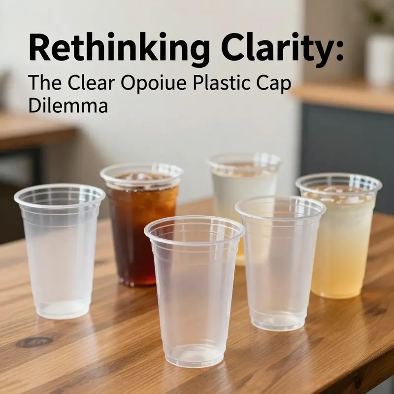
The humble plastic cup appears straightforward at first glance. One side is crystal clear, the other a chalky white or pastel that hides what lies inside. Yet within this everyday object lies a nuanced tale of materials science, processing, and design decisions that ripple through performance, hygiene, and sustainability. The contrast between clear and opaque cups is not simply a matter of aesthetics; it reflects a cascade of consequences that begin with the polymers chosen and end with how a consumer experiences a drink, a restaurant, or a laboratory setting. The term clear versus opaque sits at the endpoints of a continuum, where optical behavior is governed by how the polymer matrix is formed, what additives are present, and how light interacts with microscopic inclusions. In trying to describe a cup that is both clear and somehow opaque, one quickly realizes that the language points to a spectrum rather than a single, fixed category. The deeper you look, the more the lines blur between visibility and concealment, between pristine transparency and deliberate shading, and between recyclability and color control. This chapter traces that spectrum, linking fundamental material properties to practical outcomes in everyday use while keeping in view the broader context of packaging and sustainability that frames every choice in a modern supply chain.
At the heart of any plastic cup are the base polymers—common workhorses such as polypropylene, polystyrene, and in some cases polyethylene terephthalate. Each polymer carries its own optical fingerprint. When a cup is clear, what you are seeing is a polymer matrix with minimal light scattering. The homogeneity of the resin, the absence of large inclusions, and the smoothness of the wall permit light to pass with little distortion. The practical consequence is straightforward: high visibility of the cup’s contents. For beverages that rely on color, texture, or even layer separation to signal freshness or quality, clear cups become an essential ally. In environments such as clinical or laboratory settings, clarity also supports quick, noninvasive inspection of liquids, sediments, or separation layers. In these cases, the practitioner benefits from the ability to gauge color changes, turbidity, or contamination at a glance, without removing lids or opening containers.
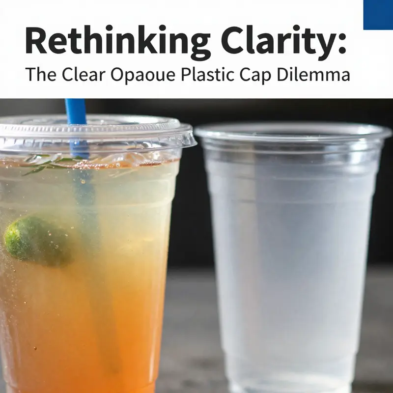
Opacity, by contrast, arises when pigments or opacifying additives are dispersed within the resin. The most common approach uses white pigments like titanium dioxide, which scatter light in all directions. The scattering disrupts the coherent transmission of light, producing a wall that blocks what lies inside. The result is a cup that appears uniformly opaque, with no content visible through its walls. This can be desirable for certain applications where visibility is not needed, or where privacy and aesthetics play a role. In some beverage service contexts, an opaque wall helps customers perceive a uniform block of color, which can convey a sense of uniform packaging, privacy, or even a premium feel. The opposite effect—visibility—remains a crucial advantage in many other settings, especially when product visibility is part of brand storytelling or quality assurance.
The arch of optical properties from clear to opaque is not just about what you see; it also influences how you perceive texture and even temperature. Clear cups tend to convey coolness and purity, because light passes through with minimal distortion and the surface appears pristine. Opaque cups, on the other hand, break the optical dialogue between the contents and the observer, creating a fixed impression of color and mass. This shift can alter consumer expectations about the beverage inside. The same liquid in a clear cup might look lighter or more translucent, while in an opaque cup it presents as a solid block of color, which could subtly alter perceived sweetness or strength. These perceptual effects matter in retail environments where first impressions can influence choice at the point of sale.
From a materials engineering perspective, the additives responsible for opacity—pigments, opacifiers, and sometimes colorants—do more than change appearance. They can influence mechanical behavior, thermal stability, and long-term durability. The introduction of rigid inorganic particles such as TiO2 to the polymer matrix creates light scattering but also interrupts the uniform continuity of the polymer network. That disruption can affect tensile strength and impact resistance. In some cases, the presence of pigment particles creates microstructural sites that can act as initiation points for microcracking under stress, especially when the cup is exposed to repeated mechanical loading or sudden temperature changes. Moreover, opacified cups may exhibit altered heat transfer characteristics. The pigments can act as partial barriers to heat flow, and the overall wall thickness, along with the distribution of inclusions, modulates how quickly the contents exchange heat with the surrounding environment. In short, while opacity serves practical or aesthetic needs, it is not a neutral addition; it reshapes how the material behaves under real-world conditions.
Thermal stability and UV exposure further differentiate clear from opaque variants. Pigments and the resins that carry them can act as photo-oxidative catalysts or stabilizers, depending on composition and processing. Light can drive chemical reactions in polymers that degrade mechanical properties or alter appearance over time. In opaque cups, pigments can help shield sensitive liquids from light-induced degradation but may also compromise long-term stability if the pigment system is not well matched to the polymer matrix. Conversely, clear cups maximize transmission of light, which means any photo-degradation tendencies of the base polymer are left unchecked by pigments. This can be mitigated through the use of heat stabilizers or UV absorbers, but those additives again influence the final properties of the wall and its behavior under thermal stress. The decision between clear and opaque thus becomes a balancing act: you weigh the benefit of light shielding for certain contents against the desire for pristine transparency and the associated material performance.
Hygiene and consumer perception also ride on the optical distinction. The transparency of a clear wall can reveal residues, condensation, or droplets on the interior surface. This immediate visibility can reassure customers about cleanliness, but it can also demand higher standards of manufacturing hygiene and stricter cleaning protocols. An opaque cup hides interior details, which might feel more hygienic in some contexts but can also obscure the presence of staining or buildup after use, raising concerns for some buyers. In practice, this tension nudges operators toward robust cleaning regimes and routine inspection of cups, regardless of the surface appearance. The choice between clear and opaque, then, is as much about process discipline as it is about material science.
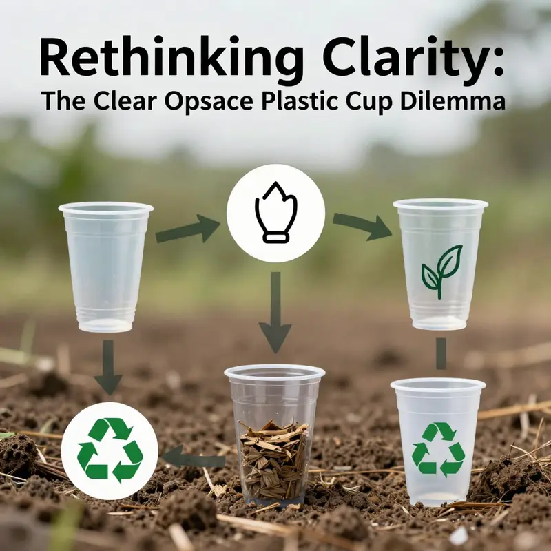
Recycling and end-of-life considerations provide another axis along which these two variants diverge. Clear plastics generally have higher market value in post-consumer streams because their purity enables more versatile refabrication routes. When colorants and pigments dominate, recycling streams encounter challenges, including color contamination and more complex sorting. Opaque cups, with their pigment-laden walls, can thus complicate recycling without proper infrastructure to handle pigment-rich streams. In the broader sustainability discourse, this highlights the importance of aligning material design with recycling pathways, so that a seemingly simple choice does not inadvertently complicate recovery. Manufacturers and recyclers alike are increasingly attentive to how additives interact with existing processing technologies, and to how cups can be designed for easier separation and reuse where applicable.
The production line itself reveals how these differences emerge. In injection molding or thermoforming processes, the masterbatch—a concentrated blend of pigment with base polymer—is blended with the resin to achieve the desired opacity. The distribution of pigment particles must be uniform to avoid streaks and ensure consistent appearance. That uniformity, in turn, interacts with the flow, cooling rates, and wall thickness that define dimensional stability. Clear cups benefit from fewer inclusions in the interior, which supports consistent wall thickness and fewer sites for microcracking under stress. Opaque cups rely on carefully controlled particle sizes and distributions to avoid excessive scattering that could compromise strength. The resulting wall that finally reaches the consumer is the product of the resin chemistry, the pigment system, and the precise timing of the manufacturing steps. Any mismatch between resin and pigment or between processing temperature and cooling strategy can yield clouds, specks, or uneven opacity, undermining both appearance and performance.
In practice, designers and operators must negotiate a series of tradeoffs. If product visibility is critical—for beverages where the color, sediment, or foam matters—clear cups are favored, with stability achieved through optimized resin grades and stabilizers. If privacy, branding, or content protection is a priority, opaque options may be chosen, with attention to maintaining adequate mechanical properties and a sustainable end of life. Occasionally, designers explore translucent or semi-opaque alternatives that sit between the two poles. Such options can offer a compromise, providing a veil that hides contents while still allowing some light transmission to convey color or texture in a controlled way. This middle ground invites a more nuanced design space, where wall clarity, pigment concentration, and wall thickness are tuned to achieve a desired balance.
For readers of this chapter who also work in packaging design, it is useful to see how these material decisions align with broader packaging strategies. A related part of the discourse involves the integration of sustainable materials and formats across product lines. When color and clarity choices are harmonized with recycling capabilities, the overall environmental footprint can be reduced without sacrificing user experience. To illustrate how adjacent packaging formats tackle related challenges, consider the family of single-wall and double-wall designs used in take-away systems. While paper-based formats occupy a different material family, the governing principle remains: visibility, barrier properties, and end-of-life pathways must be aligned with consumer expectations and waste management infrastructure. For readers seeking a broader view on sustainability in packaging, one related resource discusses how polymer matrices and additive systems shape performance in thermoplastics. It provides a rigorous scientific foundation for understanding why a seemingly minor additive can ripple into multiple performance outcomes. eco-friendly-printed-logo-single-wall-paper-cup-with-lid
As this chapter closes its loop, the practical lesson becomes clear. Clear cups and opaque cups embody different design choices anchored in material science, processing, and supply chain consequences. The optical behavior—transparency versus opacity—hovers over every other property: how the cup handles heat, how it endures mechanical stress, how it reveals or conceals contents, how it interacts with cleaning regimes, and how it participates in recycling streams. There is no universal answer that fits all contexts; instead, the optimal choice emerges from a careful appraisal of the liquid inside, the consumer environment, and the lifecycle goals of the packaging system. The simple cup thus serves as a microcosm of modern materials engineering, where a handful of additives and processing steps can tilt performance in a direction that affects safety, satisfaction, and sustainability for countless uses. Readers should leave with an appreciation that what appears to be a small design decision—clear versus opaque—carries with it a suite of material and systemic considerations that extend far beyond the wall color and the surface finish.
External resources provide deeper, more technical insight into the molecular foundations of these differences. For a detailed, peer-reviewed exploration of polymer matrix modifications and the effects of additives in thermoplastics, see the cited resource from a major chemical science publisher. This work delves into how pigment and opacifier systems interact with polymer matrices, offering a rigorous context for the observations described above about transparency, strength, and aging. It complements the practical discussion with the theory and data that support material choices in real-world cup production and packaging design.
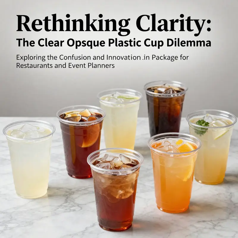
Clear Plastic Cups in Motion: Market Applications and Consumer Insights
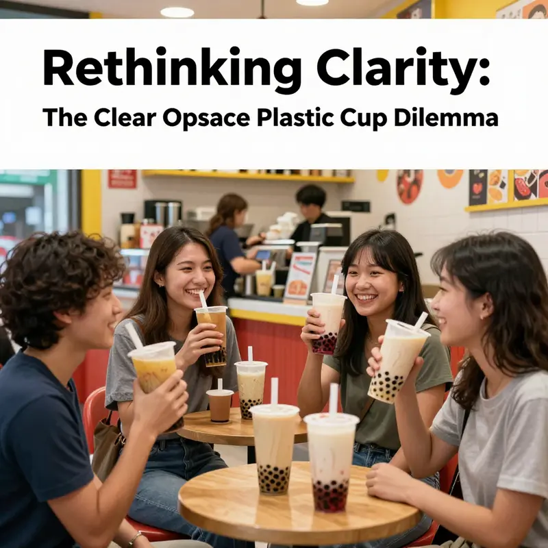
Clear plastic cups function as more than simple containers in today’s fast-paced beverage landscape. Their value comes from the way they reveal what is inside, shaping perceptions of freshness and quality as the drink passes from counter to table. The visibility of color, foam, and condensation informs taste expectations and can influence choices even before the first sip. For operators, that transparency translates into a reliable, streamlined serving experience across cafes, food trucks, and large events.
Most use occurs in foodservice takeout and dine-in service, for beverages ranging from hot coffee to cold fruit drinks. Beyond hospitality, clear cups are finding roles in medical settings, in cars as part of on-the-go kits, and at campus or stadium venues where speed matters. The shared property is simplicity: a lightweight, cost-conscious vessel that preserves the product’s appearance while enabling fast service.
As sustainability questions sharpen, the industry balances single-use convenience with end-of-life responsibility. Many operators explore reusable or recyclable options, pilot deposit-and-return schemes, and cleaning logistics that scale to crowds. Materials like polypropylene offer a durable path for reuse systems, while still providing the clarity customers expect. The trend is toward a hybrid model: keep the benefits of transparency and light weight, but shift toward circular design that reduces waste.
Safety and hygiene drive choices; cups must meet food-contact standards and avoid components that could migrate into beverages. Quality and durability matter for repeated cleaning, and vendors increasingly emphasize certification and traceability.
Experience design now treats the cup as part of a service ecosystem: visible sanitation, clear labeling, and easy return points. Policymakers can accelerate scale by supporting standardized cleaning protocols, funding pilots, and aligning incentives with recycling infrastructure.
The practical route forward ties circular cup concepts with transparent consumer messaging and robust logistics. Successful programs require consistent cleaning, stable supply chains for reusable cups, and trust that the cups are sanitized between uses. When well executed, reuse can lower per-use costs and shrink environmental impact while preserving the speed and convenience customers expect.
Clear by Design, Heavy on the Footprint: The Lifecycle of Transparent Plastic Cups
Transparent cups promise cleanliness but obscure the energy, material, and waste burdens embedded in their life cycle. The clarity of the surface is a marketing cue that can mask the realities of polymer production, processing, and post-use fate. This chapter traces the path from feedstocks to final disposal, highlighting how choices in materials, coatings, and manufacturing methods influence greenhouse gas emissions, resource depletion, and pollution.
Manufacturing plastics from fossil-based polymers demands energy, often drawn from power grids that rely on fossil fuels. The processing steps to transform monomers into finished cups require high temperatures, catalysts, and solvents, contributing to emissions and local environmental perturbations near factories. The design for recyclability and the end-of-life infrastructure shape whether a clear cup adds to a closed-loop system or becomes residual waste.
End-of-life outcomes depend on waste management systems. In many places, single-use cups are collected, sorted, and recycled at low rates, with contamination and multi-material coatings reducing recovery. Clear finishes may facilitate consumer trust but can complicate separation if coatings or printing layers are used. Biodegradable or compostable options still require appropriate composting infrastructure, and their benefits vanish without it.
Policy, design, and consumer behavior must align to minimize harm: standardizing materials, avoiding multi-layer barriers, and investing in collection and recycling. While clarity can support user experience, it should not override considerations of recyclability and lifecycle impact. The bottom line is that the environmental footprint of a cup emerges from the entire system, not the appearance of its surface.
Seeing Clearly and Holding on: The Evolution of Clear and Opaque Plastic Cups Toward Function, Aesthetics, and Sustainability
The cup is more than a mere receptacle; it is a junction where perception, temperature, and structure meet. In design discourse, the terms clear and opaque sit on opposite ends of a spectrum, yet contemporary innovations push both ends toward a shared goal: better user experience without compromising safety, efficiency, or a responsible footprint. When we examine the trajectory of plastic cup design, we discover a quiet revolution that regards the cup as a visual and tactile instrument as much as a container. It is about how a viewer interprets the liquid inside, how a hand engages the form, and how the material supports or distracts from the event or setting in which the cup is used. The research materials sketch a future in which clarity and concealment both serve functional ends, and where sustainability threads through every decision from resin selection to recycling streams. In this sense, the evolution is less about choosing a single direction and more about balancing clarity of contents with the warmth of touch, and balancing visibility with temperature retention and end-of-life considerations. The result is a family of containers that can adapt to coffee service, water stations, floral displays, and festive gatherings, all while aligning with a growing imperative to minimize waste and maximize reuse.\n\nMaterial choices anchor much of this evolution. The dominant workhorse remains PET and PP, favored for their food-grade safety, lightweight properties, and molding versatility. PET’s hallmark is its crystal clarity, which makes contents legible at a glance and integrates seamlessly into environments where product visibility matters—whether it’s a layered beverage, a fruit-infused cool drink, or a drink with distinct color profiles that you want customers to notice. The eye is drawn to the liquid level, the hue, and the density of the contents, and PET’s transparency supports a perception of purity that aligns with consumer expectations of food safety and quality. PP, though occasionally less transparent than PET, offers chemical resistance and a slightly warmer touch, a trait that can be leveraged in designs where a softer, more comforting aesthetic matters. Together, these materials support a spectrum of uses—from beverage service to floral décor where water and stems must be visible and carefully presented. The choice between clear and translucent finishes hinges on the intended narrative: a product that must reveal its contents for trust and attraction, or one that benefits from a gentle veil that accentuates the display without overpowering it.\n\nClear containers, with their unyielding transparency, occupy a unique role in visual communication. They are not merely containers but canvases that allow contents to assert themselves. In floral arrangements, for example, a crystal-clear cup can serve as a water reservoir that remains visually unobtrusive while supporting elegant stems and blossoms. In beverage contexts, clear cups offer a silent endorsement of freshness—color gradients, fizz, and layering become part of the sensory experience, inviting customers to judge quality by sight before tasting. Yet transparency is a double-edged sword. It exposes any condensation, spills, or cloudiness that might undermine a perception of cleanliness or product integrity. This is where design nuance matters: subtle shaping, smooth finishes, and controlled shear lines that minimize residues while maintaining a high level of optical clarity. The aesthetic integration is essential; a cup must disappear as an obstacle so that the audience can focus on what the cup holds rather than the cup itself. A well-executed clear cup is a stagehand, not the star—a tool that enhances the presentation of the beverage, the bouquet, or the event’s overall palette.\n\nIn practice, the architecture of a clear cup often embraces ergonomic considerations that enhance comfort and safety. For hot beverages, the need for a secure grip, resistance to heat transfer, and a design that prevents accidental contact with the lips is paramount. This has driven innovations in contouring—the body of the cup may feature a slightly slimmer midsection, a gently outward flare, or a ribbed or textured surface that reduces the chance of slips when hands are damp or when the cup is handled with gloves during service. The lip design matters as well; a well-formed edge can minimize scald risk while delivering a clean sipping experience. These ergonomic refinements coexist with the demand for clear visibility; the designer must ensure that a grip-friendly surface does not introduce opacities or visual inconsistencies that distract from the contents. When events require hands to be occupied or where beverages are carried through bustling spaces, the ergonomic profile becomes a critical element of operational efficiency and customer safety.\n\nOpaque variants, by contrast, play a different but equally important role. The opacity is not simply about blocking light; it is a tool for insulation, branding, and rhythm in service. In contexts where temperature stability is prized—hot drinks in chilly venues or cold beverages during outdoor events—opaque cups often deploy double-wall construction, sometimes with air or foam insulation sandwiched between layers. This architecture dramatically reduces heat exchange with the environment, enabling a longer, more manageable handling experience for patrons while preserving the beverage’s temperature. The design logic here also supports versatility in one-time versus reusable formats. An opaque cup can be engineered to feel substantial and perform well in both disposable and reusable settings, a quality that becomes particularly valuable in catering and event production where logistics and user experience must be harmonized. Double-wall construction also creates opportunities for branding and color blocking. A bold exterior finish can carry logos, metallic accents, or color schemes that align with a venue’s identity without compromising the perceived cleanliness of the interior surface, which remains visible through the inherent opacity. In many cases, the glossy, opaque exterior works in concert with a transparent interior throat or a translucent barrier that hints at contents while protecting against heat transfer, creating a tactile and visual dance that satisfies both function and presentation.\n\nSustainability threads through both clear and opaque branches of this evolution. The industry’s pivot toward recyclable materials, lighter weights, and smarter end-of-life strategies is not an afterthought but a core design brief. PET and PP are engineered to meet stringent food-grade safety standards while maintaining recyclability. The lightweight character of modern cups reduces material use and energy consumption across production and distribution chains. Yet the conversation does not stop there. Many players are exploring closed-loop recycling systems that capture used cups and reintegrate them into new products, minimizing waste streams and extending the value chain. Biodegradable alternatives enter the narrative as well, though their adoption involves careful consideration of composting infrastructure, feedstock availability, and the potential for contamination in recycling streams. This necessitates transparent labeling, standardized safety protocols, and clear guidance for users about disposal routes. The overarching aim is to thread circular economy principles into everyday packaging decisions, blending performance with responsibility so that a cup’s afterlife is as deliberate as its first use.\n\nThe visual and tactile communication of a cup—whether clear or opaque—also intersects with branding, event design, and consumer perception. A clear cup can become a window for story, enabling the audience to read a beverage’s color, layering, and even the sediment beneath, all of which contribute to an impression of honesty and quality. An opaque cup can shield color inconsistencies in branding or help maintain a uniform aesthetic in environments with variable lighting. The choice between transparency and opacity becomes part of a brand’s rhetorical strategy, shaping how audiences construe value, cleanliness, and premium experience. In settings where design cohesion matters, the cup becomes a supporting actor in a broader ensemble. It should harmonize with tableware, glassware, textiles, and floral elements, allowing the event’s color story to unfold without interruption. The best designs recognize that the cup’s form will be scrutinized as much as its contents, and so they balance lightness, thermal behavior, tactile satisfaction, and visual integrity as a single, cohesive system.\n\nAs the field evolves, cross-pollination with other packaging formats continues to influence cup design. For instance, the emergence of eco-friendly, printed-logo, single-wall paper cups demonstrates demand for adaptable branding and sustainability in a single package. The linked resource highlights how brands seek to project identity while honoring environmental goals through recyclable and compostable pathways. For practitioners and designers, this means thinking beyond a cup’s material in isolation and considering the entire experiential loop—from how a cup feels in the hand to how its disposal affects the local waste stream. The convergence of clear and opaque design strategies with branding opportunities invites a more nuanced approach to product life cycles, one that acknowledges the intricate trade-offs among clarity, insulation, aesthetic resonance, and environmental responsibility. It also invites teams to consider how differing contexts—coffee service, wine tasting events, floral arrangements, or outdoor festivals—demand distinct blends of transparency, opacity, and insulation to support the user’s journey.\n\nFor readers seeking a deeper dive into the technical underpinnings of these innovations, the chapter aligns with a comprehensive guide published by a leading industry authority, which offers detailed specifications, standards, and practical guidance on 2026 plastic cup design innovations. This external resource provides a technical backbone to the broader narrative of human-centered design, material science, and sustainability that grounds the chapter’s arguments in established research and engineering practice. It is a recommended companion as practitioners translate this chapter’s insights into production plans, quality checks, and sustainability goals. In parallel, practitioners looking for real-world sourcing and practical material options will find a wealth of case studies and supplier options across diverse packaging ecosystems. The evolving dialogue between material selection, ergonomic form, thermal performance, and environmental accountability continues to shape how clear and opaque cups support not only beverages but also the many contexts in which humans gather, celebrate, and share moments of daily life.
Final thoughts
The exploration of clear opaque plastic cups reveals a fascinating intersection of consumer needs and environmental considerations. As beverage businesses increasingly strive for clarity in their product offerings—both literally and metaphorically—it becomes crucial to understand the materials, applications, and innovations driving the industry forward. Embracing a mindful approach to cup selection not only enhances customer satisfaction but also aligns with a greater movement towards sustainable practices in food service. The future of beverage containers will hinge upon innovative designs that marry functionality with ecological responsibility, guiding businesses to make informed choices in their packaging strategies.