In an industry thriving on visual appeal and customer trust, packaging plays a pivotal role in branding and food safety. The restaurant sector, particularly around takeout dining, has seen an influx of creativity in packaging designs, spotlighting distinctive colors like yellow. Notably, restaurants like Yo!Sushi have made a mark with their unique yellow takeout bags shaped like fish, conveying freshness and quality. This article delves into the significance of yellow takeout components, exploring Yo!Sushi’s creative approach, the essential role of yellow security seals, and the cultural perceptions surrounding yellow packaging in various cuisines. Each chapter will unfold insights into how these elements not only enhance the customer experience but also solidify brand identity in an increasingly competitive culinary market.
The Yellow Signature: How a Bright Takeout Bag Became a Moving Brand Emblem
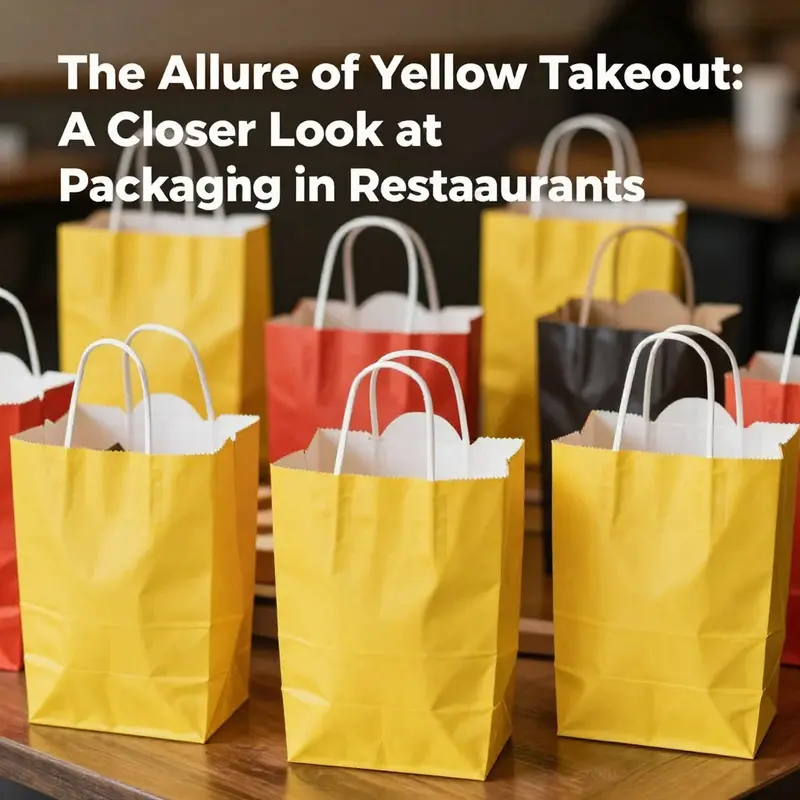
In the crowded dance of urban dining, a single object often travels farther than a chef’s reputation or a glossy menu. It is the simple takeout bag, that unassuming carrier that becomes a portable stage for a brand’s personality. When a sushi-oriented concept opts for a vivid yellow in its takeaway packaging, the choice resonates beyond utility. The color gleams in a street littered with neon signs and ceramic bowls. It catches the eye of a hurried passerby, invites a longer, slower look at the bag’s surface, and begins to tell a story about what lies inside. In this sense, yellow takes on more meaning than merely a hue. It becomes a strategic device, a promise of energy, freshness, and playfulness that aligns with a culinary identity built around bright, clean flavors and careful craftsmanship. The yellow package is not only a container; it is a moving billboard, a pocket-sized ambassador for the restaurant that designed it, and a touchpoint that makes the act of taking food home something a little more memorable than merely satisfying hunger.
The distinctive yellow is often paired with a design motif that nudges the stool or the tote bag into a moment of delight. It is not unusual to see a bag fashioned with unexpected contours, perhaps even a shape that suggests movement or a nod to a signature ingredient. In practice, the outer wrapper is typically crafted from paper—lightweight enough to carry comfortably, sturdy enough to resist moisture, and simple to recycle after its journey from store to door. Within this outer shell, the packaging may include internal dividers that organize the contents into logical compartments. The goal is not just to transport food; it is to deliver an orderly experience that preserves the integrity of delicate items like sliced fish, fresh vegetables, and sauces, while also guiding a customer toward a neat, confident assembly at the table or on a couch.
When this packaging design is anchored in a kitchen that prides itself on freshness and presentation, the bag becomes a micro-website for the brand. Each glance at the yellow surface, each hold, and each transfer from hand to hand tells a story of care. The color is a beacon that makes the bag easy to locate in a stack of deliveries, a practical advantage that reduces the time a courier spends at a door and helps a customer recognize the source at a glance. The visual impact is amplified on social media as well. An unboxing photo or a quick video clip can celebrate not just the meal but the moment of discovery—the moment when a bright yellow bag appears and signals something special is within. In this light, packaging becomes a shared experience, a small ritual that enhances anticipation about what the bag holds and how the contents will perform when opened.
The choice to design a bag around a bold color also communicates a philosophy about zinging energy into everyday routines. A yellow bag is not a muted container; it is a statement that aligns with a brand mentality rooted in youthfulness, creativity, and a willingness to stand out in a crowded market. It suggests that the restaurant values not just the quality of its ingredients but the entire lifecycle of the meal—from the moment the bag is handed to the customer to the moment the consumer sits down to enjoy it. In this sense, the bag functions as a kind of portable advertisement that travels through sidewalks, subways, and kitchens alike, turning ordinary errand-running into a fleeting encounter with the brand’s essence. The design language communicates: we care about details, we respect your time, and we want the experience to be a little brighter as you carry our food with you.
This approach to packaging sits within a broader trend in the takeout economy, where brands experiment with shapes, textures, and finishes to create durable impressions without sacrificing practicality. A yellow bag might be printed with subtle line work that echoes the restaurant’s culinary identity, or it might be intentionally minimal, letting the color do most of the talking while the customer discovers more through the contents inside. Either way, the packaging becomes a stage for the meal rather than a mere container. The choice of a paper outer layer resonates with sustainability concerns that many consumers hold today, and it complements a design ethos that emphasizes recyclability and reuse where possible. It is a reminder that a striking color can coexist with responsible materials, and that the most effective packaging communicates clearly about both aesthetics and ethics.
Even beyond color and material, the bag’s internal structure can reinforce brand values. Dividers, for instance, help keep items separated, preserving texture and presentation. When a restaurant pairs vibrant exterior with thoughtful internal organization, it reduces the chances of accidental spills, protects fragile components like sashimi or delicate garnishes, and facilitates a smoother transfer from bag to plate. In a sense, the bag becomes a very small, portable logistics system, designed to minimize friction for both the kitchen staff and the customer. This attention to functional detail signals a respect for the consumer’s time and a commitment to maintaining the integrity of ingredients as they travel through the urban ecosystem.
In the world of to-go packaging, these decisions are rarely one-off. They are part of a larger conversation about how a restaurant wants to be perceived when the customer cannot sample the aroma, the sizzle, or the artistry of knife work in real time. The yellow bag, with its immediate recognizability, often prompts curiosity and conversation. People share photos, comment on the energy the color conveys, and even compare it with other takeout experiences they have had. The bag ceases to be a passive receptacle and becomes a catalyst for memory, a small but potent artifact that travels with the meal. In this way, branding through color becomes a strategic choice: it creates a consistent, portable identity that helps a visitor recall the brand when they decide what to eat again or recommend to a friend.
The broader implications extend to how the industry thinks about packaging as a communication channel. If a bag can tell a story in a glance, it becomes a tool that reduces cognitive load for a busy consumer. The customer does not need to search for a name on a sign or sift through a menu to recall where the food came from; the yellow bag triggers recognition. And recognition matters in a market saturated with options. It shortens the path from craving to purchase by providing a reliable, immediate cue. Over time, this cue can generate a sense of trust or familiarity, two ingredients that are as critical to repeat business as the quality of the fish itself. The bag, in other words, is a soft ambassador; it helps the brand stay in the customer’s mind between meals, nudging them toward a repeat visit when a craving returns.
The subtleties of this approach become even more pronounced when we consider how the color operates across different urban settings. On a busy street with a lot of color and movement, yellow can act like a bright punctuation mark—a signpost that cuts through visual noise. In quieter neighborhoods, the same yellow can convey a sense of cheer and invite someone to notice a meal they might otherwise overlook. The universal appeal of a sunny hue helps transcend language and cultural barriers, enabling a food experience to feel welcoming to a diverse audience. In practice, this means the yellow bag can support a global convenience equity for a concept that wants to travel beyond a single neighborhood or city. The bag becomes part of a scalable identity that can travel with the brand as it grows through new markets, while still feeling intrinsically connected to the origin story told by its design language.
One might wonder why a specific color would become such a powerful carrier of meaning in takeout packaging. The answer lies in the psychology of color: yellow is associated with happiness, optimism, and energy. It can stimulate appetite and foster a sense of lightness and sociability. In a takeout context, where the consumer often engages with the brand in a brief, sensory moment, such associations can create a favorable mood that enhances the overall dining experience, even before the food is opened. This mood one experiences while holding the bag can prepare them for what comes next—a meal that feels thoughtfully prepared and joyfully presented. The color’s brightness also makes the bag easier to spot in a sea of parcels, a practical advantage that translates into faster, smoother delivery experiences for drivers and a more positive experience for the recipient.
The production of a bag with this kind of identity is not a single, isolated decision. It involves collaboration among designers, kitchen staff, logistics teams, and sustainability officers to ensure that the color, shape, and structure harmonize with the restaurant’s overall brand story and with responsible packaging practices. Designers consider not only the visible surface but also the tactile experience—the feel of the paper, the resistance of the fold, the ease with which the bag can be opened and closed. The goal is to create an object that feels good to hold, looks good on the street, and functions flawlessly when it arrives at the customer’s door. In this equilibrium of aesthetics and practicality, the yellow bag becomes a living emblem that carries the restaurant’s values into the daily rhythms of customers’ lives.
As markets evolve, the role of such packaging continues to broaden. It is not merely about carrying a meal; it is about shaping a narrative of reliability and delight that can travel through many hands and many neighborhoods. A well-executed yellow takeaway bag can influence how a customer talks about a meal with friends, how they post a photo online, and how they remember the brand when they are planning a future visit. It can push someone to try a dish they might not have considered, to trust a new culinary concept because the packaging suggested that the company cared deeply about presentation and care. In sum, the bag is both a practical tool and a storytelling device, a compact conduit for brand values that travels with every order.
Within this framework, it is also worth acknowledging the ecosystem of safety and standards that surrounds food delivery. In many large urban markets, yellow seals or seals of safety are used on bags and delivery packages. These seals symbolize tamper-proof integrity and a commitment to food safety. They are not a branding element but a regulatory and procedural one, designed to reassure customers that what arrives at their door has not been altered on its way. Scanner-friendly and visible, these seals reinforce trust at a moment when customers are evaluating the quality and safety of a meal after the fact. The presence of such security features helps create a sense of reliability that can complement the positive associations of color and design. It is a reminder that good packaging lives in two spheres at once: the purely aesthetic and the strictly procedural. Both are necessary to sustain a lasting, positive relationship with customers in a fast-paced takeout economy.
Of course, the conversation about yellow packaging cannot be separated from questions of sustainability and environmental responsibility. Paper-based outer packaging is typically more renewable and recyclable than many alternatives, which aligns with a growing consumer preference for materials that minimize environmental impact. Yet the reality of urban logistics means the bag must hold up under the strain of transport, weather variation, and the sometimes rough handling that accompanies a busy delivery system. The internal dividers, while useful for organization, must be designed to minimize waste and facilitate recycling. The ideal outcome is a packaging system that preserves the meal’s integrity, supports speed and efficiency for delivery personnel, and leaves a lighter footprint on the ecosystem. When brands embrace this balancing act, the yellow bag becomes not only a symbol of vitality but also a marker of responsibility. It signals that the energy and joy conveyed by color do not come at the expense of the planet’s health. In this way, the bag’s glow becomes a beacon for thoughtful consumption rather than a purely aesthetic flourish.
From a practical standpoint, vendors and restaurant operators who adopt this approach often experiment with variations that still respect the core identity. Some may keep the yellow as the dominant color while integrating secondary tones and subtle texture to convey sophistication or craft. Others might introduce different shapes for seasonal menus or collaboration events, while preserving the recognizable color anchor that makes the bag instantly identifiable. The continuous refinement of design choices—balancing color, form, texture, and material quality—ensures that the packaging keeps pace with evolving customer expectations and industry standards. This ongoing iteration is a quiet form of branding discipline, a commitment to keeping the tangible touchpoint of takeout food aligned with the brand’s evolving story.
In the end, packaging is a narrative device that accompanies the actual food from kitchen to kitchen-table. When a restaurant leans into a bright yellow, the effect is more than cosmetic. It communicates a philosophy of liveliness and clarity, a promise that the meal inside will be handled with care, and an invitation to savor the moment of arrival. It is a reminder that every object in the dining ecosystem, down to the bag that carries the meal, has a role in shaping the consumer’s perception and memory. A well-designed bag does not merely transport; it enhances the entire experience by aligning the moment of pickup with the anticipation of delight, by helping the meal arrive with minimal fuss, and by offering a portable vignette of the brand’s energy that customers carry with them long after the box is empty.
For researchers and designers alike, the case of the yellow takeaway bag highlights a broader principle: that color matters, but context matters even more. The same hue can project warmth in one setting and urgency in another. The bag’s form can be simple or sophisticated, yet its impact rests on how well it communicates the restaurant’s values while preserving practicality for the end user. The most enduring packaging stories are those that manage to be at once performative and practical—visible enough to stand out, durable enough to endure daily use, and thoughtful enough to respect the consumer’s time and resources. In a world where meals are increasingly delivered rather than consumed on-premises, these small but potent design choices matter deeply. The yellow takeaway bag, in its bright, unassuming way, embodies a philosophy of capture, memory, and trust that travels with every order and every doorstep it touches.
Internal link reference: For a closer look at how packaging designers translate color and form into practical takeout solutions, consider the concept of octagonal kraft paper packaging, a structure that combines visual distinctiveness with logistical efficiency. octagonal kraft paper packaging
External resource: A public-facing overview illustrating how color and branding in takeout packaging influence consumer perception can be found on the official site that showcases bright yellow packaging as a brand hallmark. External site: official site illustrating yellow packaging example
Yellow Signals, Fresh Arrivals: How Takeout Bags and Tamper-Evident Seals Shape Trust in Modern Food Delivery
Color is a language in the crowded world of takeout. A quick glance at a bag or a container can telegraph a restaurant’s values just as surely as the aroma of what’s inside. Yellow, in particular, carries a resonance that many kitchens and couriers have learned to harness. It’s bright enough to grab attention in a sea of brown and white, yet soft enough to suggest warmth and approachability. In the evolving ecosystem of off-premise dining, a single color choice, paired with practical safety features, can communicate freshness, care, and reliability long before the first bite is taken. When a restaurant places a yellow takeout bag in a customer’s hands, it is not merely about packaging; it is about signaling a set of assurances—about quality, efficiency, and a standard of care that travels with the meal from kitchen to curbside and beyond.
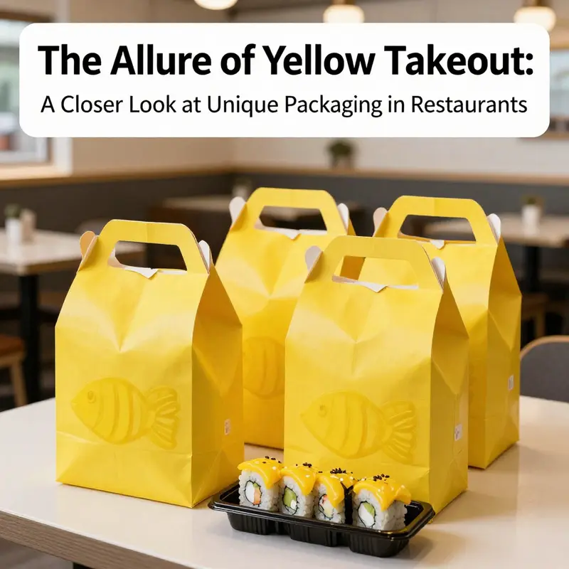
Consider a hypothetical yet plausible example drawn from contemporary packaging strategies in Japanese-influenced cuisine, where one restaurant redesigned its takeaway system to align with the core message of its culinary identity. In this scenario, the takeaway containers are rendered in an orange-yellow hue and crafted to resemble a fish shape. The intention is twofold: first, to evoke the star ingredient that anchors the menu—fresh fish—and second, to create a memorable, even playful, visual cue that helps the brand stand out on crowded street corners and in cluttered delivery queues. The outer wrapping is paper-based, chosen for its tactile warmth and its perceived eco-friendliness, while the interior features dividers that organize compartments for different components of a dish. The design is not accidental; it is a calculated fusion of form and function. The yellow palette draws the eye, but the representational shape—reminiscent of a fish—taps into deeper associations about provenance, seasonality, and the craft of sourcing. In the mind of the customer waiting at the doorway or scrolling through a delivery app, that small piece of packaging becomes a proxy for the quality inside: a promise that the kitchen values the integrity of ingredients and the care taken in assembly.
A bag and box system can tell a story without a word spoken. The material choice matters as well. Paper-based outer packaging signals a step toward sustainability that many diners now expect, even as it contrasts with the glossy, high-contrast icons of fast, efficient service. The internal dividers are a quiet, practical detail that speaks to discipline in the kitchen and consideration for the diner. The seafood-focused menu, in particular, benefits from a packaging language that suggests lightness and freshness rather than heaviness or mess. The yellow color acts as a visual cue that something is prepared with care and ready to be enjoyed. It is not that color alone guarantees satisfaction, but it helps set a frame that primes the consumer’s expectations. In neighborhoods where hundreds of meals leave kitchens daily, such cues can reduce the cognitive load on a customer, who simply recognizes the package and trusts that what’s inside has been prepared with attentiveness and hygiene in mind.
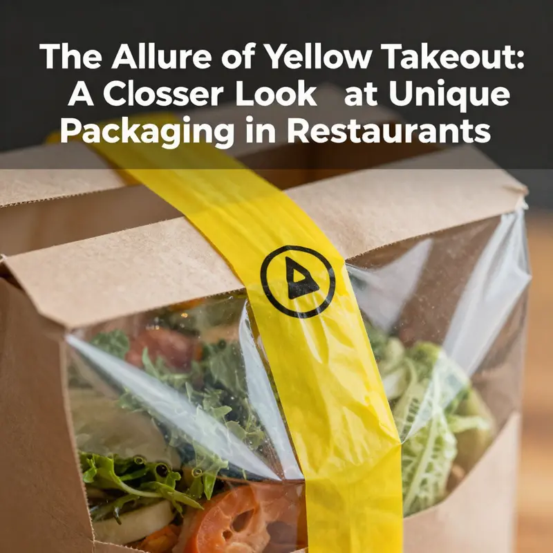
Beyond the aesthetic of the bag itself, there is another layer where yellow becomes a vehicle for safety and reliability. Across a wide range of Chinese delivery operations, yellow security seals—often on bags or containers—have become a familiar sight. They represent a simple, tangible, tamper-evident mechanism that travelers and diners alike can understand at a glance: a seal intact means the contents should be as the kitchen prepared them, while a broken or damaged seal signals potential compromise. The use of such seals is especially common in settings where food travels through multiple hands before reaching the end user, from kitchen to courier to customer. In these contexts, a bright yellow seal is more than a color—it is a signaling device that stands in for complex processes of inspection, handling, and traceability. The tamper-evident aspect is critical because it introduces a visible checkpoint in the flow of food, one that helps reduce the risk of contamination or adulteration during transport.
This color-coded signaling aligns with broader food-safety practices that emphasize quick recognition of status in busy environments. A standardized color approach—where yellow can signify readiness for service or a need for attention—makes it easier for staff to perform rapid checks at a glance. When a package bears a yellow seal and remains intact, staff can proceed, confident that the product has not been open in transit. When a seal appears damaged, the team can pause, reassess, and implement a corrective step—whether that means replacing a container, rechecking temperature history, or initiating an additional inspection. The psychological reassurance this provides extends to diners as well. In a marketplace where trust must be earned anew with every order, visible tamper-evidence reassures customers that their meals are processed in a controlled, auditable manner. It is a quiet confidence that travels with the bag, often more persuasive than a lengthy statement about hygiene or compliance.
Redundancy, of course, is a practical virtue in food delivery. Yellow seals may be used alongside other controls, including digital tracking or logbooks that record preparation time and temperature history. In some cases, these seals act as a gateway to more detailed data via QR codes or linked records, allowing staff or regulators to verify that a dish remained within safe parameters from kitchen to customer. The trend toward integrating color-coded seals with digital records reflects a broader shift in food safety management: the move from isolated, manual checks to transparent, traceable workflows. In this context, yellow becomes not just a color on a bag but a dot on a larger map of accountability.
To the customer, these details may seem almost invisible at the moment of opening a delivery, yet they shape perception in meaningful ways. A yellow seal that is intact communicates a sense of safety and reliability. For highly time-sensitive meals, where temperature and texture matter, this signals that the dish has traveled through a controlled process and is still within safe and desirable conditions. In a crowded urban landscape where multiple brands compete for attention, the combination of a visually striking yellow bag and a practical, tamper-evident seal creates a layered impression: a bold, modern aesthetic paired with a classic, dependable safety mechanism. The effect is not merely decorative; it is transactional. It reduces hesitation, supports faster decisions, and fosters repeat orders from diners who value both flavor and trust.
The regulatory and risk-management dimension adds another layer of significance. In many markets, health authorities emphasize preventing tampering and ensuring traceability across the supply chain. Yellow seals can function as part of a broader safety framework that includes time-temperature monitoring, documented handling procedures, and, where possible, digital linkage of seal status to the meal’s preparation history. The combination of a simple seal and a robust digital system can provide a clear, auditable record of a product’s journey from kitchen to consumer. This is particularly important for high-risk service contexts, such as takeout and catering events, where the same items may be prepared, packaged, and distributed to dozens or hundreds of customers across a single shift. A standardized color-coding scheme helps staff recognize status immediately, while the seal itself reduces the likelihood that a package is opened or altered without detection during delivery. The result is a more resilient operation—one that can respond swiftly to potential issues and maintain a trusted relationship with diners even when they never see the inside of the kitchen.
The practical implications for designers and operators are significant. Implementing yellow takeout packaging and tamper-evident seals requires careful coordination between branding, packaging engineering, food-safety procedures, and logistics. Designers must ensure that the color remains vibrant across printing processes and under the harsh conditions of transport and refrigeration. The packaging must also support the meal’s needs: leak resistance, barrier protection, and organizational features like internal dividers that prevent cross-contamination and simplify packing. In addition, the aesthetic layer must harmonize with the brand’s broader identity. If the kitchen emphasizes freshness and precision, the signaling should be consistent across all touchpoints—from the bag color to the seal’s placement to the subtle cues on the container itself. This coherence reinforces the restaurant’s story: that flavor begins at the moment of packaging, not just when the first bite is taken.
Operationally, this approach can improve efficiency. Staff can rely on yellow as a quick cue for prep status and for quality-control checkpoints during busy periods. The visual clarity of a color-coded system reduces the reliance on memory and minimizes errors that can occur in a fast-paced setting. On the dining side, diners benefit from predictable experiences: clean, organized packaging, clear tamper-evidence, and a consistent sense that their meals are prepared with care and oversight. The emotional payoff is subtle but powerful. A diner who feels protected by a simple, visible safety feature—like a yellow seal—enters the moment with less doubt and more appetite. In a landscape where many meals share similar flavors, packaging becomes a differentiator that translates into trust, repeat business, and, ultimately, a stronger emotional connection to the restaurant’s craft.
The broader context includes sustainability and logistical practicality. Paper-based packaging, when designed with recycled content and responsible disposal in mind, aligns with contemporary consumer expectations for environmental stewardship. The internal dividers mentioned in the fish-shaped design not only help with organization but also reduce the risk of squeezing or leaking during transit. A well-considered takeout system that combines color, shape, and structure can offer a calm, predictable experience in the chaos of urban delivery. It invites customers to see the meal not as a disposable item but as a carefully wrapped promise: a moment of relief and pleasure in a busy day. That promise travels with the yellow hue across the street, through elevator lobbies, and into doorways, carrying both the story of a kitchen and the memory of a taste that lingered just long enough to be savored.
It is impossible to separate the sensory and the systemic when we examine why yellow takes on such importance. Color is not just decoration; it is an instrument of perception that can prime expectations about hygiene, freshness, and care. The fish-inspired shape anchors a culinary narrative, turning packaging into a form of edible storytelling before the first bite. The seals, meanwhile, translate that story into a practical guarantee that can survive the rough-and-tumble transit of city life. When designers and restaurateurs think about the next generation of takeout, they are likely to keep exploring how minor adjustments—such as a shade of yellow, a slightly different fish contour, or a more streamlined seal mechanism—can alter the balance between brand memory and consumer confidence. And because the digital layer is increasingly accessible, diners will come to expect not only a great dish but also a transparent record of how it was prepared and protected along the way.
For readers who want to take a closer look at related packaging options and how these decisions translate into tangible products, consider exploring examples of disposable, customizable packaging solutions that integrate logo capabilities and practical performance. For instance, one can examine disposable take-away cups with customizable logos, which illustrate how brands extend their identity into everyday materials that customers reuse or handle regularly. Such examples reveal how a brand can maintain visual coherence across multiple packaging formats while still adapting to each item’s functional realities. This integrated approach is essential when a restaurant chooses a distinctive yellow palette; it ensures that the color remains legible, vibrant, and purposeful whether a bag sits on a doorstep, a dining table at home, or a desk during a late-night work session. It also reinforces a consistent message about safety and care, communicated through color, form, and the physical experience of handling the packaging.
As consumers increasingly evaluate meals through the lens of safety, convenience, and environmental responsibility, the yellow takeout bag emerges as more than a marketing trick. It is a compact, portable interface between a kitchen’s standards and a customer’s expectations. The visual cue of yellow, reinforced by a tangible seal, helps reduce ambiguity at a moment when decisions are often made quickly. In this sense, the color becomes part of a language that diners use to assess the reliability of a brand in minutes rather than hours. It is a reminder that good packaging design is not solely about catching the eye; it is about shaping the entire experience—from the moment the order is placed to the moment the meal is enjoyed and shared with others.
Internal links and practical insights can support readers who want to translate these ideas into their own operations. For example, consider how a brand might adopt the concept of a distinctive shape and color while integrating practical features such as internal dividers for organization and tamper-evident seals for safety. A deeper dive into packaging options for takeaway can illuminate how to balance aesthetics with performance, ensuring that every facet of the packaging—color, shape, material, and safety features—works together to create a coherent, trustworthy experience. Such exploration can also reveal how different markets may interpret color differently, underscoring the importance of testing and local adaptation when expanding a concept like a fish-shaped yellow container beyond its original setting. In this way, the yellow bag becomes a strategic asset rather than a mere wrapper, contributing to a brand’s identity while supporting a dependable, safe, and enjoyable consumer experience.
For readers who want to explore a related product category and see how design language travels across formats, an example of disposable takeaway cups with customizable logos can be a practical reference point. See the following resource for more on customizable takeaway packaging: disposable-takeaway-paper-cup-custom-logo-kraft-coffee-cup-with-lid. This kind of reference helps illuminate how color, typography, and branding cues carry across a restaurant’s packaging ecosystem, reinforcing a consistent image that customers recognize in the moment of decision. While the specific product lines differ, the underlying principle remains: cohesive packaging strategies that pair distinctive color stories with reliable safety features can elevate the perceived quality of a meal even before it is tasted. In a market where convenience often crowds out nuance, such coherence can become a competitive advantage that endures as the meal travels from kitchen to table, and then—often—into memory.
To round out the discussion with a sense of how these practices fit within broader regulatory and safety frameworks, it is helpful to connect this narrative to established guidelines that govern food-packaging safety and tamper-evidence. The U.S. FDA’s Food Code, for example, offers foundational expectations for preventing tampering, ensuring traceability, and maintaining safe handling throughout the supply chain. While this chapter centers on color and seals as signals within a specific locale, the principles of tamper resistance, clear labeling, and auditable processes resonate across borders and jurisdictions. The idea is not to replicate a single standard but to adopt a mindset that prioritizes transparency and accountability wherever the meal travels. For readers seeking a concrete regulatory reference, the FDA’s Food Code is a reputable starting point for understanding how tamper-evident packaging and related controls fit within a broader safety ecosystem. External resources: https://www.fda.gov/food/fda-food-code
Yellow Signals: How Takeout Color Shapes Taste Expectations and the Packaging Landscape
Color is the first handshake between a customer and a meal, a silent introducer that begins before the aroma reaches the nose. In takeout, color acts as an immediate cue—an instinctive forecast of what lies inside. Among hues, yellow stands out for its warmth, optimism, and appetite signaling. It does not merely adorn a container; it can prime expectations about flavor, texture, and even healthfulness. A takeaway experience begins with sight, and yellow packaging often promises something bright, easy to grab, and comforting. Yet as research into color perception grows, it becomes clear that yellow is not simply a single signal but a tapestry of cultural meanings and psychological effects that interact with the food inside and the context of the purchase.
Across cultures, yellow has earned a complex set of associations. In some markets, it is tied to sweetness, to the idea of a sunny, inviting treat that invites indulgence. In others, it carries notes of caution or novelty, signaling something different from the usual red-leaning cues that dominate many fast-service brands. The spectrum of interpretation matters because takeout packaging does not exist in a vacuum; it competes with a field of competing calls to action—on the street, in the app, during the delivery window, and in the mind of a hungry consumer who may be staring at a thousand options. The color yellow, when deployed thoughtfully, can convert curiosity into a choice. When applied with a clear understanding of local expectations, it helps reduce decision fatigue and speeds up the mental categorization of a product. A container in a yellow hue—especially when the yellow leans toward a warmer, orange-tinted tone—taps into a general affinity for warmth and approachability. It makes a potential customer feel that the meal is friendly, accessible, and easy to enjoy on the go.
At the center of this color-based narrative is a practical example that underscores both the power and the limits of yellow in takeout packaging. Consider a sushi-focused restaurant that designed its takeaway solution around an orange-yellow silhouette reminiscent of a fish. The aim was twofold: to highlight the freshness and prominence of fish ingredients and to create an imprint that would stand out on a crowded counter or within a digital shelf. The outer packaging is paper-based, a material choice that evokes naturalness and simplicity while also aligning with sustainability narratives increasingly valued by modern diners. Inside, the design incorporates dividers to keep different components orderly during transport. The concept is not merely about aesthetics; it is about delivering a coherent sensory story from the moment the box is picked up to the moment the first bite meets the tongue. The color helps passengers in the long arm of the journey—between the kitchen, the courier, and the consumer—by offering a predictable cue about the product category and its freshness. It signals a focus on seafood, on clean lines, and on the discipline of careful packaging, where even the arrangement of compartments matters to the overall perception of quality.
But yellow’s role in the takeout world extends beyond the walls of a single restaurant. In many urban markets, yellow is also a practical symbol of safety and trust. Yellow seals and labels that appear on food deliveries serve a different, yet complementary function to the color’s appetite-related effects. Across a wide swath of delivery ecosystems in urban China, yellow is commonly used for tamper-evident seals or safety locks on bags and boxes. These seals are not decorative—they are regulatory tools designed to protect the integrity of the food during transit. The use of yellow for these seals has roots in governance and public health policy, with local regulators introducing tamper-evident measures to reassure customers that the contents remain untouched from the moment the meal leaves the restaurant kitchen to the moment it reaches the doorstep. In this embedded signaling system, yellow becomes a language of trust. The consumer reads a yellow seal and understands that a formal check, a protective barrier, has framed the journey of the meal. This is a reminder that packaging serves multiple masters: it communicates flavor expectations, conveys brand personality, and acts as a conduit for safety assurances in a system built on mass distribution and distance.
The practical implications of yellow packaging, in particular, lie in the balance between signaling and delivery. On one hand, yellow can amplify perceived sweetness or lightness, which is a boon for desserts, snacks, or lighter fare where a sense of playfulness and approachability is desirable. On the other hand, when yellow is used in more savory or less predictable contexts, it risks creating a mismatch between consumer expectation and actual taste. The psychology of color suggests that yellow can prime appetite for sweetness, but it must be calibrated with the dish’s flavor profile and the overall brand narrative. A misalignment—where a savory dish is presented in a yellow container that implicitly suggests sweetness—can create a moment of cognitive dissonance at the moment of consumption, subtly undermining satisfaction before the first bite. The remedy lies in careful calibration: pairing yellow with natural textures, earthy kraft tones, or crisp, clean typography that anchors the perception in reality rather than in fantasy. The packaging becomes a storytelling device, not merely a wrapper, guiding the diner’s sensory journey before flavor is even registered on the palate.
The choice of materials further complicates the equation. Kraft paper, often used in conjunction with yellow hues, offers tactile cues of earthiness, tradition, and sustainability. The visible grain of recycled or recyclable paper can reinforce the impression of wholesome, straightforward food, aligning well with seafood-focused menus that emphasize simplicity and freshness. Inside the box, internal dividers or compartments offer functional benefits, for instance, keeping delicate nigiri separate from spicy sauces or sides, which in turn preserves the intended balance of textures and flavors at the moment of consumption. The visual harmony of a yellow exterior with the understated texture of kraft paper creates a multisensory cue: you see wellness and approachability; you feel a curated attention to detail; you taste anticipation that aligns with the meal’s content. It is a design that respects both the eater’s expectations and the practical realities of takeout logistics.
The relationship between color and branding also shifts depending on the competitive landscape and the cultural context. In global fast-service branding, yellow has often played a pivotal role as part of a broader color strategy designed to evoke friendly, inclusive energy and to capture quick attention. In this light, a yellow accent is not a standalone statement but a complementary call that works with red or black typography, natural textures, or glossy finishes to craft a brand’s personality. Without naming specific brands, it is possible to observe a general pattern: successful packaging strategies incorporate color as a preface to the meal, a way to prime taste expectations and create an emotional connection before the first bite. The color story, when integrated with typography and layout, signals to the consumer that the meal is meant to be enjoyed, accessible, and trustworthy. It is a pre-consumption cue that helps the diner navigate a sea of options by reducing ambiguity and increasing recall.
Cultural context matters, and the perception of yellow is not uniform. In some markets yellow has connotations of vitality and optimism—attributes that resonate with fresh, quick service and light meals. In others, yellow can carry more nuanced meanings related to health, cleansing, or even caution. Translating color into consumer behavior requires a nuanced understanding of the local sensory milieu. For a restaurant considering a yellow packaging strategy, this means more than picking a hue and slapping it on a box. It means shaping a coherent sensory experience that begins with color, extends through material choice, and ends in the moment of eating. The color must harmonize with the dish category, the brand story, and the expectations of the target audience. In practice this translates into a design discipline that tests color palettes, observes consumer reactions, and iterates with feedback from frontline staff and customers alike. It is not enough to be seen; a packaging color must be felt as part of a credible, credible experience that makes a meal feel as good as it tastes.
The design language of yellow in takeout packaging also benefits from anchored, tangible design elements. For instance, a container type such as an octagonal box or a boat-shaped tray can provide spatial cues that align with expectations about portioning and freshness. The idea of an octagonal kraft paper packaging solution embodies both form and function: it preserves food integrity, offers a distinctive silhouette that stands out on shelves or in photos, and carries a tactile memory of the meal in transit. This is where material innovation and color strategy meet practical logistics: the packaging must not only look appealing but also withstand the rigors of transit, maintain the product’s temperature and texture, and still deliver a coherent brand narrative from kitchen to doorstep. The packaging must be robust enough to resist moisture and leaks, easy to open without compromising the contents, and flexible enough to accommodate different menu items while preserving the yellow identity as a consistent cue. In this sense, yellow is not merely a cosmetic choice; it is part of a systemic approach to packaging that prioritizes clarity, trust, and satisfaction.
For practitioners seeking to implement or refine a yellow-centric takeout strategy, several guiding principles emerge. First, calibrate color with the dish profile. Yellow can signal sweetness and warmth, but it should not distort the perceived flavor of savory or spicy items. The second principle is to align color with sustainable material choices. A yellow exterior on kraft paper carries a narrative about environmental responsibility that can reinforce positive consumer associations. Third, ensure the color works across touchpoints. The same yellow tone should translate well in digital previews, signage, and the physical container to maintain consistency. Fourth, leverage the color to differentiate the brand in crowded markets without relying on loud branding alone. Yellow can act as a reliable beacon that helps a diner locate their order among a spectrum of options. Finally, integrate safety signals in a complementary role. Yellow seals or labels used for tamper-evident purposes can be harmonized with the color scheme so that the security element does not feel like an afterthought but rather an integral extension of the container’s identity. In this arrangement, yellow packaging communicates both appetite and assurance, a dual message that can strengthen overall satisfaction from first glance to final bite.
To illustrate how thoughtful yellow packaging can coexist with other design choices, consider the way a restaurant could pair a warm yellow with understated typography on a kraft background. The typography would be clean and legible, reinforcing the impression of reliability and care. Inside, the compartments would be arranged with precision, ensuring that sauces and sides do not mingle with primary items on arrival. The packaging would be designed to present a calm, organized impression even as the consumer’s anticipation grows. The goal is to minimize any cognitive overload at the moment of reveal, letting the eater focus on the meal rather than on deciphering the packaging. In short, yellow is a strategic tool, not a decorative flourish. When used with a disciplined approach to materials, form, and cross-channel consistency, yellow packaging can elevate a takeaway experience from ordinary to memorable.
For designers and restaurateurs exploring these ideas, the journey toward an effective yellow packaging strategy is a collaborative one. It requires listening to customer feedback, observing how meals hold up through delivery, and partnering with packaging innovators who comprehend both form and function. A successful yellow strategy should not be static; it should adapt as consumer preferences evolve, as delivery ecosystems shift, and as cultural meanings of color transform across borders. The best outcomes emerge when color is treated as a dimension of experience rather than a cosmetic afterthought when yellow becomes a signal that the meal is worth the moment of anticipation, worth the journey, and worth the memory after the last bite has been savored.
Internal link note: for designers exploring viable packaging shapes and materials, see the example of a kraft-based packaging option that emphasizes distinctive form while supporting practical use: disposable octagonal box restaurant food kraft paper packaging. This kind of packaging design demonstrates how shape, material, and color can work in concert to deliver a coherent message about freshness, simplicity, and reliability.
The journey from color to perception to delivery is not linear but cyclical. The consumer’s impression of yellow packaging begins with a glance, continues through the tactile experience of holding a container, and culminates in the taste memory of the meal. If a yellow package promises brightness but the dish delivers richness and depth, the overall experience can still be overwhelmingly positive, provided the packaging communicates the right expectations and protects the sensory integrity of the food. Conversely, if the yellow signals sweetness in a context where the meal is intensely savory or spicy, the slip in alignment can be jarring. That tension is precisely where thoughtful packaging design earns its keep: by shaping expectations in a way that is credible, culturally informed, and technically resilient. The packaging becomes a translator between a kitchen’s craft and a diner’s palate, a conduit through which taste and texture travel from stove to street, with color playing a crucial but often unsung role in the translation.
Final thoughts
The impact of yellow packaging in the restaurant industry extends beyond aesthetics; it shapes customer experiences and perceptions of quality, safety, and brand identity. Restaurants like Yo!Sushi capitalize on this color not just as a design choice but as a strategic element that captures attention and communicates freshness. Similarly, the implementation of yellow security seals reassures customers about the tamper-proof integrity of their orders, enhancing trust. As cultural perceptions continue to evolve, the significance of packaging, especially vibrant colors like yellow, will remain a key player in how restaurants engage with their clientele, influencing preferences and ultimately, dining decisions.