Strawberry milk served in clear plastic cups has become an appealing choice in cafés, restaurants, and catering services, captivating attention with its vibrant colors and delightful concoction. This article delves into the visual appeal and nutritional benefits of this delightful beverage, while also exploring its broader cultural significance. By understanding the aesthetics, health aspects, and cultural backgrounds, beverage chains and food service providers can effectively incorporate strawberry milk into their offerings, enhancing customer experience and satisfaction.
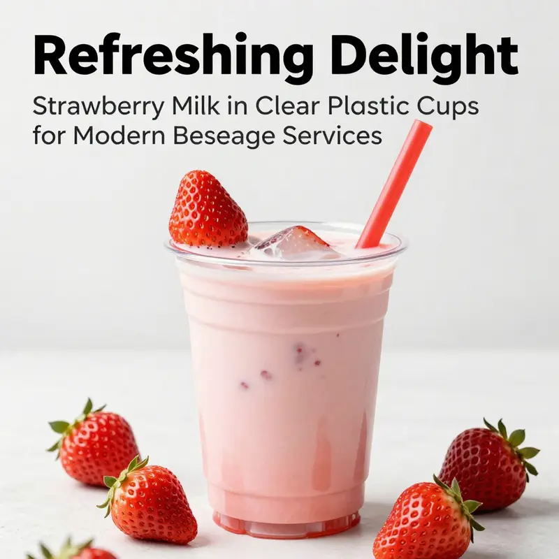
How Transparency, Color, and Detail Make Strawberry Milk in a Clear Plastic Cup Unforgettable
A single image can speak to taste, mood, and moment. When strawberry milk sits in a clear plastic cup, the beverage becomes more than a drink. It becomes a visual promise: sweetness, refreshment, and a small celebration of color. The cup’s transparency lets the pink hue do the work. It lets light pass through, revealing gradients, tiny air bubbles, and the texture of blended fruit. These small details register instantly with viewers. They invite a closer look and spark a pleasant expectation before the first sip.
The appeal begins with color. Strawberry milk occupies a narrow palette range between pale blush and vibrant rose. That range feels inherently appetizing. In a clear cup, that pink becomes focal. It contrasts with neutral or minimalist backgrounds and complements warm wooden surfaces or clean white tabletops. The eye tracks color first. The clear cup removes visual barriers so the hue takes center stage. When the drink contains flecks of fruit or a denser smoothie layer, the cup acts like a window into the beverage’s structure. Each layer suggests texture and body, which implies a fuller, more satisfying mouthfeel.
Transparency also affects perceived freshness. Condensation beading on the outside of a clear cup signals chill and immediacy. A glossy surface catches highlights. A thin ring of moisture at the base suggests it was just poured. Those visual cues prompt an almost tactile reaction: one can imagine the cold touch, the slightly sticky residue on the rim, the way the straw slips between lips. Photographs and visuals that capture these nuances trigger sensory memory. They tell a story of the moment—hot afternoon, quick treat, shared break—without words.
Design language matters, too. Clear plastic cups have a modern, unadorned silhouette. That simplicity serves as a neutral stage for styling. A minimal cup makes a bold drink look curated and intentional. It can read playful when paired with a striped straw and a fresh strawberry pierced on the rim. It becomes sophisticated when photographed with soft, directional lighting and a shallow depth of field. The cup’s utilitarian form balances decorative elements. If you add a paper sleeve, label, or sticker, the transparency keeps the beverage visible around the branding. This lets the product remain the hero while allowing subtle identity cues.
Garnish choices amplify visual storytelling. A sliced strawberry floating near the surface creates a suspended moment. Whole berries positioned on a fork or threaded on the straw read as approachable luxury. Even small changes, like a touch of mint or tiny edible flower, shift perception. Garnish suggests effort, care, and a homemade quality. When the garnish echoes the drink’s color, it reinforces the flavor promise. When it contrasts, it adds vibrancy. Thoughtful garnish placement can also reveal beverage texture. A strawberry wedge pressed against the cup glass shows juiciness. Seeds and pulp close to the cup’s wall demonstrate authenticity.
The straw itself is a small but powerful prop. A striped paper straw introduces nostalgia and playfulness. A clear or translucent straw keeps the focus on color and texture. Wide straws hint at thickness, suggesting a milkshake rather than a thin flavored milk. The straw’s angle creates directionality in an image. It leads the eye, breaks monotony, and suggests use. A bent straw, a drop of milk on its rim, or a slight tilt can transform a static scene into a narrative of imminent enjoyment.
Lighting completes the visual equation. Side lighting reveals texture; backlighting emphasizes translucency. Soft, diffused light smooths color transitions and reduces harsh reflections on plastic. A gentle highlight along the cup’s curve adds dimension. Reflections should be controlled; too many hot spots flatten the image and distract from color. When shooting or styling, consider reflective surfaces and their impact on the cup’s silhouette. Negative space around the cup helps the pink breathe. Minimal clutter keeps attention on the beverage while allowing complementary elements to support the story.
Composition choices determine how the cup communicates. Centered framing makes the drink the undisputed subject. Off-center placement creates dynamic tension and room for supporting props. Close-up crops focus on surface detail: beads of condensation, pulp, and foam. Wider shots place the cup in context: a casual café table, a picnic blanket, or a counter with ingredients. Each approach conveys different messages—luxury, nostalgia, everyday comfort. The clear cup adapts to all of them because it reveals the beverage at once.
Texture inside the cup matters visually and sensorially. Smooth, homogenized milk conveys simplicity and uniform sweetness. Visible pulp and small fruit flecks communicate freshness and artisanal preparation. Layering—thicker strawberry puree at the bottom, pale milky layer on top—creates a gradient that reads as handcrafted. When layers remain distinct, viewers anticipate a mixing moment. The potential for transformation—stirring, sipping, blending—adds intrigue. Texture also affects reflections; froth or tiny bubbles scatter light differently than a glassy surface, creating depth.
Context is a powerful amplifier. A clear plastic cup signals convenience and modern casualness. Paired with certain settings, it reads youthful and energetic. In promotional photography, the cup aligns well with social media culture: quick, shareable, and visually bold. For children’s content, bright colors, playful props, and whimsical straws enhance appeal. For artisanal or premium positioning, present the cup with natural materials and restrained props. The same cup can serve multiple brand narratives depending on lighting, styling, and composition, which makes it a versatile tool in visual merchandising.
Packaging decisions should not be overlooked. Clear plastic cups are easy to brand with sleeves or stickers while leaving most of the beverage visible. If a business wants a sustainable angle, a visually similar paper cup can be considered. For product managers reviewing packaging options, the visual trade-offs are clear: paper hides color but signals eco-sensitivity; clear plastic showcases color but raises material concerns. For businesses that prioritize the visual impact of color and texture, consider alternative or hybrid packaging that preserves visibility while addressing environmental goals. One such alternative product is available here: best-price-8oz-double-plastic-free-single-wall-paper-cup.
Practical presentation details matter. Fill level affects perception. A cup filled to the brim reads generous and indulgent. A cup with a few centimeters of headspace allows room for garnish and foam. The rim should be clean; smudges or drips can look messy, unless a deliberate drip is used to suggest immediacy. Lids change the story. A dome lid suggests a shake or smoothie; a flat lid keeps the visual silhouette clean. Lids with straw openings tell of portability and on-the-go consumption. Each small choice signals a different use case and audience.
Environmental context influences expectations. In outdoor shots, a clear cup catches sunlight and becomes jewel-like. Indoors, it can harmonize with warm or cool lighting. The cup’s transparency reveals ambient reflections; a window or neon sign can add mood. Photographers and stylists should mind color balance to keep the pink true. Image editing can push hues, but accuracy preserves appetite appeal. Over-saturation risks artificiality; under-saturation makes the drink look dull.
Human elements increase relatability. A hand holding the cup introduces scale and interaction. Fingers near the rim create a human connection and a sense of touch. Smiles, partial faces, or cropped gestures suggest a social moment. The clear cup helps here because the beverage remains visible within the interaction. Small human imperfections—a stray fingerprint on the cup or a slightly smeared lip—can add authenticity when used judiciously.
Color psychology plays a subtle role. Pink registers as nurturing and comforting. It carries associations with sweetness and childhood. When paired with fresh strawberries, the color shifts toward natural and wholesome. Designers use that to align messaging: comforting treat, quick indulgence, or fresh fruit refreshment. The clear cup amplifies these associations because it presents color without mediation. That clarity gives creatives direct control over the emotional tone.
For social media content, consider motion. A short video of a straw entering the cup, a spoon stirring layers, or condensation forming after a cold pour brings the image to life. Motion emphasizes texture and time. The clear cup reveals the process—mixing, dissolving, melting—and invites participation. Looping short clips that focus on color and tactile detail tend to perform well because they create a sensory shortcut; viewers feel the temperature and taste through movement cues.
Finally, accessibility and safety deserve attention. Clear plastic cups are convenient, but consider material transparency for users with visual impairments; high contrast between the liquid and surrounding elements helps distinguish edges. For health and safety, ensure cups meet food-grade standards and are shown in hygienic contexts in imagery. Visual credibility depends on both aesthetics and implied safety.
Every visual decision contributes to perception. The clear plastic cup is more than a container; it is an instrument for storytelling. It reveals color, texture, and freshness in one glance. It invites the viewer to imagine taste and temperature. It adapts from playful to elegant with subtle changes in styling and light. Used thoughtfully, a simple cup of strawberry milk becomes a memorable visual asset.
For additional inspiration and mockups that explore this aesthetic, consult this design resource: https://www.freepik.com/free-photos-vectors/strawberry-milkshake-plastic-cup
Crystal Clarity and Strawberry Cream: The Visual, Nutritional, and Cultural Narrative of Strawberry Milk in a Clear Plastic Cup
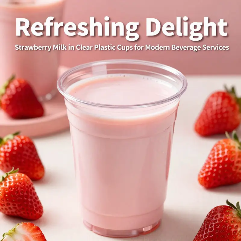
The sight of strawberry milk, pale pink swirls suspended within a crystal-clear plastic cup, has become a quiet benchmark of immediately recognizable refreshment. It is a motif that blends color psychology, packaging design, and a straightforward nutrition profile into a single, persuading image. In many menus, stock libraries, and social feeds, this combination – the bright hue, the glossy translucence of the cup, and the suggestion of real fruit near the rim – works as a compact story about sweetness, cleanliness, and instant gratification. The cup’s transparency does more than reveal the color; it frames the drinking experience itself. When a beverage sits in a clear vessel, the gaze travels from the glassy rim down through the pinkish liquid to the bottom, inviting us to read the drink as a clean composition of ingredients rather than a blended mystery. This is especially true with a strawberry milk presented in a standard one-cup serving size, roughly 240 milliliters, where the audience can measure familiarity against the visual cues of volume and color. And while the clear cup enhances aesthetics, it also anchors perception to tangible expectations. The nutritional facts, tucked away on a label at the back or on a menu card, become a counterpoint to the immediate sensory appeal. The balance between what the colors promise and what the numbers deliver shapes how people choose, savor, and sometimes overindulge. In this sense, the image of strawberry milk in a clear plastic cup is not merely a pretty photograph. It is a cultural artifact that speaks to the way we see, quantify, and respond to sweetness in a world where convenience and visual clarity are prized above all else.
To understand the full narrative, one must start with the nutrition that often accompanies the image. In a standard 1-cup serving of strawberry milk similar to the Darigold 1% formulation, the energy content sits around 200 calories. The macronutrient distribution skews toward carbohydrates, which account for approximately 72 percent of calories and translate to roughly 34 grams of carbohydrate in this 240-milliliter portion. The fat content hovers around 2.2 grams, representing about 11 percent of calories, while protein stands at about 34 grams, constituting roughly 17 percent of the energy profile achieved by this beverage. The apparent contradiction in the numbers—protein that would seem unusually high for a dairy drink of this kind alongside a modest fat level and a sizable carbohydrate portion—serves as a reminder of how nutrition data can appear at odds with common expectations when a specific product formulation is in play. These figures, drawn from a reputable nutrition-tracking source, provide a concrete context for readers who might otherwise rely solely on taste, appearance, or marketing cues to gauge how much energy and nutrition a serving contributes to daily intake.
The carbohydrate content, in particular, warrants careful attention. The substantial share of calories from carbohydrates often reflects a combination of lactose and added sugars, especially in flavored dairy beverages designed to emphasize sweetness and fruit-like flavor notes. This aspect becomes more salient when the consumer comparison shifts toward beverages with lower added sugars or alternative protein sources. In practice, for individuals monitoring total sugar intake or carbohydrate load due to dietary goals or medical reasons, reading the label becomes essential because the pink hue and the glossy clarity of the cup can mask a substantial sugar contribution. The same cup that entices with a bright strawberry color may also invite a proportion of its calories from sugars that could challenge daily targets if consumed with little regard to portion size. Yet the protein content, as listed, implies a notable contribution of dairy-derived protein within the beverage. Protein often plays a dual role: it supports satiety and contributes to nutritional balance, but in a beverage meant for indulgence, it can be surprising if the score appears higher than expected for a standard flavored milk. In any case, the combination of energy, macros, and sensory appeal underscores a fundamental point: nutrition and presentation do not always align in intuitive ways. The clear cup, by exposing every ripple and shade of pink, invites a closer look at what lies beneath the surface—both in the cup and in our choices as consumers.
From a consumer behavior perspective, the clarity of the container interacts with perception in nuanced ways. A translucent vessel makes the beverage’s color more vivid, and the pink glow often evokes notions of fruitiness, healthfulness, and refreshment. These associations can influence the moment of decision at the point of purchase or on a dining table where a child or adult is selecting a drink. The visual language of pink, combined with the visibility of the liquid’s surface, can subtly cue sweetness, leading to a higher intention to consume. This is a classic example of how packaging and presentation affect consumption behavior, separate from the actual nutritional content. The presence of fresh strawberry garnishes in some imagery or the suggestion of real fruit near the rim further reinforces the perception of natural flavor and quality, even when the beverage’s base may rely on a blend of milk and flavors rather than real fruit pieces. The result is a kind of visual confidence: the cup tells a story of freshness, purity, and indulgence all at once.
The marketing implications of such visuals are important to unpack. In stock photography and marketing materials, the strawberry milk-in-a-clear-cup motif is often used to anchor seasonal campaigns, kid-friendly menus, and social media posts. The cup’s transparency enhances the image’s versatility because it allows designers to layer text and branding over the curved surface without obscuring the drink’s key color. The garnish of real strawberries, when used, intensifies the sensory promise of fruitiness and natural flavor while underscoring the visual cue of brightness and vitality. The combination is particularly effective in conveying a sense of lightness and refreshment, even when the beverage in question is a flavored milk with a higher sugar content than some plain dairy drinks. The aesthetic thus becomes a strategic tool in how better choices are framed and how indulgence is legitimized through a convincing, sensory-rich presentation.
Yet this confluence of sight and taste can also cultivate a bias toward overconsumption if the label’s details are overlooked. The clear cup, with its easy-to-see liquid level, can unintentionally invite individuals to gauge portions by sight, which is not always aligned with nutrition guidance. In a world where snack culture and grab-and-go beverages are common, the ability to quickly assess a cup by visual cues can simplify decision-making but may compromise attempts at moderation. This is a reminder that the cup’s transparency is double-edged: it enhances the drink’s appeal while demanding greater consumer attention to sugar content and portion size. The chapter’s nutritional figures, though seemingly straightforward, become crucial as a counterbalance—an evidence set that helps readers calibrate their choices against the vivid lure of color and clarity.
What then can salad-bowl like precision offer to help readers navigate this landscape? It begins with mindful labeling and accessible nutrition information. Clear labeling, including explicit added sugar content and the ratio of lactose to other carbohydrate sources, can bridge the gap between visual appeal and healthful decision-making. For individuals who want to maintain balance, it helps to view the beverage not only as a momentary pleasure but as part of a broader dietary pattern. Moderation, as recommended by nutrition professionals, is a practical guiding principle. The idea is not to demonize the visual appeal of a pink, glossy drink in a transparent cup, but to illuminate the choices behind it. Understanding the sugar footprint of such beverages can help people incorporate them into meals and snacks without tipping daily carbohydrate targets or calorie budgets beyond sensible bounds.
The chapter also considers the role of packaging in shaping environmental and sustainability narratives. While the camera loves a clear plastic cup that showcases the drink’s color and texture, there is a broader conversation about single-use plastics, recyclability, and the environmental footprint of disposable packaging. In many markets, the choice between plastic and paper, or the option to use reusable containers, adds another layer to how we interpret a drink’s appeal. The visual of the strawberry milk in a clear cup sits within this larger ecosystem of consumer choices, where aesthetics, nutrition, and responsibility intersect. Some brands and retailers respond to these concerns by offering alternatives such as recyclable or compostable cup materials, or by encouraging customers to bring their own containers. Even within the constraints of a given beverage offering, designers can harness the power of the cup’s transparency to communicate not just flavor but also a commitment to responsible packaging. The result is a more nuanced narrative where the beverage’s pleasure is balanced by a consideration of its ecological footprint.
Within this wider context, the internal imagery that accompanies a strawberry-milk offering—whether in-store signage, online menus, or social media—becomes part of a larger storytelling system. The clear cup acts as a stage for the drama of color: the pink tone that hints at fruit sweetness, the faint gloss of the liquid on the inside of the plastic, and the way light travels through the cup to illuminate the bottom. It is a painting in motion, a marketing scene where texture, color, and form accentuate taste expectations. The science behind the scene is simple yet impactful: a product that promises indulgence can also offer nutritional anchors that help maintain balance when viewed in context of an overall daily plan. The consumer learns to weigh sensory appeal against the sugar content, while marketers and packaging designers learn to present the beverage in ways that respect both appetite and well-being. The narrative of the strawberry milk in a clear plastic cup, then, is not merely about taste; it is about the choreography of perception, nutrition, and responsibility.
For readers seeking practical guidance, this analysis invites attention to how packaging choices, even in small details like the type of cup or the presence of fruit garnish, influence perception and consumption. If the goal is to convey refreshment and fruit-forward flavor while maintaining transparency about sugar and calories, one approach involves aligning the cup’s design with clear, legible nutrition labeling and offering options that reduce added sugars without sacrificing taste. The integration of form and content—how the cup looks, how the milk tastes, and how the numbers on the label read—creates a holistic experience that can inform both consumer decisions and product development.
In summary, the strawberry milk in a clear plastic cup is a potent case study in the interplay between aesthetics, nutrition, and behavior. The cup’s clarity amplifies the drink’s color, making the pink more vivid and inviting. It does not alter the nutrition, yet it shapes how people interpret and respond to those numbers. The carbohydrate-heavy profile, combined with a meaningful protein content and a modest fat amount, reveals a beverage that sits comfortably within a range of everyday options, while inviting a closer look at sugar content for those who need to monitor intake. The image’s effectiveness lies in its ability to deliver a complete, compact message: sweetness, freshness, and quick refreshment, rendered in a vessel that makes the color the star. When readers recognize this synergy, they can appreciate not only the sensory appeal but also the nutrition behind the pink glow and the cultural resonance of a drink that is as much a visual shorthand as it is a culinary choice. This is the power of a strawberry milk in a clear cup—a simple beverage that, through color, clarity, and context, communicates volumes about taste, health, and contemporary consumption patterns.
Internal link for further packaging context: custom-logo disposable Kraft paper cup with lid.
External resource for nutrition details: https://www.eatthismuch.com/foods/darigold-1-strawberry-milk
Source note: The numeric values summarized here reflect the published nutrition facts for the specific product variant cited in the discussion and are intended to frame the conversation around color, texture, and consumer interpretation rather than to propose a universal dietary recommendation.
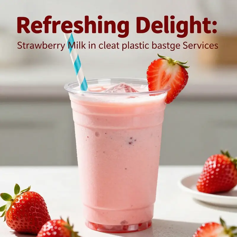
Seeing Through Sweetness: Nostalgia, Aesthetics, and the Strawberry Milk Moment in a Clear Plastic Cup
The image of bright pink strawberry milk held in a clear plastic cup is more than a beverage in a container. It is a small theatre of color, texture, and memory. When light traverses the smooth plastic, it reveals the drink as a liquid jewel, a shallow pool of rose-tinted sweetness that catches the eye before the tongue can know what it tastes like. The sight is often complemented by a striped straw, a delicate garnish of fresh strawberries, and a quiet condensation that clings to the outside like a soft reminder of chill and refreshment. This combination has become a familiar motif in food and beverage imagery, a shorthand for freshness, playfulness, and uncomplicated pleasure. It works well in stock photography and vector art because the visual cues are immediate: the color is appetizing, the cup is universally recognizable, and the whole tableau feels approachable and unpretentious. In marketing contexts, such visuals can convey a sense of accessibility, a promise that the drink is easy to enjoy and share, a few seconds of happiness captured in plastic and color.
The cultural resonance of this simple pairing runs deep. Nostalgia does much of the heavy lifting. The sight of pink milk in a transparent cup evokes a memory lane of school lunches, summer fairs, and family picnics. It is not just about the taste; it is about the mood, the feeling of being cared for by small treats that fit neatly into a busy day. The clear cup acts as a stage for the liquid itself, allowing the consumer to judge mood and texture at a glance. When the liquid is pink and opaque, it signals sweetness and a certain kid-friendly vibe. When the drink is layered or swirled, the visual suggests a small act of artistry in a casual setting. The cup itself, being disposable, adds to a sense of lightness and spontaneity: a momentary indulgence that does not demand long attention or heavy commitment. This is precisely the sort of moment that thrives in photos, posts, and reels where users scroll quickly but still pause to appreciate a bright, comforting image.
Across continents, the same image carries different but related meanings. In East Asian contexts, particularly in Japan and South Korea, strawberry milk has long linked to school lunches and daytime routines that feel almost ceremonial in their simplicity. The sight of a neatly arranged pink drink in a small, colorful cup has a domestic intimacy that travelers and locals alike recognize. It speaks to a shared memory of everyday rituals—the ritual of packing a lunch, the simple joy of a treat that fits into a busy day, the way a familiar container can signify care without needing elaborate explanation. This cultural layer adds depth to what might otherwise feel like a trivial texture in a catalog of beverage photographs. The memory is not universal, but its emotional register travels easily. The image becomes a vessel for storytelling about childhood, safety, and comfort, making the cup more than a container and the drink more than a flavor.
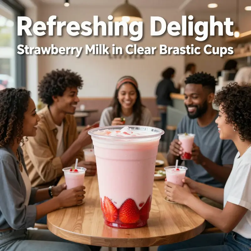
In the social media ecosystem, the strawberry milk in a clear plastic cup has found fresh currency. Platforms like TikTok and Pinterest are prime sites where creators curate feeds around the aesthetics of everyday life. The clip or image is almost always accompanied by a light, upbeat soundtrack or a caption that nudges at whimsy and delight. Hashtags such as #strawberrymilk and #plasticcup function as cataloging tools, enabling others to discover the same moment of sweetness and share their own variations. This is not just about the beverage; it is about the act of sharing a small, visually pleasing ritual with an audience. The clear cup becomes a visual cue that signals not just flavor but a vibe: casual, cheerful, and a touch playful. The light pink tone of the drink, the way it glows against the transparent surface, and the gleam of condensation can all be leveraged to evoke a sense of freshness and immediacy. In this context, the image is less about product and more about moment—an edible memory that can be tapped into at any time, in any place where a camera phone and a quick caption exist.
From a design perspective, the clarity of the container is not an accidental choice. The plastic acts as a transparent window into the beverage, inviting the viewer to judge the color, density, and texture almost as if they were peeking into a glass. The red-pink hue of strawberry milk sits against the neutral glare of plastic, creating a contrast that is both vivid and soothing. The visual hierarchy places color at the top and texture just beneath it. The eye is drawn to the gradient that sometimes forms when the drink settles, or to the whorl of strawberry pulp that may swirl near the top. A striped straw or a neat garnish can anchor the composition, providing a linear, tactile counterpoint to the fluid curves of the liquid. Such details make the image legible at a glance, which is precisely what successful stock photography and social media visuals strive for: a quick emotional read that prompts a moment of recognition and desire.
Yet the sustainment of this visual trope depends on the delicate balance between nostalgia and modernity. On one hand, the cup evokes retro sensibilities, a reminder of simpler times. On the other hand, the same cup is a perfect vessel for contemporary digital storytelling, where saturation, contrast, and composition can be tweaked to align with current aesthetic ecosystems. The process of creation, circulation, and re-creation of these images mirrors broader trends in media: the democratization of production, the compression of time between moment and memory, and the way digital platforms amplify small, personal experiences into cultural touchpoints. In this light, the clear plastic cup with strawberry milk is less a product image and more a cultural instrument, capable of transmitting mood, memory, and social meaning across contexts and generations.
The imagery is also a useful reminder of how visuals function in marketing beyond direct persuasion. A stock photograph or vector art of a strawberry milk in a clear cup does not only sell a drink; it sells a lifestyle concept. It promises a simple escape: a few bright seconds of sweetness that can be woven into a social media narrative or a menu board. The logistics behind these visuals matter too. The decision to depict fresh strawberries as a garnish or to show the drink as a smooth, uniform pink speaks to what a brand wants to communicate about quality and approachability. The fruit evokes a sense of realism and freshness, while the cup signals portability and convenience. Together, they create an image that makes the viewer feel that this moment is easy to replicate, share, and enjoy in real life. In other words, the clear plastic cup becomes a canvas for emotional storytelling as well as sensory anticipation.
There is also a practical dimension to the popularity of this imagery. For creators and marketers, a strawberry milk in a clear cup offers a reliable color palette and a straightforward composition. The pink hue is distinct without being aggressive, and it reads well across screens of varying sizes and in different lighting. The transparent cup eliminates the problem of masking branding or complex packaging, allowing the beverage to speak for itself. In teaching or guidance contexts for photographers and designers, this setup serves as a manageable example of how to choreograph color, light, and props to tell a concise story. Fresh strawberries, a striped straw, a crisp lid, and a neatly poured drink—these elements can be combined in countless ways to evoke comfort, youth, and vitality. Each variation adds a layer to the same story, expanding the vocabulary of a visual language that has proven to be resilient and adaptable across platforms and cultures.
Within the broader historical arc of food imagery, the strawberry milk in a clear plastic cup sits at an interesting intersection. It embodies the consumer’s evolving relationship with packaging, where disposability is weighed against convenience and memory. It captures a moment when a simple, affordable treat is elevated by aesthetics and narrative. The cup does not just hold liquid; it preserves a fragment of daily life that audiences can project onto themselves. That projection, in turn, fuels why the image remains compelling, generation after generation. It is a reminder that sweetness is not merely a taste but a cultural artifact that travels well, morphs with time, and continues to resonate when presented in a clear, honest container that makes the drink look undeniably accessible. The persistence of this motif is a testament to the power of color and form in shaping how we experience something as ordinary as a pink beverage in a plastic cup. As long as people seek small joys that feel tangible and shareable, this image will persist, mutating with new filters, new contexts, and new moments of social connection. The science behind this lie in how human perception is drawn to bright, warm hues and clean shapes that promise refreshment and comfort, often enough to transcend language, borders, and even the constraints of disposable packaging.
From a supply-chain and production perspective, the enduring appeal of the clear cup rests on its efficiency. The reliability of a transparent vessel makes it easier to preserve the product’s identity during transit and display. It reduces the cognitive load on the consumer, who does not need to decipher a complex label to understand what they are seeing. The strawberry color becomes the message, and the cup becomes the method by which that message is delivered. This synergy is precisely why such visuals recur in menus, in social media campaigns, and in stock art. It is not merely a duplicate pattern; it is a refined practice that knows how to maximize recognition with minimal textual explanation. And because the container is a universal element of many cultures’ everyday life, the image has a nearly global legibility. A viewer in a crowded city or a rural village can instantly interpret the scene as a moment of sweetness, refreshment, and lighthearted indulgence. In the hands of a skilled visual storyteller, this simple setup becomes a vessel for shared experience, which is perhaps the most enduring value of the strawberry milk in a clear plastic cup.
For readers seeking additional perspectives on packaging aesthetics and sustainability, there is a practical example in the broader catalog of packaging resources: eco-friendly-printed-logo-cold-beverage-cup-paper-cup-with-lid. This reference highlights how brands balance visibility, identity, and environmental considerations in everyday drinkware, revealing how the same desire for a bright, memorable image can be aligned with responsible design choices. The contrast between paper and plastic in these discussions underscores a central tension in modern beverage culture: the impulse to present a flawless, crave-worthy moment on demand, while navigating concerns about waste and reuse. In the strawberry milk imagery, the cup remains a familiar, neutral stage where the drink can shine, whether that stage is a glossy stock photo, a looped TikTok video, or a quiet moment on a café menu.
The enduring popularity of the clear plastic cup with strawberry milk is thus not mere sentimentality. It is a convergence of perceptual psychology, cultural memory, and media-era storytelling. It demonstrates how simple, everyday objects can become powerful carriers of mood, identity, and social connection. The pink liquid, visible through clear plastic, becomes a shared language that transcends language, inviting viewers to imagine themselves in the scene: a moment of cool refreshment on a busy day, a pause in a long afternoon, a tiny celebration of sweetness and ease. In the grand tapestry of food imagery, this motif occupies a space that is both nostalgic and current, intimate and widely accessible. Its appeal endures because it speaks to a universal craving for small joys that feel both personal and communal at the same time. And because digital culture continues to favor visuals that are quick to understand and easy to remix, the strawberry milk in a clear plastic cup will likely remain a familiar, adaptable symbol for years to come, a reminder that some of the sweetest experiences are the simplest ones, captured in a single, sunlit sip inside a transparent vessel.
External reference: https://www.vecteezy.com/vector-art/2168574-clear-plastic-cup-with-strawberry-juice-or-smoothie
Final thoughts
Strawberry milk, particularly when served in clear plastic cups, stands out for its visual attractiveness, nutritional benefits, and cultural resonance. As a beverage that captures the essence of sweetness and refreshment, it holds the potential to enhance the offerings of various food and beverage businesses. By leveraging its aesthetic appeal and nutritional profile, businesses can not only captivate new customers but also create a lasting impression that intertwines taste with visual delight. Embrace the strawberry milk trend today, and savor the possibilities of refreshing customer experiences that it promises.