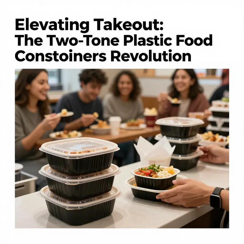
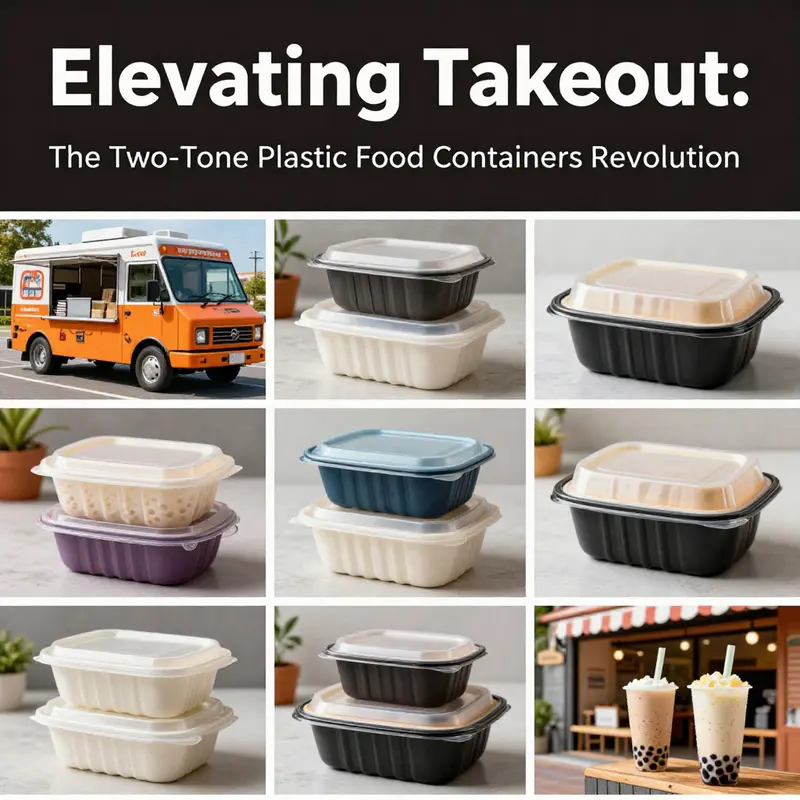
In the bustling world of food service, presentation and functionality are paramount. Plastic takeout food containers in a two-tone design, such as the model 126299361678, are transforming how beverages and food are packaged for delivery. These containers not only serve a practical purpose but also elevate the consumer experience by enhancing visual appeal and brand identity. This article will explore the material and structural advantages of these containers, dive into their design benefits, assess their superior functional performance, outline their diverse applications, and examine market trends and purchasing avenues for businesses. Whether you’re managing a bubble tea shop, a food truck, or catering services, understanding the value of two-tone plastic containers will prepare you for the future of takeout packaging.
Two-Tone Precision: Material Choice and Structural Design in Modern Takeout Containers
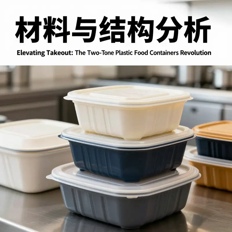
The two-tone aesthetic of contemporary plastic takeout containers is more than a visual flourish; it is a deliberate language that communicates safety, reliability, and brand identity while carrying the practical demands of modern food service. Central to this language is the material, most commonly polypropylene, or PP. PP is prized in food packaging for its balance of safety and performance. It can withstand the heat of hot meals and the chill of refrigerated transport, which means it performs across the full arc of a takeout order—from kitchen to consumer’s hands. Its heat resistance enables microwaving of leftovers in a way that remains safer for consumers than many other polymers, provided the product is clearly labeled as food-grade and microwave-compatible. This thermal resilience, paired with robust impact resistance, helps ensure that the container does not dent, crack, or deform under typical handling or accidental drops, preserving both the integrity of the contents and the wearer’s customer experience. The material’s intrinsic clarity and whiteness—coupled with a two-tone finish—offer strong opportunities for branding. When a lid and body are tinted with contrasting colors, the design can guide eyes to the most useful sections of the packaging, or demarcate different components of a meal within a single box. The two-tone scheme, far from being merely decorative, can help operators signal portioning, indicate temperature zones, or differentiate menu categories in a visually intuitive way. In a crowded delivery ecosystem, where a consumer’s first interaction with a meal is often the packaging, such cues can reduce confusion and elevate perceived value.
From a materials science perspective, PP’s properties align well with the functional expectations of takeout packaging. Its chemical resistance is notable; it resists oils and many sauces that might otherwise permeate or degrade weaker polymers. This oil and water resistance is essential for keeping contents discrete and preventing cross-contamination of flavors, a factor that extends the perceived freshness and quality of the meal. The food-grade standard attached to PP used in takeout containers is not merely a marketing claim; it is a safety baseline that governs migration limits and overall suitability for hot and cold foods. In practice, a consumer-friendly product will display a clear identification symbol, such as a resin code, indicating PP (often the number 5), which helps waste management systems sort plastics for recycling. The recyclability of PP—while technically straightforward—depends on local infrastructure, consumer participation, and the presence of widely accepted collection streams. In this sense, the material choice carries an environmental dimension that brands increasingly must acknowledge in their packaging narratives.
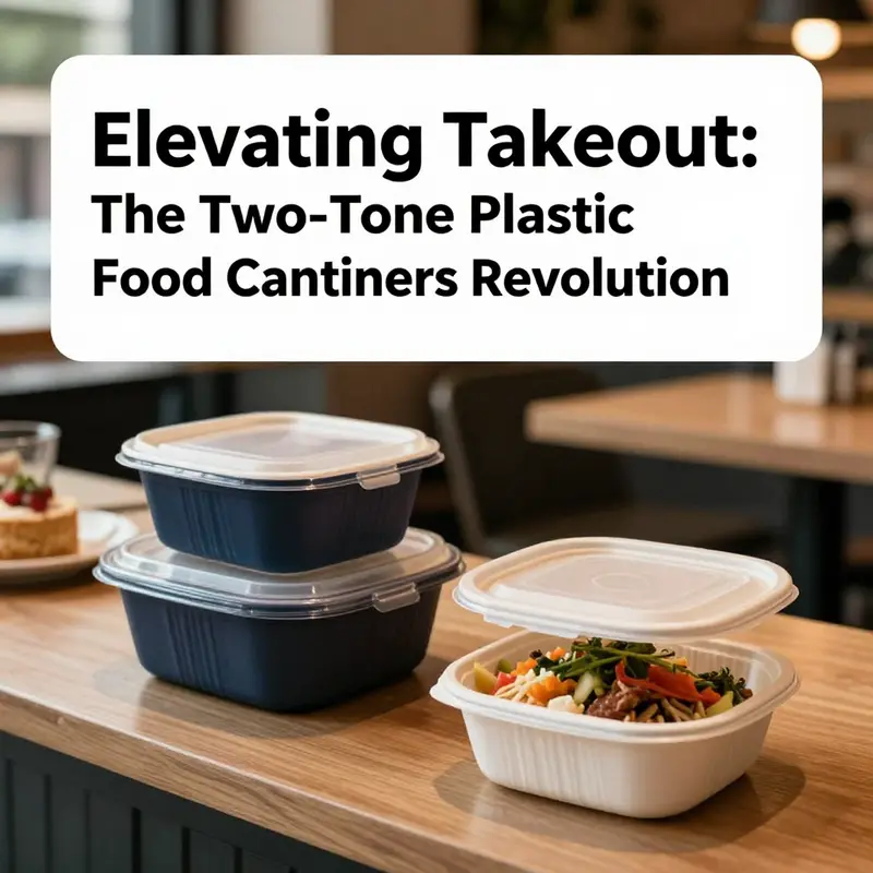
Equally important is the structural logic that supports the two-tone, often dual-compartment design. The two-tone aesthetic usually accompanies a functional, partitioned form that keeps foods separate, prevents cross-merging of flavors, and maintains texture. A typical arrangement might involve a two-compartment configuration where sauces or sides stay isolated from the main dish, preserving moisture balance and presentation. The lid’s geometry is designed for a secure, snap-fit closure that minimizes leakage and reduces the risk of spills during transit. The overall geometry—compact, stackable, and rigid—facilitates efficient storage in kitchens and delivery hubs while enabling straightforward palletization and distribution. This combination of form and function translates into tangible benefits for operations: reduced return rates due to leaks, faster handoffs at drive-throughs and pick-up windows, and a more reliable experience for customers who rely on single-serve packaging to keep meals intact on the move.
Beyond insulation and containment, two-tone plastic takeout containers harness the power of color-blocking to support operational workflows. Color differentiation can visually cue different meal lines, dietary categories, or temperature zones without requiring consumer effort to read labels. For example, a darker tone might be used for hot entrees, while a lighter hue marks sides or desserts, creating an at-a-glance system that speeds decision-making for both staff and customers. Printing opportunities on the exterior surfaces further reinforce branding while leaving the interior smooth and non-porous for clean, hygienic surfaces. The combination of a sealable lid and color-coded exterior not only protects food safety but also boosts curb appeal in a market where packaging frequently competes with the aesthetics of the meal itself.
In practical terms, selecting a two-tone PP container involves a few deliberate considerations. Material quality and compliance are paramount: the product should be confirmed as food-grade PP, with clear signaling of heat tolerance and microwave compatibility if these functions are required. The packaging should display a middle-to-high level of opacity or color contrast that remains stable under thermal cycling, to avoid color transfer or fading after repeated heating or chilling. The structural features—two compartments or a two-tone exterior paired with a secure lid—must align with the types of meals being served. For soups and sauces, reliable sealing is non-negotiable; for rice bowls or noodle dishes, a rigid base with reinforced corners helps prevent crushing during transit. The expectations around capacity, typically in the range of several hundred milliliters for a single-serve meal, also shape the choice of wall thickness and lid geometry. In addition to functional performance, operator narratives about sustainability and safety influence selection. The PP composition offers recyclability in theory, but the practical recycling outcome hinges on regional programs that accept polypropylene and on consumer participation in proper disposal.
Another layer of consideration is the manufacturing and supply chain dimension. Two-tone aesthetics require colorants and precise tooling to achieve consistent coloration and seam integrity across large production runs. This is not merely a cosmetic concern; consistent color blocking ensures that cartons from the same batch look uniform, which supports brand consistency and reduces consumer confusion. Meanwhile, the partition designs and snap-fit lids must tolerate high-volume use without compromising seal quality or dimensional stability. The production environment must mitigate issues such as warping, flash, or misalignment that could impair sealing performance, especially under the rigors of cold-chain transport where contraction and expansion cycles are common. In this regard, robust quality control processes—from incoming resin checks to final lid-fit testing—help ensure that every container performs as expected from kitchen to consumer doorstep.
For readers who want a tangible touchpoint into this broader landscape, consider the broader ecosystem of takeout packaging that surrounds plastic, paper, and mixed-material solutions. The conversation around two-tone PP containers sits at the intersection of design, safety, and sustainability. It invites a careful evaluation of how color and form influence user experience while preserving the integrity of the food and the brand’s reputation. As this chapter has outlined, the material choice—polypropylene—provides a dependable platform for heat resistance and barrier properties, while the two-tone design translates that practicality into a visual shorthand that supports efficient service and brand recall. In a world where every detail matters, the marriage of material science and thoughtful design becomes a decisive factor in the success of modern takeout packaging.
For readers who wish to explore related packaging formats and supplier profiles, there is a spectrum of options that expand the conversation beyond plastics alone. An example of related consumer-facing packaging formats can be found here: Disposable Kraft Paper Bowls for Takeout (https://greendispopack.com/product/disposable-700ml-kraft-paper-bowl-take-out-octagonal-rectangle-paper-bowl/). This link illustrates how packaging designers balance aesthetic appeal with performance across materials, reminding us that the packaging ecosystem is broader than any single material choice while still anchored by core principles of safety, cost, and usability. External resources offer additional context on global supply and standards for takeout packaging, including wholesale and distribution perspectives: https://www.alibaba.com/wholesale/takeout-packaging-container_8.html. Together, these references underscore that the evolution of two-tone plastic takeout containers is both technology-driven and customer-centric, a synthesis of material science, mechanical design, and experiential branding that defines how meals travel from kitchen to doorstep with clarity and confidence.
双色外卖塑料餐盒的设计力量:如何通过色彩与结构提升用户体验
双色设计不仅是视觉修饰,而是一种以用户为中心的功能策略。 在讨论塑料外卖餐盒的设计时,双色(two-tone)处理能同时回应美学、实用、安全与可持续性需求。它把简单的容器转变为有效的沟通载体,帮助品牌传达信息,指引使用者操作,并在使用场景中解决实际问题。下面的叙述从多个紧密相连的角度,描述双色塑料外卖餐盒如何系统性地提升用户体验。
首先,颜色本身具有快速识别的力量。通过在外卖餐盒上采用强烈或微妙的色彩对比,品牌可以在众多包装中迅速被识别,同时将不同菜品或套餐分区传达给消费者。一个常见且有效的做法,是用一种颜色标识主食区,用另一种颜色标识配菜或酱料区。这样的色块分明不仅减少了开箱时的混淆,还能在视觉上提示用户正确的取用顺序与搭配方式。对于需要配送多种菜品的场景,这种颜色编码能显著降低出错率并提升用餐便捷性。
其次,双色设计增强了功能性与操作体验。当颜色与物理分隔结合使用时,容器的功能立即变得直观。例如,透明或浅色区域可以用于观察食物状态,而不透明或深色区域用于承载油脂较多或需要保温的部分。通过精心选择色彩和材料光泽,设计师可以引导用户将不同类型的食物放置到最合适的位置,保证口感与温度的最佳表现。更重要的是,这种视觉指引在灯光不足或用户忙碌时仍然有效,降低误操作的概率,提升整体满意度。
在材料与安全方面,双色并不意味着必须牺牲性能。常见的塑料外卖餐盒通常采用聚丙烯(PP)等食品级材料,因其耐热、无异味并可安全微波加热。采用双色设计时,可以使用同种材料通过色母或表面处理实现色差,保证每一部分的热稳定性和耐用性一致。这样既满足加热、冷藏与运输的需求,也能保持材料安全标准。用户在使用过程中得到的稳定性能,会转化为对品牌的信任感,增强复购意愿。
环保性是现代消费者关注的核心之一,而双色策略可以与可持续材料相结合以回应这一关切。设计师可以将双色作为体现材料差异的工具:例如主体采用可回收的PP,而盖或外层采用可降解或生物基材料。通过颜色区分,用户能够简单判断哪些部分进入回收流、哪些部分需要特殊处理,从而简化后续的废弃物分类。这样的设计不仅传递了品牌对环境责任的态度,也在实际层面帮助用户做出更环保的选择,形成良性互动。
此外,双色设计具备强大的品牌与情感连接能力。包装是品牌与顾客接触的第一点。相较于单一颜色,双色容器提供了更灵活的视觉语言:可以通过季节性配色、节日限定款或联名配色来制造惊喜,从而提升用户的情感投入。此类策略尤其适用于注重品牌体验的连锁餐饮或订阅餐服务,当用户在家中打开一个色彩讲究的餐盒时,整个用餐体验被提升为一件值得分享的事。这种情感增值,对社交媒体时代的口碑传播极为有利。
生产与定制层面,双色方案也展示出高效性与经济性。现代注塑与表面印刷工艺允许对色彩和纹理进行精确控制。批量生产时,双色模具或后处理上色并不会显著增加单位成本,尤其当品牌通过统一色彩体系来管理多个产品线时,规模效应可以被充分利用。对中小型餐饮企业而言,双色容器还可作为一次低成本的品牌升级手段,通过少量定制就能产生明显的辨识度提升。
用户维护与重复使用方面,双色设计可以辅助功能化标签的替代。传统上,用户依赖贴纸或文字标签来区分餐盒用途和处理方式,而颜色能更直接、更持久地传达这些信息。比如,某一颜色代表可微波、另一色代表仅冷藏,通过颜色形成的视觉记忆,用户对容器的适用情境会越来越熟悉,从而减少误用并延长容器使用寿命。长期来看,这种设计减少一次性浪费,兼顾了便利性与环保性。
最后,双色设计是一种跨文化的沟通工具。色彩在不同文化中具有不同的象征意义,合理运用可以在国际化经营中带来额外好处。品牌在进入新市场时,通过调研目标用户的色彩偏好来调整配色方案,可以更好地与当地消费者建立连结。这种基于色彩的本地化策略,比单纯依赖文字或图形更直接也更具包容性。
综上所述,双色塑料外卖餐盒通过将视觉、功能、材料与情感设计融为一体,提供了一条清晰的路径来提升用户体验。它既是包装美学的延伸,也是实际使用效率与环保考量的结合体。设计上若能保持材料的食品安全标准,合理配置色彩指引,并在生产上兼顾可持续性,双色餐盒将成为一项低成本却高回报的设计投资。
如需查看可替代的环保纸质包装方案与不同容量的外卖容器示例,可参考这款可带盖的纸质碗页面以获取灵感: 可带盖纸质外卖碗示例。
欲了解更多类别与市场上同类产品的完整列表,请参阅一份外部资源以获取供应商与规格信息: https://www.alibaba.com/wholesale/takeout-packaging-container_8.html
Two-Tone Resilience: A Cohesive Evaluation of Safety, Convenience, and Brand Impact in Plastic Takeout Containers
The fusion of color and engineering in two-tone plastic takeout containers marks a meaningful shift in how packaging communicates safety, convenience, and brand intent long before a customer even unwraps the meal. The two-tone design is not merely an aesthetic flourish; it is a deliberate system that helps operators convey organization, differentiate dishes, and guide user behavior in the crowded ecosystem of quick-service and delivery. Behind the glossy surface lies a careful choice of materials, an understanding of thermal and mechanical limits, and a strategy for sustaining quality from kitchen to curbside. At the core of this conversation is the material itself—polypropylene, a workhorse in food packaging that balances safety, clarity, and practicality. PP’s chemical stability reduces the risk of food interactions, a nontrivial concern when sauces, oils, or acidic components are involved. This stability translates into predictable performance as meals travel through bustling street corners and busy delivery corridors. When a container is labeled as microwaveable, it signals that the user can reheat the meal within the same vessel, a feature that resonates with the needs of time-strapped customers and the growing expectation of convenience. Yet microwaveability hinges on more than a label. It depends on a design that resists warping, maintains lid integrity, and preserves the barrier between food and environment during extended heating. In that sense, the interplay between material choice and structural design is inseparable from the two-tone aesthetic. The color differentiation in two-tone containers often serves a practical purpose: it helps staff and customers visually partition compartments or sauce zones, reducing cross-contact of flavors and streamlining clean-up and reuse in the kitchen. This subtle cue can improve accuracy in packaging multiple components of a single order and enhance the overall dining experience by presenting a coherent, appetizing image on receipt or screen. The visual clarity of the two-tone scheme also supports branding without sacrificing functionality. A color scheme that aligns with a restaurant’s palette can reinforce recognition and trust, which matters when a customer selects a meal from a sea of options. The performance story, however, rests on the container’s ability to withstand the rigors of transport. A well-made two-tone container should deliver robust sealing, resisting leaks and keep-out of odors while remaining light enough for efficient stacking and shipping. The seals or lids must perform under pressure, resisting the squeeze of a bag or the bumps of a curbside drop. In practical terms, that means a lid design that accommodates a secure snap or gasket system, a base that stays rigid under load, and a geometry that discourages deformation during transit. Durability also extends to resistance to oils and moisture. A container that breaks down under the weight of a fatty sauce or a hot broth undermines safety, creates mess, and erodes consumer trust. The two-tone approach often leverages color to mask minor surface imperfections that can arise during molding or handling, but it must do so without compromising the perception of quality. The true value of two-tone containers emerges when look and function converge. For instance, the two-tone partitioning strategy can enable a practical separation of food groups within a single box, reducing cross-contamination and keeping different textures intact. This is especially valuable for meals that pair dry items with soups or gravies. In the most effective implementations, the interior geometry supports such partitioning through simple, integrated features rather than cumbersome add-ons. The result is a container that feels sturdy in the hand, as much a tool for the kitchen as a social cue in the consumer’s hands. From the operator’s viewpoint, reliability translates into operational efficiency. A container that resists leaks reduces the volume of corrective actions during delivery, lessens waste, and helps maintain the integrity of the brand promise. Packaging that remains visually appealing after microwaving or brief refrigeration reinforces a sense of care and professionalism. It is not merely about keeping food inside; it is about preserving the customer’s perception of the brand as a reliable, considerate choice. This is where design meets policy. The choice of polymer, its additives, and any printing on the surface must align with safety standards for contact with food. Even though the two-tone finish is eye-catching, it must not compromise the container’s chemical inertness or heat resistance. In jurisdictions with strict packaging guidelines, validated material compatibility and proper labeling are essential to ensure consumer confidence and regulatory compliance. The conversation about two-tone plastic containers thus moves beyond the surface to foreground a balance of performance and perception. However, no discussion of performance would be complete without acknowledging practical limitations. High-temperature use can induce warping if the base materials are pushed beyond their tolerances. Repeated cycles of freezing and heating may affect clarity or color stability, which, while not a safety issue, can influence perceived quality. Grease resistance is another critical factor; if the surface absorbs or wicks oil, it can lead to staining, making the container look aged or less appealing over time. These challenges are not insurmountable. Advances in molding precision, polymer blends, and barrier coatings continue to extend the safe operating window for two-tone designs. They enable more aggressive sealing, improved heat tolerance, and better resistance to staining, all while preserving the visual impact of the two-tone approach. For foodservice operators, this combination of durability and aesthetics carries tangible benefits. A well-executed two-tone container supports a consistent customer experience, reinforcing reliability with a memorable presentation. The packaging becomes part of the brand’s storytelling—an understated, tactile reminder of care, cleanliness, and efficiency. It also opens doors to broader packaging strategies, such as straightforward differentiation of meal sizes or categories through color cues, which can streamline ordering, reduce error rates, and enhance upsell opportunities. In evaluating performance, it is essential to consider the end-of-life story as well. PP is widely recognized for recyclability in many municipal streams, though actual recyclability depends on regional facilities, ink systems, and separation needs. Operators should align packaging choices with local recycling infrastructure to advance sustainability goals without compromising performance. The two-tone design should not hinder recycling if the materials and inks are compatible with the accepted processes. To connect these considerations with practical sourcing and design perspectives, one can explore packaging design resources that discuss how color, material selection, and form factor interact in real-world operations. For a concrete example of packaging design considerations in practice, see this overview of disposable octagonal- and related packaging concepts: disposable-octagonal-box-restaurant-food-kraft-paper-packaging. This reference highlights how design decisions extend beyond appearance and toward integrity, ease of use, and lifecycle impact. It is a reminder that two-tone plastic containers are part of a broader ecosystem of takeout packaging where form and function must align with user expectations and regulatory constraints. For those seeking guidance on regulatory and safety contexts, official resources on food-contact materials provide essential grounding. They help ensure that a given packaging solution remains compliant across markets while supporting the consumer’s confidence in the safety of reheating and consuming meals from such vessels. As packaging engineers, designers, and operators continue to refine two-tone plastic takeout solutions, the focus remains on delivering containers that are safe, dependable, and visually coherent with brand stories. In this sense, performance is not solely a mechanical attribute but a composite experience—one that begins on the production line, travels through the logistics chain, and ends in the customer’s hands with every meal delivered ready to enjoy. For regulatory context on food-contact materials and to explore broader safety guidelines, consult external resources such as the U.S. Food and Drug Administration’s guidance on food packaging materials: https://www.fda.gov/food/packaging-labeling-materials/food-packaging.
Two-Tone Packaging in Practice: How Plastic Take-Out Containers Shape Service Across Sectors
Two-tone plastic take-out containers sit at the intersection of design, performance, and everyday logistics. They are more than a single-use vessel; they encode a set of promises about reliability, brand presence, and the pace of service in a crowded food economy. At their core, these containers are typically molded from a sturdy polymer such as polypropylene, a material chosen for a balance of heat resistance, toughness, and chemical inertness. The two-tone aesthetic emerges not merely as decoration but as a functional language. The contrast between two colors helps diners and staff distinguish dishes at a glance, differentiates menu lines, and reinforces brand recognition even when the box travels through a bustling kitchen or a crowded delivery corridor. The practical advantages of this approach extend beyond appearance. The material itself resists oil and moisture, a critical trait for hot entrées, fried items, or saucy salads. It performs across a wide temperature range, tolerating cold storage, reheating, and even microwave reheating for consumer convenience, all while maintaining shape integrity. The lid system, often designed to seal tightly, adds a reliable barrier against leaks and spills, a feature that is vital when take-out meals travel from kitchen to customer in unpredictable transit conditions. The result is a packaging option that keeps food secure, appetizing, and presentable from the moment it leaves the heat until the moment it lands on the customer’s table or desk.
The two-tone design also carries a subtler, but equally important, message about predictability and control. In a dimly lit kitchen, a quick glance can reveal which container belongs to a hot dish, which one is a cold or salad option, and which SKU or portion size is loaded inside. For operations that handle dozens or hundreds of items per day, this color code translates into measurable gains in speed and accuracy. It reduces mislabeling, lowers the chance of cross-contamination, and supports a smoother handoff between cooks, packers, and drivers. Visual differentiation becomes a silent supervisor, guiding staff through the packing queue with less cognitive load and fewer errors. In a competitive market, where the first impression is often the last, the two-tone look also elevates the perceived quality of the whole service. A container that looks sturdy and well-made suggests a restaurant that takes care with its packaging as well as its food, and the effect can be as powerful as a glossy menu or a well-timed delivery estimate.
From the standpoint of food safety and hygiene, the packaging is designed to withstand a demanding lifecycle. It must tolerate repeated exposure to oils, sauces, and acidic components without degrading or absorbing odors. It must remain intact when dropped or bumped during transit, and it should resist cracking under the mechanical stresses of stacking and nesting in supply carts, on shelves, or inside delivery bags. The microwave-safe characteristic, while not universal for every container, provides a practical option for consumers who prefer to reheat at home rather than discard and reuse. The potential for refrigeration and freezing is equally important; the container needs to hold its shape and not leak when food is chilled or rapidly frozen. In these ways, the two-tone container aligns with the broader demands of modern foodservice: fast, reliable, safe, and capable of preserving the sensory appeal of meals across the entire journey from kitchen to consumer.
The range of applications for this packaging approach is broad and interwoven with the operational realities of various service contexts. In bustling restaurants and fast-casual outlets, the containers support quick assembly lines and rapid handoffs at the counter. Their durability accommodates the busy flow of takeaway orders, curbside pickups, and drive-through windows, where stability in transit matters as much as the food’s warmth. In hotels and catered events, the packaging assists with portion control and presentation, helping to convey a sense of care even when the dishes are carried to rooms or conference spaces. Airlines and long-haul transporters rely on sealed, two-tone containers to maintain food integrity during flights or lengthy trips, where the risk of spills or exposure to ambient conditions increases. Retail and convenience stores incorporate these containers as ready-to-go options for pre-packaged meals, snacks, and salads, offering shoppers a convenient, reliable way to purchase and carry meals without compromising on cleanliness or convenience. For delivery platforms, the packaging plays a critical role in the last mile: it must endure shifting weights, jostling, and the pressure of being placed into a customer’s bag alongside other items, all while retaining a neat, appetizing appearance when opened.
Color and branding extend beyond aesthetics into practical marketing and customer experience. The two-tone palette becomes a lightweight co-branding instrument, allowing operators to emulate a cohesive identity across a spectrum of menu items. This coherence helps establish trust and recognition, especially for diners who order repeatedly and expect consistency across orders. The design also supports menu differentiation; for instance, a brighter two-tone pairing can cue diners to a spicy offering, while a cooler combination might signal a fresh, salad-forward option. In this sense, the packaging contributes to an intuitive ordering experience, guiding choices even before the first bite. The role of such packaging in brand storytelling should not be underestimated. In a crowded landscape where packaging may be the most visible touchpoint after food quality, the two-tone design can become a discreet ambassador for the restaurant’s ethos—efficiency, reliability, and a commitment to presentation.
For procurement teams and operators, the economics of two-tone plastic take-out containers hinges on a balance of unit cost, performance, and supply chain resilience. The polypropylene family offers a favorable mix of stiffness and toughness, allowing thinner walls without sacrificing integrity. This translates into weight savings that, when scaled across thousands of units, reduce freight costs and storage footprint. Yet, the price discipline in bulk sourcing remains critical. Suppliers must balance resin costs, colorant formulations, and tooling investments to provide consistent color fidelity and dimensional stability across batches. The predictability of performance—temperature tolerance, leak resistance, and compatibility with a standard set of lids and dividers—drives operational efficiency and reduces waste, returns, and customer complaints. In practice, buyers often seek containers that can partner with a common line of lids, vents, and separators, ensuring that substitutions due to stockouts do not disrupt the packing line or delay deliveries. This continuity matters because the consumer’s experience is shaped not just by the food, but by the moment that packaging protects and presents it.
For brands exploring the spectrum of packaging options, this approach offers a versatile pathway without locking them into a single, rigid format. The two-tone aesthetic and the robust performance profile enable operators to adapt to evolving menus, seasonal promotions, and changing consumer expectations with minimal disruption. If a business wants to experiment with branding while maintaining a practical, scalable solution, it can consider adding a customization layer—such as a lightweight logo imprint or a color swap for new campaigns—without sacrificing the core attributes that make the container reliable on a busy day. For brands seeking concrete examples of how to integrate packaging choices with a broader take-out strategy, consider resources that showcase the full range of disposable take-out packaging solutions and customization options. One useful entry point for further exploration is a supplier page that highlights disposable takeaway products designed for logos and branding, offering guidance on how such items can align with a restaurant’s visual language and service standards. Customization can be a differentiator, but it should remain aligned with the packaging’s primary functions: safety, cleanliness, and efficiency in a fast-moving environment. For readers who want to see real-world variations in packaging design and supplier options, this broader landscape offers useful context without diminishing the central insight that well-constructed two-tone containers support a smoother, more reliable take-out experience.
As this examination of two-tone plastic take-out containers unfolds, it becomes clear that their value stems from a well-calibrated mix of materials science, design literacy, and thoughtful logistics. They are not merely passive receptacles but active contributors to a restaurant’s operational tempo and customer satisfaction. They help keep meals intact and appetizing, support branding in a subtle yet persistent way, and enable staff to work more efficiently under pressure. In other words, they are a small but powerful node in the packaging ecosystem that, when chosen and managed with care, can amplify the quality of the entire take-out experience. For readers seeking deeper procurement guidance or supplier references, exploring the broader catalog of take-out packaging proves instructive. A widely used platform for wholesale takeout packaging containers offers a range of options that illustrate how these come together in real-world supply chains. External resources such as these can provide practical price data, lead times, and customization possibilities that help teams plan more accurately for peak periods and promotional events. External reference: https://www.alibaba.com/wholesale/takeout-packaging-container_8.html. Meanwhile, one relevant internal reference to consider when integrating packaging with branding strategies is a sample page about disposable takeaway paper cups with logo customization, which demonstrates how packaging choices can dovetail with visual identity across multiple touchpoints: https://greendispopack.com/product/disposable-takeaway-paper-cup-custom-logo-kraft-coffee-cup-with-lid/.
Two-Tone Plastic Takeout Containers: Design, Market Dynamics, and the Economic Pulse Behind 126299361678
The two-tone plastic takeout container stands at the crossroads of aesthetics, functionality, and supply chain economics. It is more than a packaging vessel; it is a compact signaling device that communicates brand personality while delivering reliability in handling, heating, and preserving food. To understand its value, one must look beyond the glossy two-tone exterior and examine how color blocks, material choice, and manufacturing discipline align to meet the expectations of modern diners and the operational needs of busy kitchens. In this context, the reference to a model or product code such as 126299361678 becomes a reminder that every packaging solution belongs to a broader ecosystem—one where design choices ripple through production costs, supplier networks, and consumer perception alike. While the exact details of that specific code may be elusive in a general knowledge base, the underlying dynamics of two-tone plastic containers reveal a coherent story about where value comes from and how it travels from factory floor to customer’s hand.
Two-tone design immediately serves a practical purpose beyond aesthetics. By partitioning a single box into distinct color zones, manufacturers can differentiate meal components, sauces, or temperature zones at a glance. This visual cue supports quick recognition in a crowded takeout landscape, aiding operators who handle dozens or hundreds of orders daily. For the consumer, the color contrast can imply a level of care in branding and packaging integrity, reinforcing confidence that the container will perform as promised during transit. The design choice is therefore a knot of branding strategy and functional clarity. Paired with a robust polypropylene (PP) structure—which dominates the category for its heat resistance, rigidity, and cost efficiency—the two-tone approach yields a packaging solution that is both reliable and scalable. PP’s known properties, including microwave suitability, good barrier performance against moisture, and compatibility with automated filling lines, make it a practical backbone for takeout workflows. The material’s clarity and printability also enable brands to imprint logos and color accents directly onto the lid or walls, maximizing shelf appeal without sacrificing performance.
Yet design does not exist in a vacuum. The economic landscape surrounding two-tone plastic containers is shaped by the simultaneous tension between growing demand for convenient packaging and rising scrutiny of environmental impact. The takeout segment remains buoyant as urbanization and delivery platforms expand, but different regions respond to sustainability pressures in divergent ways. In many markets, plastics continue to hold a dominant share because of cost advantages and production efficiency, especially at mass scale. In others, there is a push toward recyclable or reusable systems, which can complicate color-rich, multi-layer designs that may hinder recycling streams. Manufacturers respond by balancing aesthetic goals with processability and end-of-life considerations. The two-tone effect, while visually striking, can introduce additional steps in the extrusion and molding process to maintain color consistency across batches, potentially affecting yield and lead times. Consequently, the total economic value of these containers arises not only from the unit price but also from the stability of supply and the predictability of color quality across seasons and orders.
From a procurement perspective, the packaging market for two-tone plastic containers sits within a broader B2B ecosystem where buyers seek predictable performance, consistent color, and scalable delivery. The dominant channels are wholesale platforms and direct supplier relationships that can accommodate customization—color combinations, lid designs, and joinery for sealing systems. The emphasis on customization is part of a larger strategic trend: packaging is increasingly treated as a canvas for brand storytelling and product differentiation. This is especially true for fast-casual concepts and delivery brands that aim to create a memorable unboxing experience, where even the inside of a lid becomes a space to reinforce identity. In practice, buyers weigh several variables when choosing a two-tone PP container. Material grade and compliance with safety standards—such as guidelines for food contact in major markets—rank high, alongside capacity, sealing effectiveness, and stacking performance. The two-tone feature adds marginal cost but can support premium pricing or higher turnover if it translates into improved consumer recall and repeat orders.
The economic calculus also includes the total cost of ownership: the container’s resistance to heat, its performance in wet or oily foods, and its behavior in refrigeration and freezing. A well-designed two-tone box must resist delamination, oil seepage, and leakage without requiring extra labor in the kitchen. In many cases, the cost premium for two-tone styling is justified by longer shelf life of products in transit and enhanced consumer trust when the packaging looks as sturdy as the contents. This alignment between form and function is the crux of value creation in this category. It is also why material choice matters. PP is favored for its ability to tolerate mild microwaving, tolerate freezing temperatures, and stand up to rough handling during delivery. The color-blocking technique used to achieve the two-tone look must be compatible with the heat and mechanical stresses the container will encounter from the moment a customer receives it until the last bite is enjoyed.
The market does not exist in isolation from regulatory oversight and consumer expectations. Food-contact safety standards govern material composition and migration, while environmental considerations push manufacturers toward higher recycled content and clearer labeling about recyclability. The tension between durability and recyclability is not easily resolved, especially for two-tone designs that complicate recycling streams when different colors or multiple plastic layers come into play. Industry players respond with design-for-recycling approaches and partnerships to improve post-consumer collection. At the same time, the economic value of two-tone containers grows when supply chains achieve reliable, low-cost production with consistent color fidelity and minimal defects. Stability in color across lots reduces waste and returns, which in turn strengthens total profitability for both manufacturers and distributors.
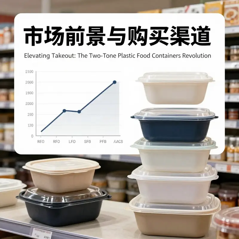
For buyers contemplating volume across multiple orders, pricing is a key variable. Market conditions historically show a broad range for PP takeout containers, with the final price depending on order quantity, customization, and packaging configurations. As a reference point, similar dual-compartment or two-tone designs can reveal a price arc shaped by scale, which often yields lower unit costs as orders increase. The logical expectation is that buyers granting long-term commitments or recurring orders can negotiate favorable terms, including color consistency guarantees and preferred lead times. This expectation, however, sits alongside the reality that the availability of consistent material grades, colorants, and molding capacity can be sensitive to fluctuations in raw material markets and currency movements across regions. In this sense, the economic value of a two-tone container is a function of forecasting accuracy, supplier reliability, and the flexibility of the manufacturing base to absorb spikes in demand without compromising the color and seal quality.
To illustrate how these considerations weave together in practice, consider the lifecycle of a typical order. A kitchen team selects a two-tone PP container for its reliability and brand fit, emphasizing a color pairing that aligns with their palette. The supplier confirms material compliance and confirms a tolerance for color consistency across batches. Once approved, the order moves into tooling and molding setup, where colorants forge the two-tone effect and the sealing geometry is validated for spill resistance. If the supply chain operates with a robust network of distributors and a responsive manufacturing line, the lead time remains predictable, and the cost remains within the expected band. The result is a packaging solution that not only keeps meals intact but also reinforces the brand’s visual language during the most critical moment—the moment of distribution into the hands of a hungry customer. As the ecosystem evolves, the integration of sustainability targets into this lifecycle adds another layer of value, as buyers increasingly seek packaging that balances performance with responsible end-of-life outcomes. In many cases, this means selecting suppliers who can document recyclability pathways or provide recycled-content options compatible with existing recycling streams, even if the two-tone design imposes some complexity.
For readers seeking a window into concrete procurement examples, such listings demonstrate the breadth of this market segment. In parallel with the narrative of two-tone efficiency, there is a broader story about how packaging choices influence consumer perception and repeat business. The color language of a container can become a shorthand for quality assurance and brand promise, a factor that can translate into tangible market advantages when paired with dependable service from suppliers and a clear plan for end-of-life management. Readers may also consider exploring related packaging categories—such as eco-friendly, design-forward alternatives in other materials—to understand how brands navigate the balance between aesthetics, cost, and sustainability across diverse product lines. If you are exploring a broader packaging strategy, the linked resource on customized eco-friendly designs offers a reference point for integrating environmentally conscious choices with compelling visuals, while still leveraging the tried-and-true performance characteristics of PP takeout containers. customized design eco-friendly 1300ml kraft soup and salad paper bowl with lid. For an external perspective on supplier listings and product specifications in this category, you can consult the following industry resource: Alibaba listing for Plastic Take Away 2 Compartment Containers.
Final thoughts
The rise of plastic takeout food containers, especially those with a two-tone design like the 126299361678 model, marks a significant leap forward in the foodservice industry. Their appealing aesthetics, coupled with high functionality and diverse applications, make them indispensable for businesses aiming to enhance their takeout offerings. As consumer preferences evolve, adopting these innovative containers can set your brand apart, attract more customers, and ultimately contribute to greater satisfaction with your services. Embracing these solutions not only leads to operational efficiency but also positions your business as a modern and thoughtful part of the culinary landscape.