In the competitive landscape of food and beverage service, the aesthetics of your offerings play a crucial role in attracting customers. Clear plastic cups with pretty designs not only add a touch of elegance but also elevate the visual presentation of drinks, making them perfect for bubble tea shops, restaurants, and event planners. This article delves into various aspects of these delightful cups, including design techniques that bring beverages to life, the materials that ensure quality and durability, market trends leading to increased popularity, maintenance tips for longevity, and sustainability considerations that modern consumers value. By understanding these components, businesses can make informed choices that enhance their brand while meeting customer expectations for both beauty and functionality.
Illuminating Clarity: Design Techniques that Elevate Clear Plastic Cups with Pretty Designs
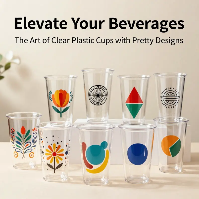
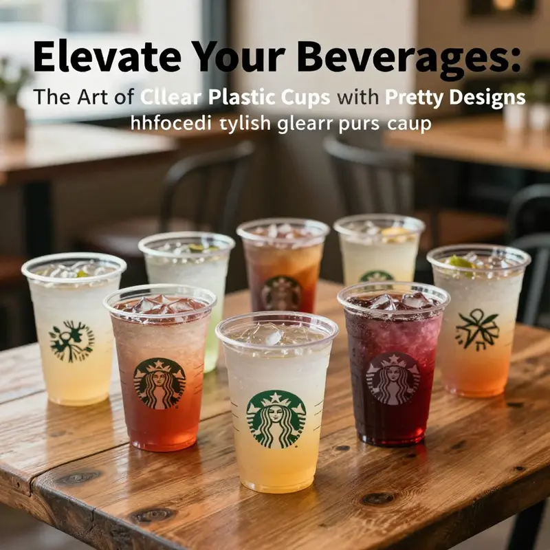
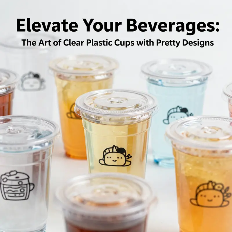
Clear plastic cups carry a quiet promise: the beverage inside remains visible, its hue and shimmer unmuted, while decorative elements add personality without shouting. The best designs respect that balance, turning a simple sip into a small moment of ceremony. Designing these cups requires a careful negotiation among material properties, printing or shaping techniques, and the intended setting. A cup used at a casual gathering, a themed party, or a busy cafe must perform as reliably as it looks. The choice of material matters first. PET and PP are commonly favored for clear cups because they offer high clarity, durability, and food safety. PET typically delivers a pristine, glass-like transparency that makes the beverage itself appear more vibrant, a quality that retailers and bartenders alike appreciate when presenting cold drinks with natural colors—amber iced tea, azure lemonade, or ruby juice. PP, while slightly less rigid, can offer better heat resistance and a smoother surface for certain finishes, which matters when the cup is touched, shuffled, or stacked during service. The environmental dimension has become inseparable from design decisions. Recyclability remains a practical imperative, and for some segments, bioplastics such as PLA provide an alternative path to sustainability. The most elegant outcomes, however, merge aesthetics with responsibility: designs that endure through repeated use or careful disposal, and coatings or finishes that resist wear without compromising recyclability. In practice, this means selecting plastics that hold ink well, resist scratching, and can be washed without substantial loss of fidelity. Designers who contemplate future reuse or recycling often embrace finishes that are non-toxic and compatible with standard cleaning routines, even if a product is marketed as disposable. The design process begins with an intimate understanding of the cup’s curvature and surface characteristics. Unlike flat media, a cup presents a cylindrical canvas with a continuous arc. A motif that reads well on a flat sheet may distort when wrapped around a curve, so artists work with vector-based layouts and take advantage of the cup’s seam line to align key design elements. This attention to geometry ensures that a floral motif, a geometric lattice, or a logo remains legible from multiple viewing angles. Digital printing has become a cornerstone of this discipline. It enables high-resolution, full-color imagery directly on the cup’s surface. Designers create artwork in vector programs, ensuring sharp lines and scalable detail. The inks used for plastic substrates are formulated for adhesion and colorfastness, and a protective coat is usually applied to mitigate abrasion and fading. The result can be a lush image—delicate petals, bold abstracts, or photographic-like scenes—that stays vibrant under cold or room-temperature beverages. When a brand or event seeks a one-off ambiance, digital printing makes it feasible to produce small batches with rapid turnaround, enabling limited-edition collections or seasonal motifs that enliven the table without large-scale inventory. Yet another approach is laser etching or engraving, a method that creates a permanent, tactile design by removing a thin layer of the plastic to reveal the clear substrate beneath. The effect is distinctly refined: frosted lines, matte textures, or crisp geometric patterns that improve grip while adding a premium feel. The etched design interacts with light differently than ink, producing subtle glints as the cup turns and the drink catches the glow of candles, LEDs, or daylight. Laser etching excels with minimalist aesthetics or intricate line art where a restrained, almost architectural quality is desired. For those seeking depth without ink, 3D molding with embedded inserts offers a visually striking alternative. In this approach, transparent or colored inserts are placed into the mold during injection, creating internal shapes or logos that appear to float within the cup. A miniature flower, a tiny emblem, or even LED elements can be embedded to create moments of wonder when the cup is viewed from different angles. The eye perceives depth as light refracts through the insert, and the overall experience is more immersive than a flat print could achieve. Decal transfer technology provides another layer of versatility. Pre-printed decals are applied to the cup surface, often activated by heat or water, to achieve complex finishes with metallics or holographics. This method can be cost-effective for small runs and enables effects that are difficult to reproduce with direct printing. However, decal transfers demand careful handling during application to prevent bubbles, misalignment, or peeling after washing. The choice among these techniques is rarely about one method alone. Rather, it is a decision matrix where visual goals, production scale, cost constraints, and sustainability targets converge. A floral pattern might be digitally printed for a bright, full-bleed effect that celebrates color. A logo might be laser-etched for a crisp, understated mark that reads well even on a partially filled cup. An embedded motif can create a sense of depth that invites closer inspection at a well-lit table. These possibilities illuminate how clear cups can serve as more than vessels; they become storytellers for the beverage and the moment. The capacity to pair form with function is essential, but so is an understanding of how designs endure in real-world use. Repeated washing and exposure to detergents can dull ink, especially on lower-grade substrates or with less durable finishes. The guidance from manufacturers often emphasizes gentle dishwashing or hand washing to preserve fidelity. When sustainable design is a priority, manufacturers are increasingly turning to durable, recyclable plastics and to coatings that resist wear while remaining compatible with recycling streams. The broader trend toward sustainability also shapes consumer choice, especially in hospitality and event settings where the combination of aesthetics and eco-responsibility is a differentiator. A pretty cup can elevate a beverage’s presentation and communicate a brand’s attention to detail, yet it must perform under the pace of service and the realities of cleanup. For a cafe or catering operation that emphasizes eco-conscious practices, the alignment between design and material choice becomes part of the brand narrative. This alignment is reinforced by the possibility of reusable, higher-end clear cups with etched or embedded designs that retain their elegance through multiple uses, while still offering the sparkle and clarity customers expect. The language of design here is as much about psychology as technology. Patterns with high contrast or bold color read clearly against the beverage’s hue, while lighter, more intricate motifs tend to disappear behind a deep amber or dark cola. Designers therefore tailor motifs not just to the cup, but to the typical drinks that will fill it. When a beverage’s color is the protagonist, the cup acts as a frame, enhancing the perceived intensity of the drink without stealing attention. The current momentum in design sees a convergence of artistry and sustainability: biodegradable or recyclable plastics, thoughtfully chosen finishes, and prints that withstand the rigors of real-world use without compromising recyclability. This convergence is not a compromise but a promise that pretty designs can be both visually arresting and responsible. To readers who want to explore further, the design of these cups sits at the intersection of craft and engineering—the same cross-pollination that has driven advances in other forms of consumer tableware. For those who wish to push creative boundaries, digital painting techniques, laser-work, 3D insets, and decal possibilities can be mixed and matched to craft limited editions for seasonal menus, weddings, or brand activations. It is a practice that honors the beverage’s color, the cup’s transparency, and the audience’s experience, turning every pour into a moment worth remembering. In short, the most successful clear cups with pretty designs balance clarity with character. They embrace material realities and production realities while inviting the eye to linger a fraction longer on both color and texture. This is where design becomes a quiet form of hospitality, inviting people to savor the moment as much as the drink itself. For readers seeking a concrete example of the broader principle—design that respects both aesthetics and ecology—this approach aligns with a growing emphasis on eco-conscious design in various cup formats, and it speaks to the enduring appeal of clear cups that celebrate beauty without masking utility. eco-friendly single-wall paper cup with printed logo.
Clarity, Craft, and Color: How Material Quality Elevates Pretty-Designed Clear Plastic Cups
Clear plastic cups carry more than beverages; they carry the promise of a moment well-presented. When a drink is poured into a transparent vessel, the cup’s material becomes a quiet stage for color, aroma, and design. The choice between polypropylene and polystyrene is more than a matter of weight; it shapes how vividly the decoration appears and how the cup withstands daily wear. In many commercial settings, clarity matters as much as durability, because the beverage itself becomes part of the visual equation. Designers and manufacturers balance transparency with strength, aiming for a surface that remains crisp under ice, condensation, and the occasional splash. The material sets the baseline for how long a design stays legible, whether the cup is used for a casual summer gathering or a formal event.
PP shines with a glow that stays even after repeated use, resisting moisture and temperature swings that threaten to dull a print. PS, lighter and stiffer, offers cost advantages and a pristine look but can be more sensitive to heat and sunlight. The material choice becomes a framing device for the artwork: a delicate floral motif may sparkle on PP with a subtler, waxy finish, while a bold geometric print on PS can appear almost enamel-like due to the surface tension and gloss level. The real magic happens when color and clarity align with food safety standards, ensuring that every swirl of color remains faithful to the original design.
Design integrity hinges on more than the raw plastic. It rests on inks that are certified food-grade, formulated not to bleed, migrate, or interact with the beverage. The printing methods—screen printing for thick, durable layers; digital printing for high-resolution artwork; laser etching for finer lines and subtle metallic accents—each leave a signature on the cup’s surface. A skilled set of hands and machines translates a two-dimensional design into a continuous wrap that can run from lip to base without wandering off. To preserve vibrancy, manufacturers often apply protective overlays or binding coats that guard against moisture and abrasion, yet these layers must remain safe for contact with liquids. Infrastructure also matters: the tolerances of injection or extrusion molding influence how evenly the wall thickness can follow a curved design. When done well, the result is a crisp image that remains legible and sharp even as beverages chill, clouds form on the inside of the cup, and light refracts through the liquid.
The chemistry behind the design is not hidden; it governs what consumers can expect from the first sip to the last drop. Food-grade inks reduce risk while enabling bright hues and precise lines. This is particularly important when a logo or a seasonal motif is used for branding or event theming. A high-resolution print can retain its edge when seen under LED or natural light, and a reliable printing process minimizes the risk of fictitious or mismatched color tones that would betray a brand’s quality promise.
Beyond aesthetics, material quality also shapes performance. Clear cups must contend with cold drinks, ice, and condensation that can creep along the inner surface and affect impression. A well-chosen PP or PS substrate resists moisture migration to the printed layer, helping to keep the design intact as the beverage remains cold. For beverages that sit in cups for longer periods, the question becomes how the surface handles immersion in a chill or in a room-temperature environment. In practice, designers select materials with low permeability to limit gas exchange that might cause clouding or discoloration over time. Even the edge finishing matters: a smooth, rolled rim reduces micro-abrasions on the artwork and contributes to a more polished silhouette that enhances the perception of quality. The rim itself must be compatible with lids and with stacking or refrigeration, adding another layer of compatibility checks to the design brief.
When the design is more elaborate—like a busy floral scene or a gradient wrap—the thickness of the wall and the rigidity of the plastic support the seamless wrap of color. If the wall is too thin, the print may distort under pressure from tongs, stirring spoons, or the weight of the liquid. If it is too stiff, the cup can feel brittle in slips or during handling in a busy service line. The balance of clarity, strength, and flexibility is a material science problem as much as a visual one, and it is achieved only through careful specification and rigorous testing.
Applications reveal how material quality translates into real-world impact. In promotional events, the aesthetic of the cup matters as much as the clarity of the beverage itself; a pretty design can become a memory anchor for a brand, an icebreaker for conversations, and a signal of care. In cafes and restaurants, a durable, high-clarity cup supports the eye-catching presentation of signatures or limited-time drinks, inviting customers to savor the whole sensory package rather than just the liquid inside. And in themed parties or seasonal celebrations, a consistent design language across cups reinforces mood and cohesion, turning a simple drink into a curated experience. The shared goal across these contexts is trust: when a cup promises vivid design and safe materials, customers are more likely to associate that experience with reliability and quality.
Yet this trust hinges on care in use. Repeated washing, aggressive detergents, or high-heat cycles can erode the printed layer, especially if the design rests on a lower-quality substrate or relies on older printing technologies. Hand washing or gentle dishwashing cycles, as recommended by manufacturers, extend the life of the artwork and help ensure that the cup remains a faithful canvas for future servings. Even with premium reusable options, wear can accumulate. In those cases, the distinction shifts from disposable convenience to long-term design integrity, and the same attention to material choice that benefits a single-use product becomes essential for sustainability.
It is here that the broader industry conversation about sustainability intersects with material quality. Reusable clear plastic cups with permanent, high-resolution designs are expanding in hospitality and events, offering a longer lifecycle while preserving the aesthetic appeal of the initial design. The market’s interest in products that balance environmental considerations with style has pushed suppliers to invest in tougher plastics, safer inks, and printing methods that resist fading through dozens or hundreds of cycles. Even as disposables remain a staple for many occasions, the rising demand for responsible alternatives underscores a shift in how material quality is judged. Consumers are not simply buying a pretty cup; they are choosing confidence that the vessel will retain its form and its decoration, drink after drink, event after event.
The design conversation also extends to the supply chain. Material suppliers and printers collaborate to align polymer choices with printing compatibility, ensuring that what looks vibrant in a showroom will survive the actual conditions of service. This collaboration reduces the risk of color mismatch, misalignment, or peeling that could undermine a brand’s message. In practical terms, it means that decisions about wall thickness, gloss level, and surface energy are not cosmetic afterthoughts but core components of product performance. When done well, the result is a cup that not only presents the beverage with pristine clarity but also holds up to the rigors of daily use, stacking, and transport.
From a strategic perspective, designers and buyers often compare clear plastic cups to other molded packaging choices to understand where the real value lies. The same care given to printing and material selection is echoed in other packaging formats that rely on durable, food-safe surfaces for branding and information. For those who want to explore related options in printing and sustainability, consider a resource on eco-friendly, printed logos for single-wall cups. For a practical example of eco-friendly printed logos on single-wall cups, see this resource: eco-friendly printed logo single-wall paper cup.
To place these ideas in a broader context, industry analyses emphasize that consumer expectations around aesthetics and safety continue to rise, with material quality serving as the foundation for both. A deeper dive into composition standards and industrial benefits provides a technical backdrop for these trends: https://www.partycity.com/blog/understanding-clear-cups-lids-composition-standards-and-industrial-benefits
Design as Glass: How Clear Plastic Cups with Pretty Designs Shape Brand Experience in Vietnam
Clear plastic cups with pretty designs have moved beyond mere containers to become canvases for brand storytelling and curated customer experiences. In markets where beverage presentation can sway a first impression just as much as flavor, these transparent vessels offer a rare combination: the clarity to showcase the drink’s color and the design language that communicates identity at a glance. This shift is particularly pronounced in Vietnam, where the food service sector and event ecosystems are expanding rapidly. Cafes, street vendors, and hospitality venues are increasingly leveraging cups as part of their visual vocabulary, recognizing that even small details—patterned rims, delicate motifs, or bold logos—can elevate a routine drink into a moment worth sharing. The trend aligns with a broader consumer expectation: packaging should be as thoughtful as the product, and presentation can be a driver of perception and value.
At the core of this transformation is the material and the printing technology that brings these designs to life. Cups made from PET or polypropylene strike a practical balance between clarity, strength, and safety for cold and room-temperature beverages. The goal is not merely to print on a surface but to integrate color and identity while preserving the beverage’s visual appeal. When a glass of iced tea or a fruit smoothie is poured into a transparent vessel adorned with a complementary motif, the colors of the drink and the graphic work in harmony. Consumers perceive quality not just in the liquid but in the entire glass that carries it. This is especially true in settings such as trade fairs, product launches, and promotional campaigns where aesthetics can amplify a brand’s narrative, drawing attention in crowded spaces and encouraging social sharing.
Design trends in this space are characterized by bold, high-contrast logos and vibrant themes applied to transparent cups. The effect is twofold: brands can illustrate their identity directly on the cup while the beverage itself remains a vivid, changing backdrop. For beverages like smoothies or craft beverages, the clear cup acts as a stage where the color and texture of the drink can take center stage, while the printed design provides context, mood, and signaling about quality. Printing methods—ranging from screen and digital printing to laser etching—have evolved to deliver durable, fade-resistant graphics that maintain their impact despite handling, temperature fluctuations, or exposure to light. This durability matters in outdoor events and busy venues where cups may travel from counter to table, or be reused in a quick-service cycle.
Branding and visual appeal drive much of the market dynamics in Vietnam. Clear cups are increasingly used for product launches, community outreach, and customer giveaways precisely because they combine low cost with high visibility. A well-designed cup can imprint a brand’s character long after the drink is finished, turning everyday consumption into subtle advertising and a reminder of the experience. In this context, the design is less cosmetic and more strategic: it reinforces positioning, triggers recognition, and supports a cohesive brand ecosystem that includes signage, menus, and digital touchpoints. The trend dovetails with hospitality operators’ desire to create cohesive environments where every element—from lighting to glassware—conveys care and attention to detail.
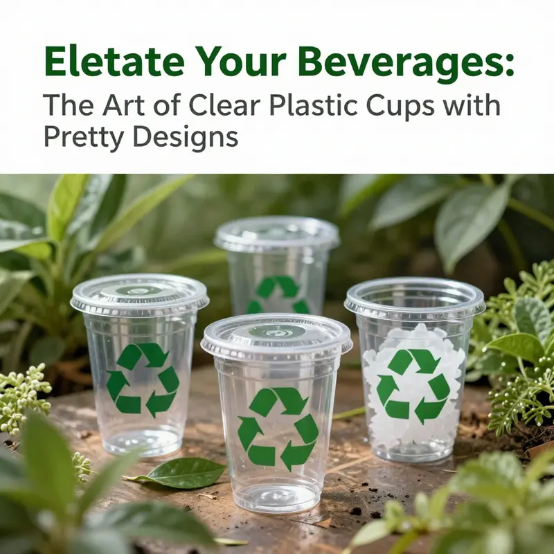
As the market grows, manufacturers and designers are exploring sustainability as an equally important dimension. Consumers and operators alike are increasingly mindful of environmental impact, and there is a parallel demand for eco-friendly materials and responsible sourcing without compromising visual appeal. Clear cups that can survive repeated use or are part of a circular packaging approach align with this consciousness. In practice, this means selecting materials and printing methods that minimize environmental footprints while preserving vibrancy and legibility. It also means offering reusable configurations where feasible, or selecting high-quality, recyclable plastics that can sustain long service lives in busy settings. Sustainability conversations are not a footnote here but a core driver of design choices, product development, and the messaging that accompanies campaigns and events.
Yet durability remains a practical concern. Repeated washing or exposure to strong detergents can fade designs over time, particularly on lower-grade materials or with less durable printing engines. Industry guidance emphasizes gentler washing cycles or hand washing to preserve aesthetics, a consideration that operators must weigh when choosing between disposable and reusable options. In places with heavy foot traffic and outdoor events, fade resistance becomes a differentiator, informing manufacturers’ investments in inks, coatings, and plastic formulations that resist wear while maintaining clarity and color integrity.
The Vietnam market embodies this balance among aesthetics, functionality, and sustainability. Clear cups are increasingly viewed not simply as disposable containers but as integral components of brand presentation and customer experience. For event organizers and food service operators, the investment in well-designed clear cups pays off in stronger brand recall, more engaging displays, and higher perceived value for beverages that might otherwise look ubiquitous. The forward-looking segment also reflects a broader market shift toward environmentally minded packaging choices, a trend that resonates with global sustainability narratives and local regulatory and cultural contexts alike. Industry observers point to ongoing developments in materials and printing technologies that will further enhance color fidelity, durability, and environmental compatibility, enabling designers to push the boundaries of what a transparent cup can carry—story, value proposition, and memory—all in one.
For practitioners seeking concrete guidance, the practical takeaway is to harmonize design with beverage color, material selection, and care instructions. The design should be legible from a distance and align with the mood of the event or venue, whether that means a playful floral motif for a spring promotion or a strong, minimal mark for a formal product launch. The printing approach should be chosen with the intended use in mind: high-traffic venues may demand more durable methods, while limited-run campaigns can leverage rapid digital printing to test concepts before scaling. In markets like Vietnam, where the pace of adoption is rapid and consumer tastes evolve, a flexible strategy that accommodates both reusable and disposable formats can reduce risk while expanding reach. The beauty of the clear cup lies in its transparency—not just of the beverage, but of the brand’s ethos and its commitment to an experience that feels thoughtful, polished, and timely.
A practical example of how design can balance branding with sustainability and practicality can be found in related formats that emphasize eco-friendly printing and reusable use cycles. eco-friendly printed-logo single-wall paper cup offers a glimpse into how printed logos can travel across formats while maintaining clarity and impact. This reference underscores the industry-wide move toward integrating aesthetic appeal with responsible materials and production practices, a trajectory that is likely to shape clear cup design across categories in the years ahead. For policymakers, suppliers, and brand managers looking to anchor their visual campaigns in current market realities, the Vietnam Plastics Industry Outlook 2026 provides a broader context on the factors shaping demand and the trajectory of packaging innovations within the region. External resources illuminate how consumer preferences, regulatory frameworks, and technological advances intersect to push the market toward more attractive, more durable, and more sustainable solutions.
In sum, the rise of clear plastic cups with pretty designs reflects a sophisticated convergence of form, function, and foresight. The cups are not merely vessels; they are vehicles for color, identity, and shared experience. As design becomes an essential component of customer interaction and as sustainability moves from a trend to a baseline expectation, the cup—from its clarity to its print—must perform across multiple dimensions: it must showcase the drink, convey brand values, endure practical use, and align with evolving environmental standards. In Vietnam and beyond, this is more than a design brief; it is a strategic opportunity to redefine what a simple glass can communicate and how a small gesture of presentation can amplify a brand’s story in a crowded marketplace.
External resource: https://www.vietnamplastics.org.vn/reports/2026-industry-outlook
Durability and Care for Clear Plastic Cups with Pretty Designs
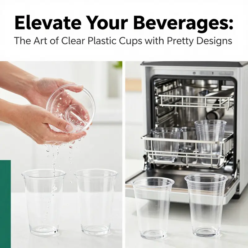
Clear plastic cups with pretty designs sit at an intersection of form and function. They invite the eye with delicate florals, vibrant motifs, or bold branding, while offering the transparency that lets the beverage color speak. The appeal is both emotional and practical: elegance without fragility, personalization without heavy glassware, and a surface that travels easily from kitchen to table. The materials behind the glassy surface—commonly polypropylene or polystyrene—combine clarity with resilience, but the true test of style lies in how well the design wears over time. In everyday use, these cups must endure bumps, condensation, and the cycles of cleaning, while keeping the artwork legible and the cup safe for guests. It is a delicate balance that designers navigate by selecting the right substrate and a compatible printing and coating method.
Durability is determined by the base plastic. Polypropylene offers heat resistance and toughness, helping the cup hold its shape at common beverage temperatures. Polystyrene provides crisp clarity and a lighter feel, enhancing a pristine presentation. Both materials can withstand typical casual-use temps, and both resist minor impacts. Yet the decorative ink or coating is more exposed to wear. Repeated washing, abrasives, or harsh detergents can erode the design, especially if the ink is not heat- or UV-stabilized. Many producers pair high quality inks with protective coatings to resist humidity, heat, and light.
From a hospitality perspective, the visual impact is part of the guest experience. A floral motif can elevate an iced tea, while a bold logo reinforces brand presence. But longevity matters: fading or blur undermines the message and perceived quality. Clear cups show smudges, cloudiness, or color shifts more readily, so care routines are an investment: follow manufacturer recommendations, avoid abrasive tools, and train staff to minimize wear.
Maintenance is simple but important. Most clear cups are dishwasher-safe on top racks with gentle cycles; however, high heat can shorten life. Hand washing with a non-abrasive sponge minimizes micro-scratches and preserves the ink layer. Storing cups in a cool, dry place away from direct sunlight slows color fade. When stacking, use spacers or soft liners to prevent scuffing of the printed area.
Design methods influence durability. Screen printing yields vivid colors and durability but benefits from a robust base. Digital printing enables gradients but may require specialized inks for repeated contact with liquids. Laser etching offers a different look and can resist fading but may alter texture. Choosing a method is about balancing appearance, washability, and the expected lifespan in busy service environments.
For brands pursuing sustainability, reusable clear cups with durable, high-resolution designs are increasingly common in venues that emphasize eco-conscious service. These options demand mindful handling and proper cleaning protocols to maintain their appearance. The right combination of substrate, ink, and protective coating can deliver a sharp image that endures wash cycles while letting the beverage color show through.
Ultimately, durability and maintenance shape how a design travels from concept to table. The goal is to harmonize clarity with a surface that invites touch and social sharing without compromising longevity. With the right care routines and appropriate equipment, a cup can preserve its artwork from first sip to last.
null
null
Final thoughts
Clear plastic cups with pretty designs serve as a fusion of aesthetic appeal and functional durability, making them an exceptional choice for beverage providers looking to enhance their offerings. By understanding the various design techniques, material qualities, and market trends while also prioritizing durability and sustainability, businesses can make strategic decisions that resonate with customers. As the demand for unique and visually appealing beverage presentations continues to rise, investing in quality clear plastic cups can create memorable experiences that set establishments apart in a crowded market.