In today’s competitive beverage landscape, effective branding and compliance are critical for success. Clear labels for plastic cups provide an innovative solution that blends aesthetic appeal with regulatory requirements, enhancing product visibility and consumer connection. For bubble tea shops, beverage chains, and catering services, utilizing clear labels is essential not only for branding but also for ensuring product information is easily accessible. By exploring the materials and durability options, customization possibilities, regulatory compliance, and shifting consumer preferences, businesses can make informed decisions that boost customer engagement and trust. Each chapter of this article delves deeper into these themes, promising a comprehensive understanding for professionals seeking to optimize their labeling strategies.
Seeing Through Branding: The Critical Role of Clear Labels on Plastic Cups
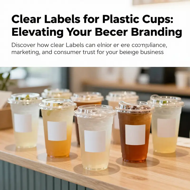
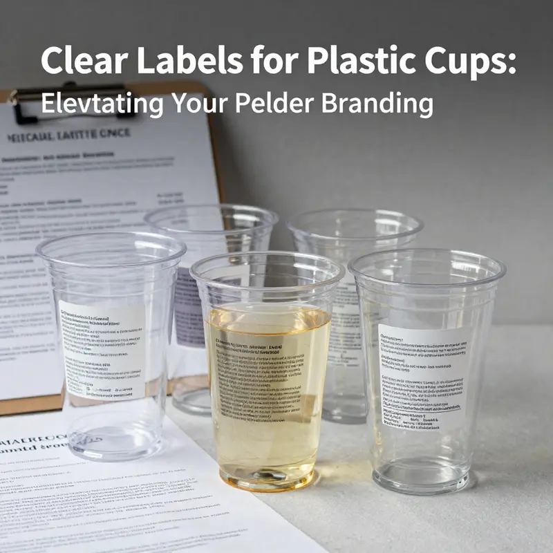
A clear label on a plastic cup does more than identify the contents; it acts as a bridge between a brand and the person holding the cup. When a label remains legible through moisture, heat, and frequent handling, it becomes a steady touchpoint that communicates reliability, safety, and a brand’s values. In this sense, clear labeling is not a peripheral feature of packaging design but a core instrument of storytelling and trust. The choice of label material, the clarity of the information presented, and the label’s durability under real-world conditions converge to shape how consumers perceive a product long before they sip. The case for clarity is not merely about compliance; it is about aligning branding with the lived experience of the cup—from the moment it is filled to the moment it is recycled. In practice, that means investing in labeling that can withstand everyday use while still conveying essential details that matter to the shopper and the regulator alike. A primary consideration is the label’s material and its relationship to the cup itself. Waterproof vinyl, for example, offers a compelling combination of moisture resistance and colorfastness. It can endure condensation, spilled liquids, and cleaning cycles without fading. When a label stays crisp, the logo remains recognizable, and the message remains legible, the brand avoids a jarring misalignment between its intended image and the actual product seen by the consumer. This durability ultimately reinforces perceived quality and reduces the friction that can undermine a customer’s trust in the brand. The materials used for cups—polycarbonate (PC), polypropylene (PP), and polyethylene terephthalate (PET) among them—also shape how labeling is perceived and how the brand is judged. PC cups may be associated with certain chemical considerations, such as the presence of bisphenol A (BPA) in some contexts, which has driven demand for alternative materials. When labels clearly indicate the cup’s material and any associated safety considerations, they empower consumers to make informed choices. This kind of transparency resonates with a growing segment of eco-conscious buyers who want to know not only what they are drinking but how the container is made and how it will be disposed of. The label, therefore, becomes a concise statement about sustainability, health, and corporate responsibility, all of which contribute to brand credibility. The reality that many consumers expect straightforward, trustworthy labeling underscores a broader shift in how brands communicate. Rather than relying solely on flashy colors or clever taglines, modern labeling emphasizes clarity, completeness, and ease of understanding. A well-designed label lets a shopper quickly identify critical information: the material type, recyclability, production date, and the organization responsible for the product’s safety. The inclusion of certification marks or compliance indicators—such as production licenses or quality standards—helps prevent confusion and reinforces the sense that the brand adheres to recognized benchmarks. Such details matter especially when products are used in fast-paced or high-demand settings, including events, cafes, and take-away operations where quick decisions are the norm. A label that plainly states the cup’s material and its safety credentials reduces the cognitive load on staff and consumers alike. It also minimizes the risk of mislabeling or miscommunication, which can lead to regulatory penalties or customer dissatisfaction. The regulatory landscape around plastic cup labeling is not static, but certain core expectations remain consistent across markets: the material type should be identifiable; essential regulatory information should be legible; and contact details for the manufacturer should be readily accessible. These requirements serve dual purposes. They protect consumer safety by enabling traceability and accountability, and they support brand integrity by creating a transparent dialogue with the customer. When brands meet these expectations, they signal that they respect the consumer’s right to information and the community’s standards for safe, responsible manufacturing. The resonance of clear labeling extends beyond compliance. It influences market positioning in meaningful ways. In a market where brands vie for trust and loyalty, those that invest in informative, visually appealing labels are perceived as responsible stewards of health and the environment. This perception translates to stronger customer loyalty and a more durable competitive edge. Consumers are increasingly selective, favoring products that provide not only an appealing design but also substantive information about materials and safety. A label that communicates these elements effectively can tip the balance in a purchase decision. The design of the label itself matters as much as the data it conveys. Readability—through appropriate typefaces, contrast, and size—ensures that information remains accessible in real-world conditions. Placement matters as well; labels should be positioned so they are seen at the moment of purchase and remain intact during use. A label that peels, smears, or becomes illegible can undermine the very trust it seeks to build. The integration of design and information is most powerful when the brand complements the label with clear messaging about sustainability and care for the consumer. Transparent labeling aligns with a broader consumer expectation for honesty and openness. When a brand communicates, in a straightforward way, that its products comply with safety standards and regulatory requirements, it signals a commitment to long-term product stewardship rather than a quick, cosmetic presentation. The practical implications of clear labeling extend into the everyday experience of customers. For someone choosing a beverage in a crowded venue, a clear label offers quick confirmation of the container’s safety and quality. It can also provide practical guidance, such as the cup’s compatibility with specific beverages, serving temperatures, or whether the cup is suitable for recycling after use. This information reduces guesswork, speeds up service, and can improve the overall customer journey. In this sense, the label becomes a facilitator of a smooth, confident consumer experience rather than a mere decorative feature. The concept of material transparency is central to this narrative. By identifying whether a cup is made from PC, PP, or PET, a label communicates not only safety considerations but also environmental implications. Consumers who care about recyclability or the life cycle impact of a product will read this information closely. Clear labeling about recyclability and end-of-life handling supports responsible disposal choices and can influence a brand’s reputation for environmental stewardship. An explicit acknowledgment of the label’s own durability and the surface it adheres to also matters. The adhesive’s interaction with different plastics and its resistance to moisture can determine whether the label endures throughout use or becomes loose in a way that compromises legibility. In turn, this affects brand perception. When labels perform reliably, the brand’s promise of quality is reinforced. A durable, legible label communicates consistency: the brand stands behind its product from shelf to sip to disposal. It also reduces waste associated with replacing damaged labels and lowers maintenance costs for retailers, which can translate into a more efficient packaging ecosystem overall. Brands can take practical steps to implement clearer labeling without compromising aesthetics. First, select label materials designed for the product environment—waterproof options that resist fading and smudging. Second, design for readability in the context of typical cup sizes and beverages. This includes matching font sizes to the most common viewing distances in a café or event setting and ensuring high-contrast color palettes for quick recognition. Third, align the label content with regulatory expectations while keeping the information concise. A well-structured label might present the material type, production date, manufacturer contact details, and a certification mark in a compact layout that does not overwhelm the visual identity of the cup. Fourth, consider the user journey beyond purchase. Labels should be legible in transit, during consumption, and in post-use contexts like recycling centers or waste streams. This forward-thinking approach helps ensure that the label continues to serve both the consumer and the environment even after the cup is emptied. To illustrate how these principles translate into practice, consider brands that emphasize sustainability through their labeling. The choice to feature a clear statement about material safety—paired with a logo and a straightforward reference to recyclability—can convey a strong message about environmental responsibility. In some cases, the label itself can become a canvas for storytelling, conveying a brand’s commitment to ethical sourcing, safe manufacturing, and transparent communication. For those seeking examples of how such labeling strategies can be implemented in a practical way, one may explore options that emphasize eco-friendly design and legible information, such as the option to showcase a logo on a clear, durable label that remains readable on the cup through multiple uses. This approach not only preserves the brand’s aesthetic integrity but also helps ensure compliance with safety and labeling standards across markets. The synergy between labeling and brand identity becomes particularly evident in the context of consumer interactions at point of sale and during service. A clear label can act as a differentiator in a crowded market by signaling to the customer that the brand values clarity, safety, and environmental responsibility. This can foster a sense of trust that extends beyond the immediate purchase, encouraging repeat behavior and word-of-mouth recommendations. In sum, clear labeling on plastic cups serves a trifecta of purposes: it supports regulatory compliance, enhances consumer safety, and elevates branding and marketing. It accomplishes this by providing material transparency, comprehensive information, and a design that harmonizes aesthetics with legibility. The label becomes a trusted narrator of the product’s story, one that helps brands communicate their values while guiding consumer choice. When done well, labeling does more than reduce risk; it adds value by enriching the consumer experience with clear, actionable information that respects both the customer and the environment. This holistic approach to labeling, grounded in materials science, regulatory awareness, and design sensitivity, offers a practical path for brands aiming to build durable relationships with their audiences. It invites brands to tell a more complete story about their cups and, by extension, about their commitment to quality, safety, and sustainability. For those who want to see how this approach translates into real-world packaging options, an example of a label strategy that aligns with these principles can be found in the broader catalog of eco-conscious labeling solutions; you can explore a representative option here: eco-friendly-printed-logo-cold-beverage-cup-paper-cup-with-lid. Additionally, readers can consult official guidelines to understand the regulatory framework underpinning these practices and how they translate into labeling requirements across jurisdictions: https://www.cnas.gov.cn/xxgk/xxgk/2022-07-13/65194.html.
Transparent by Design: Materials and Durability Behind Clear Labels on Plastic Cups
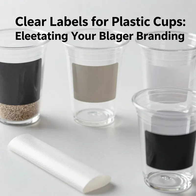
Clear labels on plastic cups sit at the intersection of aesthetics, function, and trust. They must disappear into the cup’s surface enough to let a brand’s identity shine through, yet be robust enough to survive the life cycle of a beverage. Material choice and durability are not afterthoughts but the backbone of successful labeling. When a label remains legible, resists moisture and heat, and preserves the clarity of a logo or regulatory text, the consumer’s perception of the brand shifts. The label becomes a reliable cue that travels with the cup itself. In this sense, clear labels are more than a surface treatment; they are a promise that what’s printed on the cup will endure long enough to convey the brand’s message, even as condensation forms on the exterior.
At the core of material choice are three broad families that dominate the field: polyester, vinyl, and specialized clear films. Each offers a different balance of durability, print quality, and interaction with the cup’s surface. Polyester labels stand out for their exceptional moisture and chemical resistance. They are designed to hold up under a wide range of temperatures, which is crucial when a cup carries a hot beverage or sits in a cool environment that still sees humidity on its exterior. The print quality on polyester is generally high, with stability that reduces the risk of color shift over time. For brands that prioritize long-term legibility and a crisp display of logos, ingredient lists, or barcodes, polyester provides a dependable foundation that won’t fade or smear with normal handling.
Vinyl labels, by comparison, emphasize durability in environments where moisture is a consistent challenge and where the label might experience more physical wear. In many settings the cup may be handled by multiple hands, passed across tables, slipped into holders, or stacked with other cups. Vinyl’s adhesive systems and flexible film structure help the label resist tearing and moisture intrusion, maintaining legibility when condensation beads along the cup’s surface. Its resilience is particularly valuable for high-usage scenarios where a label must survive frequent contact with fingers, sleeves, or tippers that could otherwise abrade or lift thinner substrates.
Specialized clear films complete the triad by addressing niche conditions. These substrates can be tailored for enhanced adhesion to smooth, non-porous plastics and for specific printing methods. They may offer optimized gloss levels, improved optical clarity, or adhesive chemistries engineered to minimize phenomena such as silvering or edge lifting when the cup is bent or curved. In practice, these films support a clean, near-invisible appearance that preserves the cup’s own color and the branding elements printed on the label. While their properties can be more specialized, they are a vital option when a brand needs specific performance in challenging environments.
Durability testing in the research context often centers on exposure to moisture, heat, UV light, and mechanical wear. Polyester and vinyl labels are typically tested for resistance to moisture migration, which can cause print to blur or colors to fade if the ink and substrate are not well aligned. When hot beverages are involved, the label must survive not just heat but the steam that accompanies the beverage’s journey from machine to mouth. The label’s resilience to condensation is crucial; even a small amount of bubbling or edge lifting can compromise legibility, undermine brand clarity, and trigger consumer doubt about the product’s safety and quality. UV stability also matters, because outdoor use or exposure to bright indoor lighting can bleach or alter inks over time. The durable labels are designed to resist UV-induced fading, preserving the integrity of a brand’s identity as the cup moves through different lighting environments.
Beyond the substrate and adhesive, print quality plays a critical role in durability and readability. Clear labels must present color accuracy and image fidelity when viewed through a transparent layer. This means that the printing process—whether digital, flexographic, or thermal transfer—must be calibrated to deliver sharp lines, solid fills, and faithful color reproduction on a substrate that is itself clear. When the label is placed on a colored cup, the printed elements must be tested for how they interact with the cup’s base color. The result is a label that reads cleanly, with logos and text that remain crisp as the cup is filled and as condensation forms on the exterior.
In practice, the ideal clear-label solution balances three factors: durability, aesthetics, and regulatory clarity. From a regulatory standpoint, many food-contact labeling requirements demand clear presentation of important product information, allergen statements, and safe handling notices. Clear labels must maintain these elements without the information becoming obscured by the label’s transparency or the cup’s color. The material choice supports this objective by providing a stable substrate that holds a legible print over time, even when exposed to the routine stressors of a busy environment. A label that remains legible under these conditions does more than satisfy compliance; it reinforces consumer trust. When customers can read the label without struggle, there is a perceived commitment to transparency, which in turn can influence purchasing decisions and brand loyalty.
Design is a dimension to consider as well. Clear labels encourage a brand’s design language to breathe through the cup’s surface. The material’s optical properties—gloss level, haze, and clarity—determine how much of the cup’s own hue and texture remains visible behind the print. A well-chosen substrate allows a logo to sit in harmony with the cup’s color and shape, avoiding the impression of a sticker slapped on a container. The label should feel like an extension of the cup rather than an afterthought. For brands seeking to emphasize sustainability or a premium aesthetic, the right clear-label material can translate those values into a tangible, everyday experience.
Cost and sustainability are part of the calculus as well. Polyester and vinyl labels carry different price points, but durability often translates to lower total cost of ownership when you consider reduced re-labeling and waste from damaged labels. The strategy is not merely about resisting moisture or withstanding heat; it is about preserving the label’s role as a consistent touchpoint between product and consumer.
To connect these considerations with practice, teams look to real-world applications where clear labels truly matter. The design intent is not merely to wrap a cup with a pretty surface; it is to ensure a cohesive experience from first glance to last sip. The interplay of substrate selection, adhesive chemistry, printing technology, and die-cut tolerances all contribute to a label that remains clean, legible, and visually integrated with the cup design.
Finally, the sustainability dimension matters. Since the cup and its label are often part of a disposable packaging system, brands seek approaches that minimize environmental impact while preserving readability. This can involve using more durable label formulations, exploring end-of-life pathways where the label can be separated from the cup for recycling, or choosing printing methods that reduce waste and energy use.
Taken together, the durability narrative for clear labels points to a practical philosophy: choose substrates that respect the cup’s surface and customer expectations, select adhesives that endure temperature and moisture shifts without sacrificing readability, and apply printing methods that preserve color fidelity and edge sharpness. When done well, the label becomes nearly invisible in its function—presenting essential information and branding with a sense of understated confidence. It is a reminder that the success of a simple cup’s label rests not on a single standout feature but on a carefully engineered compatibility between surface, seal, pigment, and purpose.
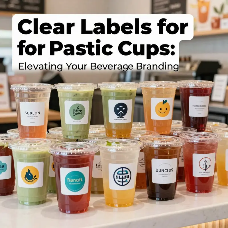
Clear, Crafted, Connected: Custom Transparent Labels that Turn Plastic Cups into Brand Ambassadors
Clear labels on plastic cups do more than identify a beverage. They are a surface for storytelling, a shield against moisture, and a tool for trust. In a world where container design often drives first impressions, transparent labels let the cup speak in your brand’s voice while the liquid remains visible. The choice of a clear film, the finish, the adhesive, and the shape all work together to deliver legibility and elegance that does not obscure the product itself. This is not merely about printing a logo; it is about turning a disposable item into a deliberate marketing touchpoint that travels from the production line to the consumer’s hand and beyond.
When brands consider customization for clear labels on plastic cups, they are really weighing how a label behaves as a member of the product, not just as a label. The most immediate benefit is visual: a logo, colors, and messaging appear with pristine clarity against the cup’s transparent surface. The label’s transparency must be supported by a printing process that preserves color accuracy and edge definition, even when the beverage inside is pale or saturated. Full-color printing on a transparent film makes the brand image pop without adding visual bulk. It also avoids the problem of a printed area fighting against the cup’s color, which can dilute the brand’s contrast if the label is opaque. In practice, this means using high-quality digital printing on a clear film that adheres smoothly to the cup’s curve, creating a seamless surface that reads as part of the cup rather than as a separate sticker.
A central consideration is durability. Clear labels for cups must stand up to moisture, condensation, and occasional wipe-downs, especially in self-serve or outdoor settings. Waterproof vinyl or similarly engineered films meet this need. They resist smudging and fading, ensuring that logos and essential information stay legible from the moment the cup leaves the production line until it is disposed of or recycled. The durability of the label reinforces brand reliability. Consumers come to expect that what they see on the cup accurately reflects what’s inside the beverage, and a label that deteriorates can erode trust just as quickly as a mislabeled allergen notice might.
Beyond durability, customization options offer versatility. Custom transparent labels with full-color printing allow brands to print the logo, a design motif, or a message directly onto a clear, glossy, or matte finish film. The result is a label that harmonizes with the cup’s transparency, letting the beverage’s own hue influence the overall aesthetic rather than hiding behind an opaque graphic block. Finishing choices matter: glossy film tends to intensify color contrast and give a vibrant, crisp look, while matte clear film provides a modern, understated elegance and reduces glare in bright environments. The choice between gloss and matte is often strategic, tied to the brand’s personality and the context in which the cup will be used.
Custom shapes extend the potential. Die-cut labels can follow the cup’s curvature, wrap around the body, or frame the logo with negative space. Circle, ellipse, or custom silhouettes can emphasize a central mark or create a repeated branding motif around the cup. When alignment is precise, the label reads as a natural extension of the vessel rather than a sticker. This harmony between form and function supports readability at a glance and enhances perceived value.
Durability and sustainability intersect through adhesive choice. Permanent adhesives provide security during transit and stacking, while removable options accommodate reusable-cup programs or events that require easy label refresh without harming the cup or the label. The production plan should balance adhesion with end-of-life goals, ensuring the material and adhesive suit recycling streams where feasible.
A well-integrated approach links label design to broader packaging systems. Clear labels should be considered in tandem with cup geometry, lid design, and any sleeves or secondary packaging. When brands align the label identity with existing design language—color, typography, and imagery—the result is a cohesive brand expression that travels with the product through every touchpoint. In co-branding scenarios, the label can be a partner piece that complements the cup’s narrative without overpowering it.
Finally, the sustainability conversation is central to modern labeling. Eco-friendly films, compatible inks, and recyclable adhesives enable a clear label strategy that respects environmental objectives. The aim is to deliver a durable, legible label that supports brand transparency while fitting within responsible packaging ecosystems. A thoughtful supplier partnership can deliver a label program that stays legible through moisture and handling, while still meeting sustainability commitments.
In short, clear labels on plastic cups are a strategic asset, not a decorative afterthought. They enable brands to communicate identity, compliance, and value with clarity and confidence, turning a disposable item into a portable ambassador that travels from production to hand to home.
Clear, Compliant, Confident: Navigating Food‑Contact Rules for Clear Labels on Plastic Cups
Regulatory clarity is as important as label clarity. For businesses using clear labels on plastic cups, compliance means more than meeting a single checklist. It requires aligning materials science, printing processes, manufacturing controls, and documentation with the legal frameworks that protect consumers and preserve brand trust. Proper compliance preserves the label’s visual transparency while ensuring nothing migrates into the food or beverage inside the cup.
Regulatory frameworks in major markets set the baseline. In the United States, materials that contact food fall under the Food and Drug Administration’s remit. Films, adhesives, and inks used in labels must meet food‑contact standards and avoid substances that migrate into food. The relevant statutes require food‑grade components and limit indirect additives. In practice, that means choosing substrates like BOPP or PET films with documented food‑contact approvals, adhesives cleared for direct or incidental food contact, and inks whose chemistries have been demonstrated safe under intended use conditions.
Across the European Union, rules are similarly rigorous but expressed through harmonized regulations. Materials and articles intended for food contact must comply with Regulation (EC) No 1935/2004, which establishes a safety objective and requires that materials not transfer constituents to food in quantities that could endanger health. For plastics specifically, Regulation (EU) No 10/2011 sets permitted substances and migration limits, and requires labeling that enables traceability. REACH further constrains chemicals used in inks and adhesives, meaning some conventional solvents, plasticizers, or pigments are restricted or banned. For clear labels, this dual requirement—safety of substance and traceability of supply—shapes supplier selection and the documentation businesses must maintain.
Design and material choices for clear labels are not purely aesthetic. Transparency depends on avoiding additives and coatings that haze or yellow. That limits the use of certain varnishes and laminates. It also shifts preference toward water‑based, UV‑curable, or food‑approved solventless inks. Those options lower migration risk and keep printed elements crisp without compromising the cup’s transparency. UV inks cure quickly, reducing volatile residues, but they must be specified and tested for food contact. Water‑based systems avoid many organic solvents, yet they require careful drying and curing controls to prevent microbial growth or tackiness on the label surface.
The heart of proving compliance is testing. Migration testing evaluates whether any components of the label can transfer into a food simulant under realistic conditions. Two complementary approaches are common: overall migration testing, which measures the total amount of non‑volatile substances transferred, and specific migration testing, which quantifies individual regulated substances. Testing protocols mimic worst‑case conditions—temperature, contact time, and the type of food (acidic, fatty, aqueous). Aging and shelf‑life tests assess whether heat, light, or time increase migration risks. Sensory tests may be needed to confirm that labels do not impart odors or tastes. Businesses should treat test results as part of a living file, repeated when materials, suppliers, or printing methods change.
Documentation and traceability are equally important. Regulators expect a traceable chain from raw materials to finished goods. That includes manufacturer declarations of compliance, certificates for inks and adhesives, batch records, and migration test reports. For products marketed in the EU, labeling often needs to include identification elements such as manufacturer details, batch numbers, and appropriate polymer identification or recycling codes. Traceability simplifies recalls and demonstrates due diligence in the event of an inquiry. Maintaining a single, indexed compliance dossier per label design streamlines audits and supports internal quality programs.
Operational controls complement material selection and testing. Good Manufacturing Practices (GMP) for food contact materials require controlled production environments, validated cleaning procedures, and employee training on contamination risks. Print houses and converters should operate with segregation protocols to prevent cross‑contamination between food‑grade and non‑food‑grade jobs. Storage conditions matter: humidity and temperature influence adhesive performance and ink stability. Clear labels are especially sensitive to contamination that can cloud or stain the film, so storage in clean, dry, climate‑controlled spaces is essential.
Working with suppliers is a risk‑reduction strategy. Ask suppliers for specific statements about food‑contact approval, supported by lab reports. Evaluate their testing frequency and whether they will notify you of regulatory changes. A supplier with a robust compliance program can provide substitute materials quickly if a restricted chemical appears on a watch list. Collaboration with converters also matters: plate setup, curing parameters, and varnish application all affect the finished label’s safety and clarity. Formalize these expectations in purchase orders and supplier quality agreements.
A practical compliance pathway follows a few core steps. First, define the intended use scenario: hot or cold beverages, alcoholic or acidic drinks, contact time, and storage conditions. Second, specify acceptable materials and printing chemistries before procuring samples. Third, run a targeted testing program: overall migration, specific migration for regulated substances, and stability under light and temperature. Fourth, assemble a compliance dossier with supplier declarations, test results, and production controls. Finally, implement ongoing surveillance—repeat testing after material changes and maintain records for audits.
Label content obligations sometimes extend beyond material safety. For food‑service businesses, regulatory regimes may require that certain information appear on packaging: manufacturer or packing identification, batch codes, and recycling or polymer identification marks. Even when a label is clear to preserve branding, leaving space for mandatory data is essential. Make these elements unobtrusive yet legible—microprinting, a dedicated small panel, or ink differences that remain readable against the beverage can achieve compliance without compromising aesthetics.
Sustainability considerations increasingly intersect with compliance. Recyclability schemes want materials that do not contaminate recycling streams. For example, some clear adhesives or inks can interfere with mechanical recycling of PET. Therefore, the best practice is to select inks and adhesives compatible with the recycling pathways used in the product’s market. That choice keeps labels both compliant and circular, aligning regulatory safety with environmental responsibility. When relevant, provide recyclability information on the label or through QR codes linked to recyclability guidance.
Globally distributed products add complexity. A formulation that meets U.S. requirements may not automatically satisfy EU or other jurisdictions. Some countries adopt their own positive lists or test regimes. A practical approach is to design to the strictest anticipated regulation for the markets served. That reduces the chance of rework and ensures consistent supply chains. For cross‑border sales, maintain copies of relevant declarations of compliance in the local language where required.
Finally, adopt a risk‑based mindset. Not every label component carries equal hazard. Prioritize testing and control for components that contact food directly or lie within reach of food through migration routes. Use supplier audits, review certificates, and spot tests to confirm ongoing compliance. When in doubt, consult regulatory experts or accredited laboratories to interpret migration data and regulatory applicability.
For businesses balancing branding and regulation, clear labels can deliver both transparency and compliance. Thoughtful material choices, rigorous testing, controlled production, and thorough documentation form a single, integrated compliance program. When labels remain visually clear and legally sound, they strengthen brand promises and protect consumers. For a complementary look at eco‑friendly cup options that pair well with compliant labeling strategies, see this resource on eco‑friendly printed cold beverage cup options: eco-friendly printed cold beverage cup options.
For authoritative regulatory guidance and official updates on food contact materials, consult the Food and Drug Administration’s resources: https://www.fda.gov/food/food-contact-materials
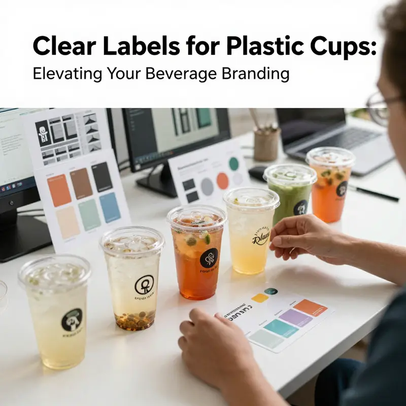
Seeing Clearly: The Strategic Power of Clear Labels on Plastic Cups for Branding, Compliance, and Consumer Trust

Clear labels on plastic cups do more than declare what the cup holds. They serve as a surface where branding meets practical communication. In a crowded market, the label becomes a small but potent canvas made of waterproof vinyl that endures moisture, condensation, and frequent handling. When labels are clear, the cup remains visually honest, allowing the product inside to shine while still carrying essential information. The choice of material matters: waterproof vinyl resists fading and peeling, ensuring logos and instructions stay legible from service counter to consumer hand. The design challenge is to balance aesthetics with legibility and durability. Brands seek to project a coherent story across packaging and product. The label must support the cup’s function—whether it is a simple cold-drink vessel or a multi-use service item that will accompany customers through a meal, a festival, or a long commute. This requires more than decoration; it requires legible content, clean typography, and predictable placement so that the label reads correctly from every angle and in varied lighting conditions.
Consumer expectations are shifting toward transparency and responsibility. Clear labels can reveal attributes that matter to buyers: content materials, recyclability, and eco credentials. A rising share of consumers will pay more when they see explicit information about recycled content or sustainable sourcing. The 2025 study in the Journal of Consumer Research showed that eco-labels and recycled-content details significantly increased willingness to pay for everyday items. This is not mere rhetoric; it translates into brands attaching real value to clear disclosures on cups. The label becomes a bridge between product performance and environmental responsibility. When a label communicates that a cup is recyclable after use or made with a higher recycled-content ratio, that information travels with the product into the consumer’s daily life. People carry those signals into their routines, sharing them with friends, colleagues, and family. The net effect is a subtle but meaningful shift in trust: when a brand does not hide its environmental stance behind vague claims but presents verifiable facts, it earns credibility.
Beyond sustainability claims, the clarity of the label affects the sensory and practical experience. In food service contexts, showing the color of the drink through a clear cup can be a selling point, allowing customers to assess freshness and appetite. Labels that stay legible as the cup fogs with cold condensation or as the drink level changes contribute to a smoother, faster service. Labels can also tell users what the vessel can and cannot be used for. For example, heat resistant or microwave safe indicators reduce misuse and errors that could compromise safety or flavor. In regional markets where disposable cups are ubiquitous at stalls and social gatherings, clear, informative labeling helps differentiate items by material type, such as polypropylene or polystyrene, and by temperature tolerance. The labeling language matters as much as the symbols; concise wording, clear typography, and intuitive icons help ensure that a diverse consumer base understands the intended use and limitations of each cup.
Design strategies are shaped by the realities of manufacturing and packaging. Labels must survive the journey from production line to point of sale, through storage and consumer handling. The recommended approach is to use materials that resist moisture and fading while maintaining a clean, transparent look. The label’s adhesive should be strong enough to stay in place but not so aggressive that it leaves residue on cups that will pass through recycling streams. In places where consumer awareness of disposal options is rising, including disposal instructions on the label has become almost routine. This is part of a broader shift toward responsible consumption, where consumers expect brands to be upfront about performance and environmental impact. The result is not only compliance with labeling standards but also a storytelling opportunity. A clear label that communicates both safety and sustainability can harmonize with branded cups used in events, promotions, and everyday service, reinforcing a consistent message about quality and care for the environment.
To translate these insights into practice, brands are adopting labeling that prioritizes legibility and consistency. The most effective labels use high-contrast typography, simple typefaces, and strategic hierarchy so that the most critical information catches the eye first. In a world where cups are stacked, carried, and stacked again, the label must remain readable after rough handling and exposure to sunlight. The aesthetic choice—whether the label fades into the background or stands out as a clear branding element—should align with the cup’s overall design language. Color coding can help, as can subtle branding marks placed in predictable locations. Importantly, the label should not impede the cup’s recyclability. Labels designed for easy removal and minimal adhesive waste reduce the burden on recycling streams and reflect a brand’s commitment to circular economy goals. As consumer expectations evolve, the label becomes a device for educating customers while enhancing their experience rather than merely marking a product’s identity.
From a strategic standpoint, clear labeling supports a brand’s credibility in sustainability narratives. When customers encounter a label that transparently communicates material composition, durability, and disposal guidance, they experience a sense of honesty and openness. This can strengthen emotional resonance, especially with audiences who scrutinize environmental claims. The practice also supports regulatory compliance, ensuring that materials and usage guidance are visible and unambiguous. For vendors serving fast moving consumer environments, the ability to convey critical information quickly—temperature limits, safe-use notes, and recycling instructions—reduces the risk of misuse and the need for post-purchase assistance. The label becomes an ally for staff at service points as well, offering on-the-spot guidance that reduces confusion and speeds up service. In the longer run, consistent labeling supports a market-wide shift toward fewer, better-labeled packaging choices. If more brands invest in clear content and durable materials, consumer trust grows, and products find better shelf life and loyalty through repeat purchases.
Market dynamics also reflect regional variations in label expectations. In markets where rapid turnover and high-volume trade are common, producers favor labels that convey essential information succinctly while preserving the cup’s visual appeal. For instance, in settings where cups are reused, the label must withstand repeated washing and handling. In other regions, the emphasis may be on explicit eco-statements and disposal guidance, aligning with local recycling infrastructure. The rise of smaller, niche formats, such as slender cups for specialty beverages, heightens the need for precise handling instructions and temperature warnings. Labels that fail to address these concerns risk confusing customers or prompting incorrect use—situations that undermine safety and experience. Even in these diverse environments, the principle remains the same: clear, durable, and honest labeling is central to the perceived value of the cup and the brand behind it. When brands demonstrate concern for product performance and environmental impact, they position themselves not merely as sellers but as responsible stewards of packaging design.
For practitioners seeking concrete examples of implementation, consider a disposable option that integrates a clear label with a brand’s logo and disposal guidance without compromising the cup’s clarity. This approach demonstrates that branding and information can coexist on the same surface without compromising readability or recyclability. For those exploring practical applications, a notable example exists in the realm of eco-friendly printed-logo cups designed for cold beverages. disposable-eco-friendly-printed-logo-cold-beverage-cup. The label’s transparency allows the drink’s color to remain visible while conveying material and disposal information in a compact, legible form. By combining high-contrast typography with a minimal color palette, this approach preserves the product’s visual appeal and reinforces sustainability messaging. Such labeling strategies illustrate how a well-planned label can support both consumer trust and operational efficiency at service points. The goal is to enable a smooth customer journey from first glance to final disposal, with information that travels along with the product rather than being forgotten at the point of purchase.
Ultimately, the decision to adopt clear labels hinges on broader business goals and customer expectations. Clear labeling is not a mere compliance tactic; it is a strategic element that aligns branding, customer experience, and environmental accountability. When a label emerges as a reliable source of information about safety, usability, and sustainability, it becomes a touchstone for consumer decision-making. As the market continues to evolve toward transparency, brands that invest in legible, durable labeling are likely to see stronger trust signals, higher perceived quality, and improved loyalty. The interplay between label clarity and willingness-to-pay is not incidental; it is a measurable outcome that can influence pricing and market share. The evidence from consumer research highlights that labels communicating eco credentials and recycled content can justify premium positioning for everyday goods, including cups, and can create healthier attachment between customers and brands. Moving forward, the focus for producers should be on designing labels that honor readability, environmental responsibility, and compatibility with recycling systems, while preserving the cup’s intrinsic appeal.
Finally, this chapter connects to a larger arc of packaging design that treats labeling as a collaborative interface. Designers, manufacturers, retailers, and waste managers must coordinate to ensure that labels survive the lifecycle of the cup. In practice, that means choosing adhesives that do not compromise recyclability, selecting materials that resist moisture, and drafting multilingual, concise content that serves diverse audiences. The evolving discourse around transparency invites brands to think holistically about packaging as an ecosystem. Clear labels can help guide consumer behavior toward safer usage and better disposal, while also elevating the perceived quality of the product. The result is a packaging experience that feels honest, informative, and respectful of the environment. As brands pursue this path, they should view labels as strategic assets, not cosmetic add-ons, and they should monitor consumer feedback and regulatory developments to refine their approach over time.
Moving into the next chapter, the conversation will turn to how standardization and regulatory alignment shape label language and information architecture for plastic cups. We will examine best practices in designing labeling systems that are both globally legible and locally appropriate, ensuring that critical details survive translation and cultural differences while preserving the cup’s clear aesthetic. This transition will also address how producers balance the competing demands of speed, cost, and clarity in a high-volume industry. In the end, the narrative remains the same: transparent, durable, and informative labels empower consumers to make confident choices and give brands the means to demonstrate responsibility. The path forward is not a single launch or a single standard; it is a continuing refinement of how we communicate through the surface of everyday objects, turning a simple cup into a trusted medium for information and integrity. External resource: https://doi.org/10.1016/j.jcoures.2025.100345
Final thoughts
Clear labels for plastic cups serve as a cornerstone for effective branding and consumer engagement in the beverage industry. By understanding the crucial aspects of labeling—from materials and customization to regulatory adherence and consumer preferences—businesses can elevate their product offerings, meet compliance standards, and establish greater trust with customers. Investing in high-quality, visually engaging, and informative labels is not just an operational necessity; it’s a strategic move toward enhancing the overall customer experience and fostering brand loyalty.