As businesses in the food service sector navigate evolving market trends, it’s essential to reflect on the pivotal innovations of the past, particularly the role of plastic food containers in the 1980s. This era introduced a plethora of colorful and functional designs that not only revolutionized meal storage but also influenced dining culture. From vintage Tupperware’s iconic sunburst lids to the robust practicality seen in everyday use, these containers became ubiquitous in kitchens across America. In this article, we will delve into five essential topics: the innovative designs that characterized 1980s containers, their cultural impact on dining practices, economic trends surrounding their production and use, regulations ensuring consumer safety, and emerging environmental considerations. Understanding these facets enables businesses—be it bubble tea shops, restaurants, or catering services—to appreciate the longstanding influence of these containers while contemplating their current and future offerings.
Bold Seals and Bright Hues: How 1980s Plastic Food Containers Redefined Kitchen Storage
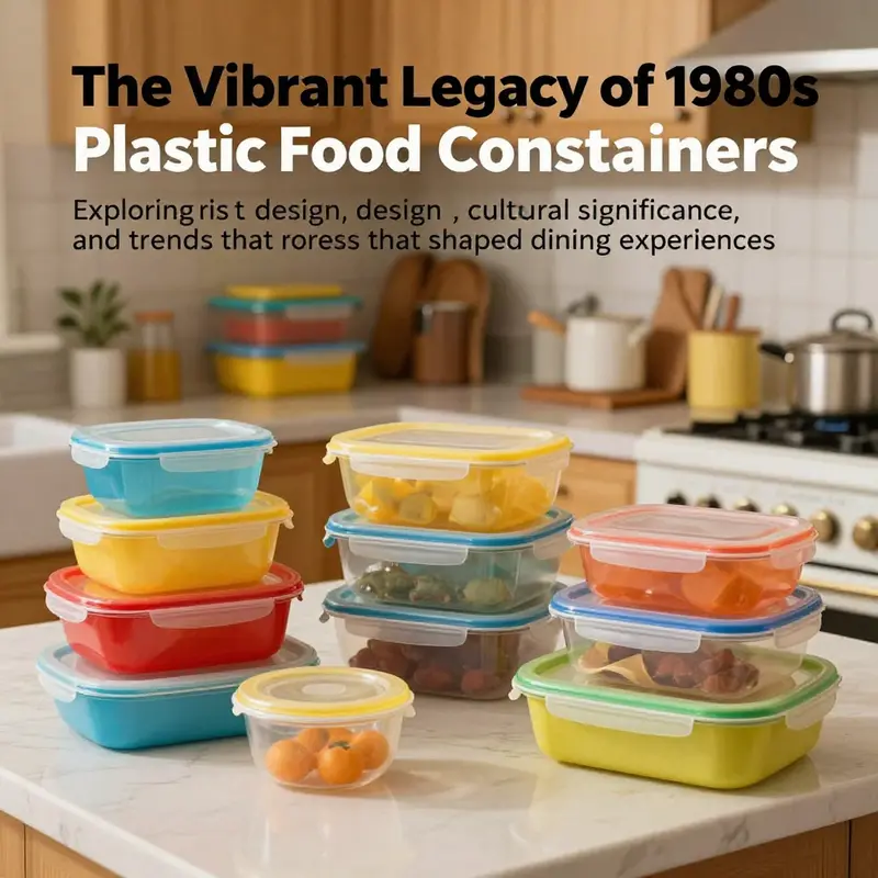
The 1980s brought a striking convergence of utility and personality to the domestic sphere, and plastic food containers sat at the heart of that transformation. In kitchens across the country, families embraced a new language of organization that married practical needs with a bold visual identity. The containers themselves became more than tool and vessel; they were cultural artifacts, artifacts that spoke in color and shape about how households organized time, meals, and space. At a practical level, the design answered a common kitchen demand: how to keep leftovers fresh, meals portable, and ingredients easy to access while occupying a minimal footprint in a crowded cabinet. Yet the design language went beyond function. It announced a kitchen that cared about color, form, and the pleasure of using everyday items that felt tailor-made for a busy, modern lifestyle. The most recognizable feature in this design moment was the push-down lid with a radiating, sunburst-inspired pattern—a tactile touch that signaled a secure, airtight seal and gave users a satisfying sense of control when closing the container. The lid was not merely a closure mechanism; it was a small ritual of order. Press down, hear the affirmative click, and watch the lid settle with a confident snap. It was a design cue that fused physics with psychology: the user could trust that the contents were protected, and that trust was built through a simple, memorable interaction.
Materials chosen for these containers bore the weight of that trust. The workhorses of the era leaned on durable polypropylene (PP) and high-density polyethylene (HDPE). These polymers offered a balance of stiffness, impact resistance, and temperature tolerance that made them suitable for a domestic ecosystem that increasingly valued bulk storage, weeknight meal prep, and freezer-friendly versatility. The choice of polymer mattered as much as the color, because it underpinned the containers’ longevity. They resisted cracking under the weight of stacked meals, endured repeated trips from fridge to shelf to dishwasher, and held up through the busy rhythms of family life. In an era before the ubiquity of microwaves in every kitchen, many of these containers were designed with freezing or dishwashing in mind, and some carried the promise of dishwasher-safe or freezer-safe use that matched the era’s growing comfort with prepared meals and batch cooking. The result was a family of storage solutions that looked robust and acted reliably, a combination that rewarded households with more efficient meal management and less food waste.
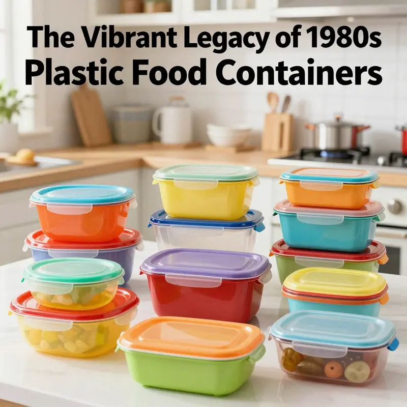
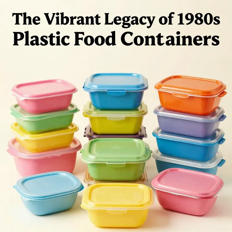
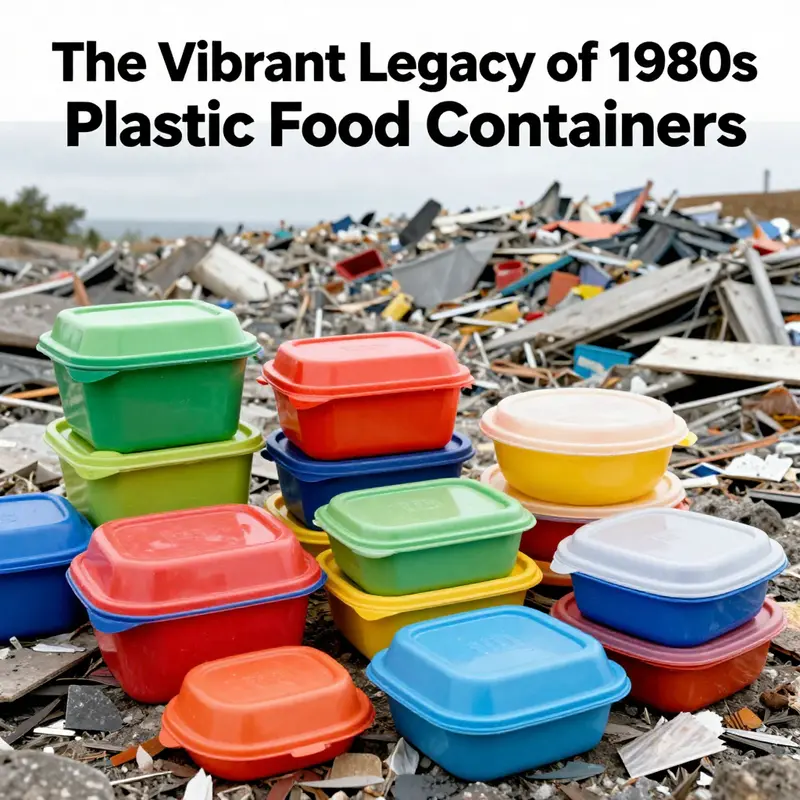
Aesthetics followed function with an unabashed enthusiasm for color. The palette was loud and optimistic: electric oranges, turquoise blues, avocado greens, and a spectrum of other vivid accents that turned pantries into showrooms of mid-century confidence—reimagined for the eighties. The bright hues did more than catch the eye; they made organization feel approachable. When a kitchen cabinet drawer or a refrigerator shelf showcased a set of stacked containers in complementary tones, it suggested that storage could be a personal expression rather than a dull afterthought. The shapes harmonized with the era’s broader design tendencies—rounded edges, compact round forms, and stackable configurations that encouraged a modular, space-conscious approach to domestic life. The combination of strong color and reliable shape reinforced a cultural mood in which everyday objects were celebrated for their durability and their ability to simplify daily routines.
In practice, these containers supported a shift in how families managed food. Leftovers found a home in the same vessels that held fresh ingredients, which meant fewer trips to the trash and less waste. The containers’ airtight or tightly sealing lids helped preserve flavors, moisture, and texture, encouraging more purposeful meal planning. The ability to store and transport meals for school lunches, workdays, or weekend picnics linked these containers to evolving routines. The era’s social rituals—busy weeknights, Sunday meal prep, and shared family meals—benefited from the predictability of a system that could be relied upon to keep foods fresh and organized. It was a small revolution in domestic life: design that worked hard and looked good doing it.
Collectors and enthusiasts still chase these designs in vintage markets and online communities, a testament to how deeply they embedded themselves in collective memory. A bright orange round storage container from the era, celebrated by collectors for its cheerful shade and robust construction, captures the essence of that decade: a product that was both practical and expressive. The nostalgia surrounding these pieces is not merely about a fond memory of a kitchen aesthetic; it is about the recognition that everyday objects can shape daily behavior. The containers helped normalize deliberate leftovers management, batch cooking, and family meals, and they showed that utility and personality can coexist in durable, affordable hardware.
As the era matured, a broader packaging conversation began to unfold—the recognition that durability and practicality did not have to come at the expense of environmental awareness or alternative material choices. While plastic storage dominated the landscape, conversations around sustainability and packaging started nudging designers toward hybrid approaches and new takeout solutions. In today’s context, it is possible to glimpse a transitional moment when households began to weigh plastic durability against emerging concerns about waste and recyclability. That tension would later drive innovations that blended the best of the old with the constraints and opportunities of newer materials. In the 1980s, however, the priority was clear: create a storage system that could withstand the day-to-day bustle of family life, while delivering the tactile satisfaction of dependable operation and the visual pleasure of bold color and confident form.
Within this story of form and function, it is also important to acknowledge that the era’s design choices did not exist in a vacuum. They coexisted with a broader ecosystem of packaging, dining, and lifestyle trends that valued convenience and expressiveness in equal measure. For instance, as consumer expectations around takeout and prepared foods grew, a parallel strand of packaging design explored materials such as kraft paper and other fiber-based options. These alternatives offered a different aesthetic and different performance characteristics, inviting a discussion about how modern packaging could balance convenience with sustainability. For readers who want to explore the material spectrum beyond plastic, a gateway to contemporary kraft packaging options can be found here: Kraft paper packaging for restaurant food.
The 1980s, then, did not simply give rise to a new storage product; they seeded a design language that would resonate for decades. The memory of bold colors, reliable seals, and modular shapes persists in the popular imagination, informing the way people think about organization, memory, and even the tactile joy of using household tools. In this sense, the era’s plastic containers served as more than containers. They were daily performers in a broader narrative about how households organized time, prioritized freshness, and expressed personality through the materials that touched their food. The push-down, sunburst-patterned lids, the sturdy polypropylene and HDPE bodies, and the unapologetically bright color stories all contributed to a design ethos that treated kitchen storage as both an act of efficiency and an opportunity for self-expression.
For researchers and curious readers, the one-stop reminder of the tangible reality of these pieces is a vintage example that captures the essence of the period. A bright orange round storage container, among the most recognizable artifacts of the era, embodies the combination of durability, everyday utility, and bold aesthetics that defined 1980s plastic storage. While modern conversations around sustainability and material choice have evolved since then, revisiting these designs offers valuable insights into how form, function, and culture can co-evolve in the most ordinary of objects. The lasting appeal of these containers lies in their ability to remind us that the kitchen is a space where practicality and personality meet, and where a simple lid can carry the memory of a decade of family life.
External resource: https://www.ebay.com/itm/265734599782
Seal, Color, and Everyday Modernity: The Quiet Revolution of 1980s Plastic Food Containers
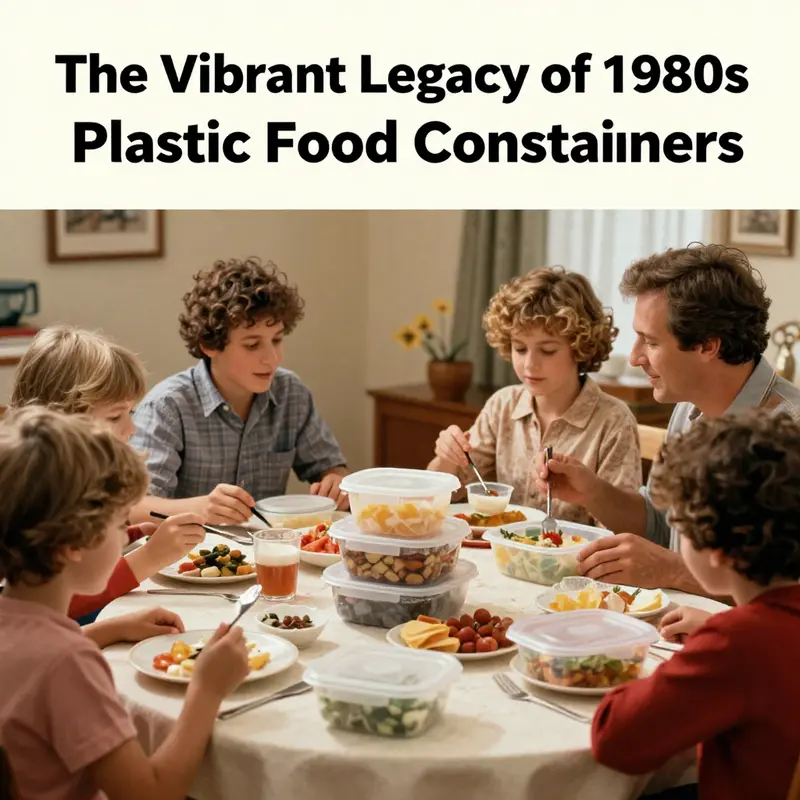
When people opened a kitchen cabinet in the 1980s, they found more than utensils and tins. They discovered a new geometry of storage that aligned with the era’s confidence in speed, order, and color. Plastic food containers – durable, lightweight, and see-through – became a practical shorthand for modern life. They didn’t merely hold leftovers or pack lunches; they reorganized how households planned, cooked, and displayed daily meals.
The design language embodied the spirit of the decade with architectural clarity. Shapes ranged from round bowls to rectangular bins, all molded in clear or tinted plastics that let residents see inside without opening lids. The lids were not mere fasteners; they were interactions – press, click, seal. This tactile ritual became a sign of domestic competence, a sound that the portion saved would stay fresh.
Color was deliberate. The decade favored bold orange, cool turquoise, and avocado green – colors that read as a cheerful gloss over daily work. They were signals about aspiring modern living: optimism, playfulness, and the idea that chores could be styled with intention.
The social life around these containers was telling. Marketing via direct selling events turned storage into a shared experience. A kitchen table spread with linked containers promised easier cleanup, organized shelves, and fewer trips to the store. Such gatherings turned housework into community activity and offered practical improvement as social currency.
Beyond design, these containers intersected with labor and family dynamics. More women entered the workforce, and kitchens reflected speed and multitasking. Leftovers could be saved and transported in lunch boxes; portions could be planned for children; mornings could be smoother. The containers became invisible partners in a routine that balanced work, family, and life.
Their influence extended to interiors. Translucent bodies let interiors breathe; contents peeked through lids guiding daily choices. Nested and stackable designs reshaped pantry architecture, favoring clear sightlines and minimal clutter. It was form following function with a wink at futurism, a lifestyle that valued preparedness and the pleasure of seeing a well ordered space.
The materials – durable plastics, lightweight yet sturdy – made ownership affordable. The balance of durability and cost helped democratize better storage. Plastic storage introduced a baseline of functionality, while glass did not disappear entirely. On countertops, the system contributed to a domestic aesthetic of efficiency without losing warmth, as bright colors lent personality to kitchens that were otherwise function-forward.
As the decade progressed, these containers became cultural memory tokens; they signaled exuberance and practicality alike. The palettes, the user friendly interfaces, and the routines of sealing, stacking, and labeling created a shared visual language. In retrospectives, containers appear not just as storage but as artifacts of a moment when ordinary appliances became icons of convenience and accessible modern living.
External resource: For a broader visual sense of the era’s iconic containers, see a vintage collection from a leading kitchen goods brand: https://www.tupperware.com/vintage-tupperware-1980s-collection.
The Plastic Packaging Boom of the 1980s: How Cheap, Colorful Containers Reshaped Markets and Kitchens
The 1980s arrived with optimism and a shift toward convenience that would reshape shopping, cooking, and everyday organization. Plastic food containers became more than storage — they embodied a new logic of efficiency, enabling lighter shipments, longer shelf life, and easier handling in crowded kitchens. Through cheaper resins and faster production, the cost of plastic packaging relative to glass, metal, and cardboard fell, helping brands offer lower prices and more adaptable designs. This was not a minor trend; it changed how households stocked leftovers, prepared meals, and navigated busy schedules.\n\nFrom the perspective of manufacturers and retailers, plastics offered a combination of lightness, durability, and versatility that could withstand microwaving, washing, and repeated use without breaking the bank. The economics of scale pushed extrusion lines to higher outputs and suppliers to coordinate with just-in-time inventory, speeding products from factory to shelf. For families, containers that sealed tightly, resisted leaks, and stacked neatly translated into tangible time savings and reduced spoilage, creating a compelling value proposition.\n\nAn emblematic moment was the emergence of brightly colored, well-sealed containers whose designs signaled modernity. The push-down lid and airtight seals became recognizable cues of reliability, while durable plastics reduced replacement costs for households and retailers alike. Brands competed not only on price but on how well a container fit into a busy kitchen routine, how easily it could be washed, reheated, or reused, and how clearly it could be identified on a crowded shelf.\n\nAcross the economy, plastics began to encroach on spaces long dominated by glass, metal, and cardboard. Form factors—round, square, and oval—were optimized for stackability and display, while color palettes helped products stand out and communicate function at a glance. The economic logic extended beyond per-unit cost to total life-cycle value, including reduced breakage, faster throughput in stores, and simpler logistics for producers and retailers.\n\nYet the era was not without trade-offs. As plastic use expanded, concerns about waste, recycling, and resource use surfaced, foreshadowing later policy and market responses. The 1980s thus hosted a balancing act between convenience and environmental responsibility, prompting early discussions about end-of-life outcomes and the need for more sustainable packaging options. The chapter of plastic packaging in this decade ends with a reminder that technology and design can deliver efficiency, while larger choices about waste streams and stewardship shape the longer arc of packaging history.
Sealed in Uncertainty: Safety, Regulation, and the Rise of 1980s Plastic Food Containers
The 1980s marked a watershed moment when plastic food containers moved from novelty to necessity, becoming a defining feature of the American kitchen. Their rise did not happen in a vacuum. It unfolded against a backdrop of rapid material adoption, consumer desire for convenience, and a regulatory environment that was still catching up to the technology. The containers themselves carried a visual language of the decade: bright, bold colors; shapes ranging from round to rectangular; and lid designs that promised an airtight seal with a simple push or snap. The practical virtues were clear: plastic could be molded into varied sizes, stacked neatly when not in use, and offered a lightweight alternative to glass. It was not just about storing leftovers or packing lunch; it was about a new relationship with food storage—defined by speed, accessibility, and reusability.
Yet beneath the glossy surfaces and cheerful hues lay questions about safety that were only beginning to be addressed in a systematic way. The regulatory framework governing food contact materials lagged behind the pace of adoption, with processes that valued industry practice and a general sense of safety over comprehensive, laboratory-based assessment. The FDA did have evaluation processes for food-contact materials, but they often reflected a pragmatic approach rather than the kind of long-term toxicology data that would come later.
A crucial point of this era was the absence of standardized consumer-facing labeling. The resin identification code system that would later appear on many containers did not exist in 1980. There was no universal shorthand for migration potential or for precise material composition, and no standardized disclosures about chemical concerns. This absence reflected a regulatory philosophy that trusted manufacturers and general safety profiles rather than demanding exhaustive, independently verifiable data.
Within the materials themselves, polyethylene, polypropylene, and polystyrene were the workhorse polymers, each offering distinct advantages. Additives—plasticizers, stabilizers, antioxidants, and processing aids—performed essential roles but also raised questions about migration into food. The science of migration was still developing, and regulatory appetite for comprehensive testing varied. In practice, many assessments aimed to meet general safety standards rather than to reveal subtle, chronic effects.
The era’s dialogue around substances like bisphenol A would intensify in later decades. In 1980, BPA’s health implications were not the central regulatory focus they would become; it circulated as a cautionary area of inquiry that foreshadowed future debate. The broader implication is clear: safety narratives existed alongside a growing confidence in plastics as indispensable, but with room for future scrutiny.
The regulatory landscape of the 1980s, then, was one of growth and transition. The FDA played a role, but the framework lacked the rigorous toxicology paradigms that would appear later. The generally recognized as safe (GRAS) designation provided a practical mechanism for handling substances whose safety had not been established via formal studies, a balance that fit production scale at the time but would later face reassessment as exposure grew.
Why does this history matter for a chapter on 1980s plastic containers? It helps explain the tension between convenience and safety that many remember from the era. Consumers enjoyed bright colors and durable designs, while uncertainties about chemical exposure and long-term health risk persisted. The absence of universal labeling meant that households could not always identify material composition at a glance, creating a paradox: a tool that made life easier, paired with questions about what was happening at the molecular level.
As the decade progressed, voices from science, policy, and industry began to converge on the idea that safety could not be measured solely by short-term outcomes. The push toward clearer labeling, better material identification, and more transparent disclosure would grow in the years ahead. The era’s plastic containers did more than store food; they helped shape a broader public conversation about safety, data, and the role of government in everyday life.
External resource (for context): U.S. FDA’s early history of food contact substances regulatory history provides a backdrop to these developments: https://www.fda.gov/food/food-contact-materials/food-contact-substances-regulation-history
Plastic Packaging in the 1980s: Color, Convenience, and a Growing Environmental Conscience
The 1980s reshaped kitchens with a new generation of plastic containers that were as visible as they were convenient. Their bright hues and modular designs signaled modern living, turning leftovers into easily storable portions and groceries into ready-to-go meals. The seals, snap-tight lids, and clear plastics suggested a frictionless routine—one that valued speed, portability, and cleanliness. Beyond aesthetics, plastics offered durability and reuse potential, reinforcing a sense of practical efficiency in everyday life.
Yet beneath the surface, environmental questions were starting to surface too. Plastics were celebrated for being lightweight and resource-efficient in transport, but the downstream consequences were not yet fully understood or widely discussed. The long-term ecological costs, the persistence of plastic waste in landfills, and the beginnings of marine pollution would only later become central to policy debates and consumer choices. In the 1980s, these concerns tended to live in then-emerging circles of science and advocacy rather than in household conversations.
Recycling infrastructure at the time was uneven and evolving. While many communities offered curbside programs, not all plastic types used in containers—such as PET and HDPE—were routinely collected or efficiently recycled across the country. Contamination, market fluctuations for recycled materials, and fragmented governance meant that much packaging ended up in landfills or incinerators rather than re-entering production. The result was a partial loop: plastics delivered immediate convenience but did not consistently demonstrate end-of-life circularity.
As the decade progressed, some households began to explore alternatives and redesign consumer choices toward reuse and more easily recyclable options. The seeds of a broader shift toward lifecycle thinking and sustainable packaging were planted, even as the dominant narrative of convenience persisted. This tension between immediacy and longer-term stewardship would grow in the following decades, shaping how people evaluated packaging materials, waste management, and policy responses.
For readers seeking a technical lens, later chapters will revisit lifecycle thinking, material choices, and the evolving rules around recycling, disposal, and environmental accounting across the packaging sector.
Final thoughts
The journey of plastic food containers in the 1980s is not just a nostalgic recollection but a crucial understanding for today’s food industry. With their innovative designs, cultural significance, and economic implications, these containers provided a foundation for modern dining experiences. As businesses reflect upon these historical trends, it remains vital to balance functionality with safety and environmental considerations. Today’s packaging solutions contribute to sustainable practices while meeting consumer needs. By understanding the past, food service operators can navigate contemporary challenges with insight and foresight, ensuring they remain leaders in the industry.